
A treatment center we audited last quarter had just finished a $190,000 website redesign. The new homepage was beautiful. Custom photography. Cinematic hero video. Award-winning typography.
The clinical team loved it. The leadership team loved it. The marketing director sent it to half a dozen industry peers who all loved it too.
The operator’s question to us was direct: “Why is our call volume down 22 percent since the launch?”
The new homepage was designed to look like a luxury wellness brand. It opened with a 14-second video of mountain landscapes and tasteful B-roll. The phone number appeared in the navigation menu in light grey, half-hidden against the white header.
The above-the-fold copy was an inspirational quote about hope. The first hard CTA appeared 2.5 scrolls down the page. Insurance was mentioned in the footer.
The redesign had optimized for everything except what a treatment center homepage actually has to do. Family members in crisis at 11 PM bounced because they could not find the phone number. Patients evaluating the facility could not find the level of care they needed.
Referral sources looking for clinical credibility found mountain landscapes instead of named clinical leadership. The new homepage looked great and converted worse than the old one across every audience the facility actually serves.
This piece is the operator-facing read on what a treatment center homepage actually has to do, and the design and architecture choices that determine whether a visitor becomes a caller. It is the broader-traffic companion to our paid landing page CRO work.
The homepage is not a paid landing page; it serves a different traffic mix and a different audience profile, and the conversion patterns are different. The principles that drive conversion are not.
Key Takeaways
- The treatment center homepage is a routing surface, not a conversion-in-place surface. Most visitors do not convert directly from the homepage; they route to the page that matches their need. The job of the homepage is to route the right visitor to the right next step in under 10 seconds.
- The 5-second above-the-fold decision is load-bearing. Family members and patients in crisis make the stay-or-bounce decision before they scroll. Phone number prominence, level-of-care clarity, accreditation signal, and insurance framing all need to be visible without a scroll on mobile.
- Family members are roughly 60 percent of residential treatment inquiry initiators. The homepage that addresses the family member directly outperforms the homepage that addresses the patient-as-reader. The vocabulary, tone, and CTA architecture should reflect this.
- Phone-first routing wins for behavioral health. The phone number above the fold, tap-to-call enabled, visually distinct, sized for thumb reach. Form-first and contact-form-only homepages convert at a fraction of the rate of phone-first hybrid pages.
- The most common treatment center homepage failure modes cluster in eight categories: hidden phone number, generic hero copy, missing accreditation signal, no level-of-care quick routing, hidden insurance information, slow mobile load time, stock photography trust signals, and absent crisis-now routing.
The Homepage’s Actual Job: Routing, Not Converting in Place
The first conceptual move that separates well-converting treatment center homepages from beautiful-but-broken ones is understanding what the homepage is actually supposed to do.
Paid landing pages are designed to convert in place. The audience arrives with high commercial intent from a paid ad, and the page exists to drive a phone call or VOB submission inside the same session. The architecture is single-purpose.
The homepage is different. The traffic mix is broader, the intent is more varied, and the visitor population includes patients, family members, referral sources, alumni, professional inquiries, staff candidates, and one-off visitors arriving from social or branded search.
The homepage cannot be optimized for a single conversion path because the audience is not single-purpose.
The right read on the homepage is as a routing surface. The visitor arrives. The homepage’s job is to recognize the visitor’s likely intent in the first 5 to 10 seconds and route them to the page that matches that intent.
Family members get routed to family-resource content or directly to the phone.
Patients get routed to level-of-care or modality pages or the phone. Referral sources get routed to clinical leadership bios and outcome content. Each route is a separate conversion path, but the homepage is the routing layer above all of them.
Most homepages we audit are trying to do too much. They try to be the conversion page, the credentials page, the brand statement, the alumni story, the insurance verification page, and the clinical leadership page all in one.
The result is a page that does none of those things well. The fix is a homepage that does one thing (route the visitor to their next step) and does it fast.
The homepage is not the conversion page. It is the routing page that sends the visitor to the conversion page. Treatment centers that try to make the homepage do everything end up with a page that does nothing well, and the call volume reflects it.
Preston Powell, CEO of Webserv
The 5-Second Above-the-Fold Decision
Nielsen Norman Group research on first impressions has consistently shown that web users form a credibility judgment in the first few seconds of arrival. For behavioral health, the timeline is even shorter.
The family member at 11 PM searching for residential treatment for her son does not give the homepage 30 seconds to make its case. She gives it 5.
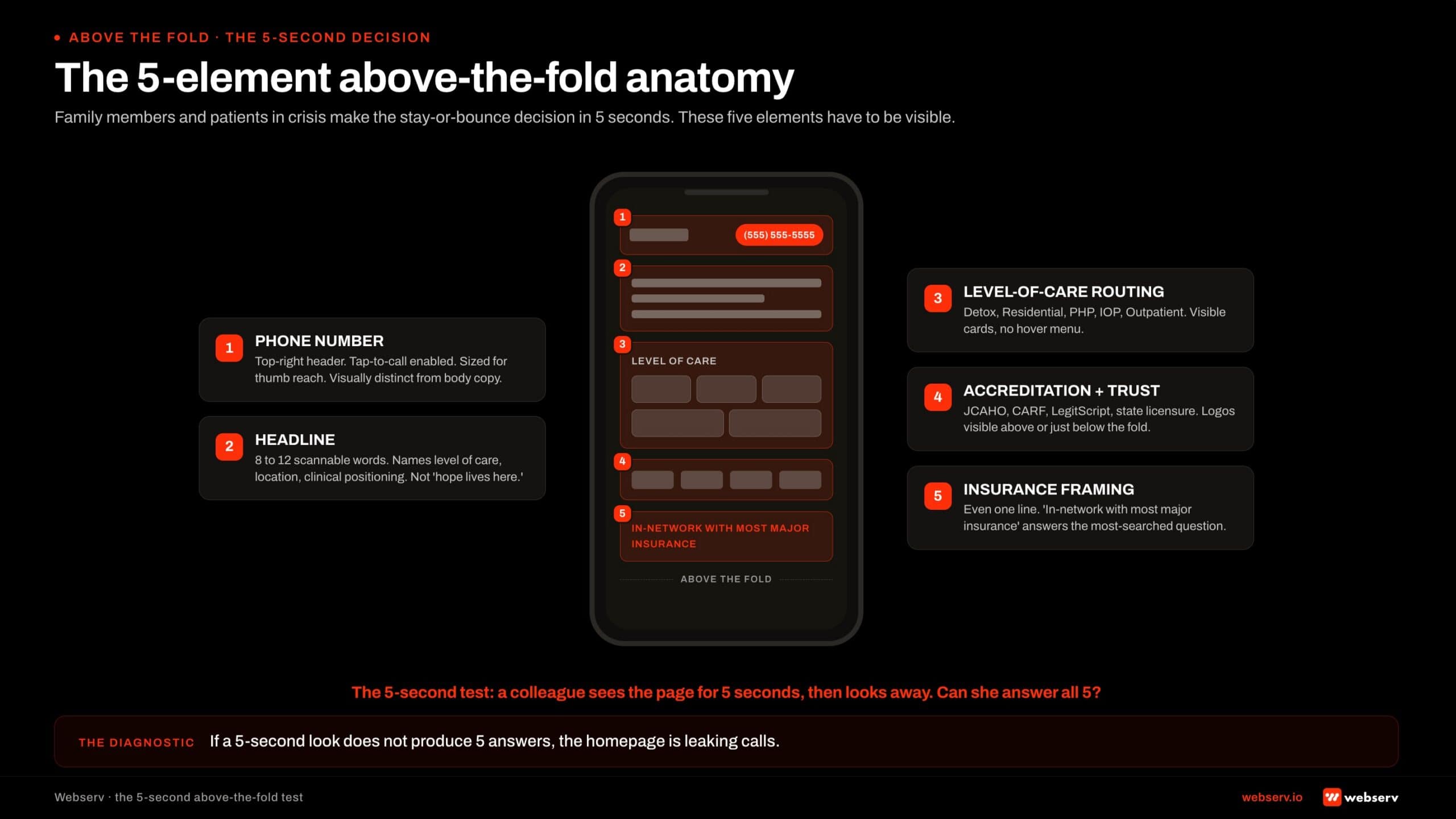
Five elements need to be visible above the fold on mobile.
Phone number, prominent, tap-to-call. Large enough to be hit by a thumb. Visually distinct from body copy. In the top right of the header on desktop and persistent at the top on mobile. The number should not require a scroll, a menu tap, or any thinking to find.
Headline that names what the facility actually does. Not “your journey starts here.” Not “hope lives here.” A specific, scannable headline that tells the visitor in 8 to 12 words that this is a behavioral health facility, what level of care it provides, and where it is located.
Levels of care visible as quick-routing options. Detox, residential, PHP, IOP, outpatient. The visitor should be able to tap the level of care she is researching and route directly to it. Hiding the level-of-care navigation behind a hover menu or a single “Programs” dropdown loses visitors.
Accreditation and trust signal. JCAHO, CARF, LegitScript, state licensure logos visible above the fold or just below. The accreditation strip is the trust shortcut family members use to decide whether the facility is legitimate within the first 5 seconds.
Insurance framing. Even a single line (“In-network with most major insurance” or “We accept most major insurance: verify in 5 minutes”) signals the answer to the most-searched question in behavioral health traffic. The line does not need to be detailed; it needs to be present.
The 5-second test for any treatment center homepage: a colleague who has never seen the site looks at the above-the-fold experience for 5 seconds, then looks away.
Can they tell what the facility does, where it is, what levels of care it provides, whether it is accredited, and how to call?
If the answer is no on any of those five points, the homepage is failing the 5-second test for the audience that matters.
The Family-Member-First Frame
The vocabulary and tone of the homepage matter as much as the structural elements. Family members are the load-bearing decision-makers in residential treatment admissions, and the homepage that addresses them directly outperforms the homepage that addresses the patient-as-reader by a wide margin.
The patient-as-reader homepage uses language like “your recovery journey,” “your treatment options,” “your insurance coverage.” The patient-as-reader is rarely the one researching at 11 PM. The patient is in a hotel room, a basement, or an ER bay. The mother is the one with the laptop.
The family-member-first homepage uses language like “find treatment for your loved one,” “what to expect when you call,” “we’ll help you verify your insurance,” “the next step is simpler than you think.” The framing acknowledges who is actually reading and what she actually needs in the moment.
The shift is not just vocabulary. The CTA architecture should reflect the family-member primacy too. The phone CTA should be obvious and immediate, because the family member is more likely to pick up the phone than the patient.
The form CTA, if present, should respect that the family member is calling about someone else, not about herself.
Most treatment center homepages we audit are written for an audience that is not the one actually visiting.
The fix is not a rewrite of every word; it is an audit of the above-the-fold copy and CTA against the family-member-first frame, with a clean revision pass on the load-bearing 20 percent of the page that the visitor actually reads.
The deeper read on family-voice content patterns applies here too. The 9 admit-driving content types we have catalogued put family-facing content as the highest-converting category in behavioral health, and the homepage is the first surface where that frame either lands or does not.
Phone Number Architecture
If the homepage is a routing surface, the phone number is the single most important routing element on the page. Most treatment centers under-invest in phone number prominence by a factor of 3 or 4 against what conversion math suggests they should.
Three rules separate phone-converting homepages from phone-losing homepages.
Visible without a scroll on mobile. The phone number needs to be in the persistent header or above the fold on mobile, sized large enough to read at arm’s length, colored to be visually distinct from body copy.
Phone numbers buried in the menu, in the footer, or behind a “contact us” link lose 40 to 70 percent of potential callers.
Tap-to-call enabled. The HTML tel: link is one of the smallest technical details and one of the highest-impact. A phone number that requires the visitor to memorize or copy-paste 10 digits loses calls. A tap-to-call link converts the visitor with one thumb tap.
Consistent across the site, including the header. The same phone number in the same place on every page reinforces the routing path. Visitors who navigate to a service page expect the phone number to be in the same position they saw on the homepage.
Inconsistent placement increases cognitive load and reduces calls.
The phone number is not the only CTA on the homepage. VOB forms, insurance verification flows, contact forms, and chat widgets all have places in the architecture. But the phone is the highest-converting CTA in behavioral health, and the homepage should make it impossible to miss.
Levels-of-Care Quick Routing
The second-highest-value routing element on the homepage is the level-of-care navigation. Visitors arriving on the homepage from organic search, direct traffic, or referral all need to be able to find the program that matches their need within 10 seconds.
The pattern that works is a level-of-care strip visible above or just below the fold. Detox, residential, PHP, IOP, outpatient, sober living, and aftercare each get a quick-tap card with a one-line description and a route to the dedicated level-of-care page.
The pattern that does not work is a single “Programs” dropdown menu that hides the level-of-care options behind a hover or a tap.
Mobile users in particular struggle with dropdown menus, and the family member researching at 11 PM on a phone with one hand free does not patiently explore the navigation structure.
The level-of-care strip also helps the SEO frame. Each level-of-care card links to its dedicated page, which reinforces the internal-linking architecture that builds topical authority across the cluster.
The topical authority framework for treatment centers covers the broader read; the homepage’s level-of-care strip is the load-bearing entry point. The entity SEO frame for AI search covers the AI-side compounding that the same level-of-care architecture produces.
Insurance Signal Above the Fold
Insurance questions are the single highest-intent search behavior in behavioral health paid and organic traffic. Family members and patients searching “rehab covered by [insurance carrier]” or “does my insurance cover treatment” are 7 to 10 days from an inquiry call.
The homepage that addresses insurance above the fold captures this traffic; the homepage that buries insurance information in the footer does not.
The insurance signal does not need to be complex. A single line (“In-network with most major insurance”) and a “Verify Your Insurance” CTA that routes to the VOB form or the insurance page is enough.
The visitor does not need a 40-carrier list above the fold; she needs to know that the facility takes insurance and that she can verify her specific coverage easily.
Three constraints shape the insurance copy. Compliance: no specific outcome promises about coverage (LegitScript and Google healthcare policy forbid that). Honesty: no claims about “free treatment” or “treatment covered at no cost” that the facility cannot substantiate.
Transparency: in-network vs out-of-network status should be clear without requiring the visitor to call to find out.
The right pattern is to acknowledge insurance is a question, route the visitor to a VOB flow or insurance landing page, and let the insurance verification process produce the specific answer the visitor needs. The homepage’s job is the routing acknowledgment; the verification page’s job is the answer.
Clinical Leadership and Accreditation Trust Bar
The trust signal on the treatment center homepage is what determines whether the visitor reads past the hero. Two elements carry the trust signal: accreditation logos and clinical leadership representation.
Accreditation logos. JCAHO, CARF, LegitScript certification, state licensure, and any specialty accreditations (e.g., ASAM membership, dual-diagnosis specialty certifications). These should appear as a visible strip above or just below the fold. Visitors use the accreditation strip as a trust shortcut; missing accreditation signal correlates with bounce.
Named clinical leadership. A photo and name of the clinical director or chief medical officer, with credentials, on the homepage. Not a stock photo, not a generic “our team” mention.
The named clinician is the credibility shortcut for the family member evaluating whether the facility is legitimate, and it is the same E-E-A-T signal that supports YMYL search ranking.
The author bios that build E-E-A-T for behavioral health blogs framework applies to the homepage too. The clinicians-as-AEO-moat read extends the same principle to AI search citation.
The trust bar should not be cluttered. Three to five accreditation logos, one or two clinical leaders, and a clear linking path to the broader bio and accreditation pages is enough.
Visitors do not read a 12-logo accreditation strip; they scan it and form a trust judgment based on the presence and density of the logos rather than the specific list.
What does not work: accreditation logos in the footer where nobody sees them. Generic “expert team” claims without named clinicians. Stock photos that read as marketing rather than clinical credibility. Each of these undermines the trust signal the page is trying to produce.
The “Are You In Crisis Now” Path
Every treatment center homepage should have a clear, immediate path for visitors who are in active crisis. The path is short: a visible crisis hotline reference, a clear “if you are in immediate crisis, call 988” line, and the facility’s own crisis-routing if applicable.
The compliance and ethical frame is real. Visitors arriving at a treatment center homepage in active crisis are a vulnerable population.
The homepage’s responsibility is to acknowledge the crisis state and route the visitor to immediate help.
That help is the facility’s own admissions line for medical and clinical needs, the 988 Suicide and Crisis Lifeline for psychiatric emergencies, and SAMHSA’s National Helpline for substance use crisis routing.
The visual treatment of the crisis path should be clear without being alarming.
A red or distinct-colored banner at the top of the page, a visible link in the navigation, and a section on the homepage that addresses the question “what to do if you are in immediate crisis” all work.
The pattern should be present on every page, not just the homepage.
The crisis-now path is not a conversion strategy. It is the ethical baseline that behavioral health facilities operate under. The conversion math is incidental to the ethical responsibility, but it is worth noting that facilities with clear crisis routing also produce more inquiry calls.
Visitors trust facilities that prioritize patient safety, and the trust signal compounds across the rest of the conversion architecture.
Design the homepage for the bounce decision, not the design awards. The mother at 11 PM is the load-bearing audience, and she does not care about the cinematic hero video.
She cares whether she can find the phone number, see that the facility is accredited, and route to the level of care her son needs. Every design decision should be evaluated against her 5 seconds.
Preston Powell, CEO of Webserv
Mobile-First Is Not Optional
Sixty-five to 75 percent of behavioral health homepage traffic arrives on mobile. The family member researching at 11 PM is on her phone. The patient evaluating the facility is on his.
Mobile is the primary audience, and the homepage that is designed desktop-first and adapted to mobile loses conversion to the homepage that is designed mobile-first.
Four mobile-first audit questions surface most of the problems we see in treatment center homepages.
Is the phone number visible in the first mobile viewport? The 390-pixel-wide phone is the audit reference. The phone number should appear in the persistent header or above the fold without a scroll.
A phone number that requires the visitor to scroll past a hero image or to tap into the menu is functionally invisible to the audience that matters most.
Are tap targets sized for thumb reach? Phone CTAs, level-of-care cards, navigation links, and the insurance verification button all need to be sized for one-handed thumb operation. The standard is 44 by 44 pixels minimum per Apple’s and Google’s accessibility guidance. Smaller targets produce mis-taps and abandonment.
Does the hero load in under 2 seconds on a 4G connection? Family members on phones with weak signal or older devices abandon homepages that take longer to render.
The hero should be optimized for fast first paint, with hero images compressed and any video lazy-loaded after the page is interactive.
Is the navigation usable with one hand? Hamburger menus that require precise tapping in the top corner of the screen lose users with phones held one-handed.
Persistent bottom-navigation bars, sticky top headers with large tap targets, and visible level-of-care strips that do not require menu interaction all outperform the desktop-style horizontal navigation.
Mobile-first is also where the WCAG accessibility guidelines become load-bearing. Color contrast, alt text, keyboard navigation, screen-reader compatibility all matter for the audience the homepage actually serves.
A homepage that fails WCAG basics fails the same audience that the mobile-first design is supposed to serve, and the compliance frame around healthcare website accessibility is tightening rather than loosening.
Page Speed and Core Web Vitals
The homepage is the highest-traffic page on the treatment center website, which means page speed compounds across more visitors here than anywhere else. A 1-second improvement in mobile load time on the homepage typically produces 8 to 15 percent conversion lift across the audiences the homepage routes.
Google’s Core Web Vitals framework measures three metrics that govern most page-speed outcomes.
Largest Contentful Paint (LCP) under 2.5 seconds on mobile. The largest visible element on the homepage (usually the hero image or video, or the headline block) needs to render in under 2.5 seconds.
Pages that miss this threshold lose visitors before the homepage has had a chance to make its 5-second case.
The common causes on treatment center homepages: oversized hero video that auto-plays before the page is interactive, large unoptimized hero images, blocking third-party scripts (chat widgets, analytics, A/B testing tools that load synchronously), and CDN configurations that do not serve images from the closest edge.
Interaction to Next Paint (INP) under 200 milliseconds. The time between a user tap and the page responding. Slow INP shows up most often as taps on the phone-call CTA or the level-of-care cards that feel laggy, which produces a real conversion drop because the visitor is in time-pressured mode.
The common causes: heavy JavaScript on tap handlers, long-running tracking scripts, and animation libraries that block the main thread.
Cumulative Layout Shift (CLS) under 0.1. The amount the page visually shifts as elements load.
Pages with high CLS produce the “tap the wrong thing because the page jumped” experience that family members in crisis particularly hate, and the experience converts worse than the same page on a slower connection without the layout shift.
The common causes: ad slots or chat widgets without reserved dimensions, web fonts that swap after initial render, hero videos that resize after first paint, and lazy-loaded images without explicit width and height attributes.
Most treatment center homepages we audit fail at least one of the three Core Web Vitals on mobile. Closing the gap typically requires image and video optimization, script load deferral, font display strategy, and CSS that reserves space for late-loading elements.
The work is engineering rather than design, but it sits in the homepage CRO category because it produces measurable conversion lift.
Common Homepage Failure Modes
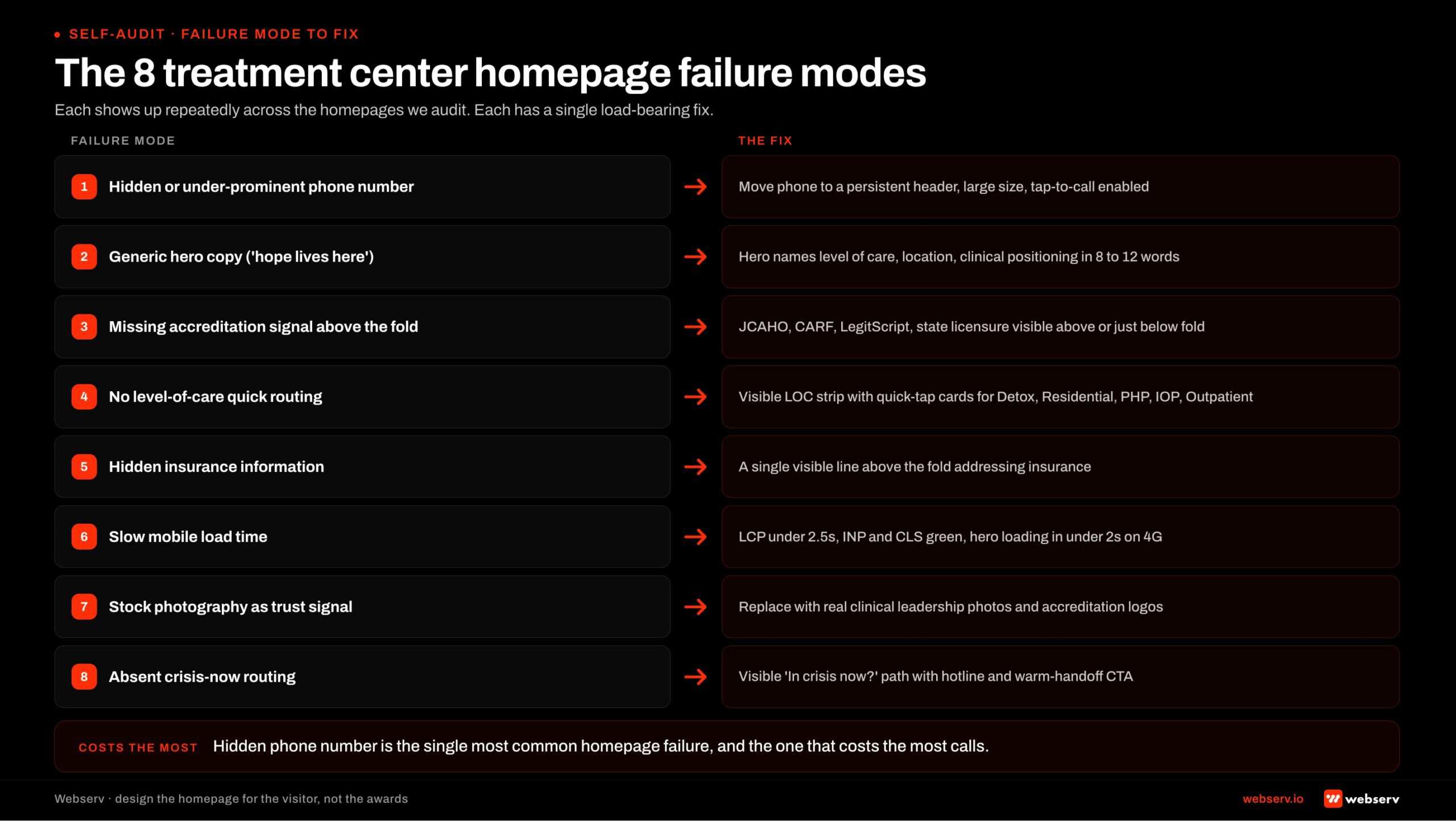
Eight failure modes show up repeatedly across the treatment center homepages we audit. The pattern is consistent enough to serve as a self-audit checklist.
1. Hidden or under-prominent phone number. Phone number in the footer, in the menu, in light grey against a white header, or sized too small for thumb-tap on mobile. The single most common homepage failure and the one that costs the most calls per audit.
The fix is moving the phone number into the persistent header at large size with tap-to-call enabled.
2. Generic hero copy. “Your journey to recovery starts here.” “Hope lives here.” “We believe in second chances.” The marketing-voice hero that says nothing specific about what the facility actually does.
The fix is a hero headline that names the facility’s level of care, location, and clinical positioning in 8 to 12 scannable words.
3. Missing accreditation signal above the fold. JCAHO, CARF, LegitScript, state licensure logos buried in the footer or absent entirely. Visitors use the accreditation strip as a trust shortcut; the absence of the strip undermines the credibility judgment family members make in the first 5 seconds.
4. No level-of-care quick routing. Programs hidden behind a single “Programs” dropdown that requires hover or multi-tap interaction. The fix is a visible level-of-care strip above or just below the fold with quick-tap cards for detox, residential, PHP, IOP, and outpatient.
5. Hidden insurance information. No mention of insurance above the fold; insurance information buried in the footer or behind a multi-click navigation path. Insurance is the most-searched question in behavioral health traffic, and the homepage that addresses it visibly captures the highest-intent visitors.
6. Slow mobile load time. LCP over 2.5 seconds, INP over 200 milliseconds, or CLS over 0.1 on mobile. The audience that bounces because of speed is the audience that needed the homepage most. The fix is the Core Web Vitals work covered above.
7. Stock photography trust signals. Stock photos of smiling families on beaches, generic recovery imagery, and AI-generated facility staff photos. The family member at 11 PM recognizes stock photography immediately and loses trust.
The fix is real custom photography of the actual facility, named clinical leadership with credentials, and authentic representation of the facility’s clinical environment.
8. Absent crisis-now routing. No visible path for visitors in active crisis. The homepage that omits the 988 reference, the SAMHSA helpline, and the facility’s own crisis line both fails the ethical baseline and underperforms on the conversion math (because visitors trust facilities that prioritize patient safety).
Most operators we audit have 4 to 6 of these 8 failure modes live on their homepage. The audit sequence below addresses them in priority order.
The Homepage Audit Sequence
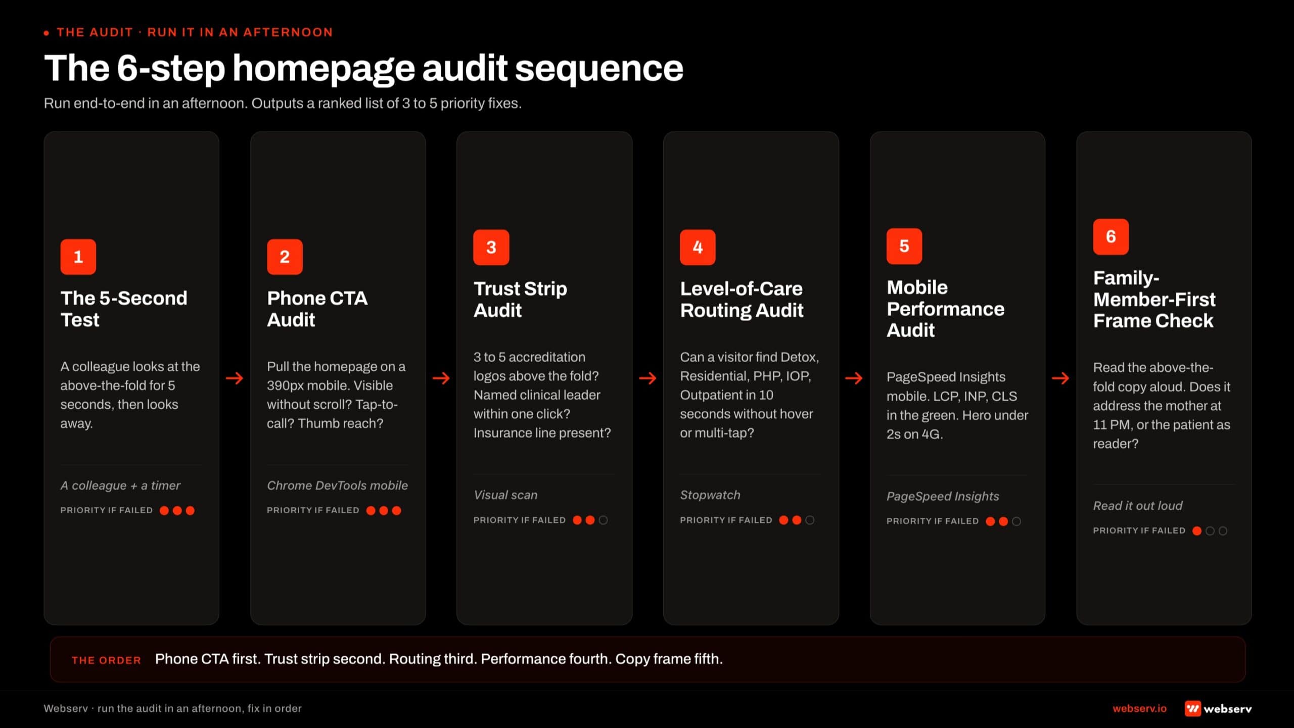
Six steps, in order, run end-to-end in an afternoon. The output is a ranked list of which 3 to 5 fixes will produce the largest conversion lift on the homepage.
Step 1: The 5-second test. Have a colleague who has never seen the site look at the above-the-fold mobile experience for 5 seconds, then look away.
Ask them what the facility does, where it is, what levels of care it provides, whether it is accredited, and how to call. Any gap in the answers is a load-bearing fix.
Step 2: Phone CTA audit. Pull the homepage on a 390-pixel mobile viewport. Is the phone number visible without a scroll? Is it tap-to-call enabled? Is it sized for thumb reach? Is it consistent across every interior page? Gaps here are the highest-priority fix because phone is the highest-converting CTA.
Step 3: Trust strip audit. Above-the-fold scan: are 3 to 5 accreditation logos visible? Is at least one named clinical leader with credentials visible or one click away? Is the insurance line present? Each missing element is a credibility judgment the homepage is leaving on the table.
Step 4: Level-of-care routing audit. Can the visitor find detox, residential, PHP, IOP, and outpatient in 10 seconds without opening a hover menu or multi-tap dropdown? The level-of-care strip should be visible or one tap away from the above-the-fold experience.
Step 5: Mobile performance audit. Run PageSpeed Insights on the homepage. Are LCP, INP, and CLS in the green for mobile? Is the hero loading in under 2 seconds on a 4G connection?
Failing Core Web Vitals on the homepage costs conversion across every visitor segment, and the fix is engineering rather than design.
Step 6: Family-member-first frame check. Read the above-the-fold copy out loud. Does it address the mother researching at 11 PM, or does it address the patient as the reader? Does the CTA language acknowledge that the family member is calling about someone else?
The vocabulary audit is the smallest fix on this list and one of the highest-impact for treatment center homepages designed by agencies that did not run the family-first frame.
The 6-step sequence typically surfaces 3 to 5 priority fixes per audit. The right next step is to address them in order of conversion impact (phone CTA first, then trust strip, then level-of-care routing, then performance, then copy frame) rather than trying to fix everything at once.
Frequently Asked Questions
Should our homepage be the page we send paid traffic to?
No, in almost every case. The homepage serves a broader audience mix (family members, patients, referral sources, alumni, staff candidates) and cannot be optimized for the single high-intent conversion path paid traffic needs. Paid clicks deserve a dedicated landing page built around the specific keyword intent and audience segment that generated the click.
The right architecture is paid traffic → dedicated landing page; organic traffic → homepage or relevant service page; direct traffic → homepage. The landing page optimization playbook for addiction treatment covers the paid-side architecture in depth.
Operators sending paid clicks to the homepage typically convert at 50 to 70 percent below what a dedicated landing page produces on the same traffic, because the homepage cannot be optimized for the keyword and audience intent the paid ad implied.
How often should we redesign our homepage?
Major redesigns every 4 to 6 years. Iterative updates every quarter on a smaller scale. The cadence is driven less by design trends and more by the changing 5-second decision the audience makes when arriving.
The triggers for a major redesign are typically not aesthetic. They are functional: the routing architecture no longer fits the current audience mix, mobile performance has fallen behind Core Web Vitals thresholds, the level-of-care or service offerings have shifted enough that the navigation is misaligned with the actual program, or the brand has materially evolved (acquisition, expansion, repositioning).
Iterative quarterly updates handle the small fixes: phone number prominence, accreditation logo refresh, level-of-care strip tweaks, insurance signal updates, crisis-routing placement, photography refresh. These compound over time without requiring a full rebuild and typically produce 2 to 5 percent conversion lift per cycle on disciplined operators.
How much should we spend on a homepage redesign?
For most behavioral health operators, a working homepage redesign runs $25,000 to $80,000 depending on the depth of custom content, photography, and clinical-leadership-page integration. Multi-facility operators with portfolio-level brand and 10+ service pages typically land at $80,000 to $150,000. Enterprise operators with 25+ pages and custom CMS work can reach $250,000.
The trap is paying for design polish that does not produce conversion lift. A $190,000 redesign that produces a cinematic hero video and ignores phone CTA placement converts worse than a $50,000 redesign that prioritizes the 5-second test. Budget should map to functional outcomes, not aesthetic ambitions.
The right allocation within the budget: 30 to 40 percent on UX architecture and routing design, 25 to 35 percent on copy and content strategy, 15 to 20 percent on custom photography and clinical-leadership presentation, 10 to 15 percent on development and CMS integration, and 5 to 10 percent on post-launch testing and measurement infrastructure.
What’s the right call-to-action on a treatment center homepage?
Phone primary, secondary CTA varies by audience segment. The phone number above the fold, tap-to-call enabled, persistent in the header is the highest-converting CTA on the homepage for the family-member-driven majority of inquiry traffic.
The secondary CTA depends on what the homepage is routing to. For paid-aware operators, a “Verify Your Insurance” CTA that routes to the VOB form captures the off-hours and form-preference traffic. For broader operators, a “Find a Program” CTA that routes to the level-of-care strip captures the research-mode visitor who needs more orientation before calling.
What does not work as a primary CTA: “Contact Us” (too vague), “Download Our Free Guide” (low intent, converts at 0.4 to 0.8 percent), and “Submit Your Information” (form-heavy framing that resists the family-member-in-crisis use case). The 9 ways to lower cost per admit piece covers the broader CTA-vs-cost-per-admit interaction.
Should our homepage include patient testimonials?
Carefully, and rarely on the homepage itself. The 42 CFR Part 2 confidentiality frame on SUD patient information is strict. Patient testimonials with identifiable faces violate the framework even when the patient has consented, because the implication of treatment exposure is itself a confidentiality breach for the broader population.
The pattern that works: anonymized alumni outcome stories on a dedicated alumni page (not the homepage), with permission documented and identifying details obscured. The homepage can link to the alumni page, but the testimonials themselves do not belong above the fold on a page family members visit before they understand the facility’s clinical positioning.
The credibility signal that does belong on the homepage is named clinical leadership, accreditation logos, and named clinician bios. The clinicians-as-AEO-moat framing covers why named clinician content is the right credibility signal for both human visitors and AI search systems. The clinical content system that Google trusts piece extends the same principle to the broader content cluster.
How do we measure whether our homepage is converting?
Three measurement layers. First, the bounce-and-route metrics: bounce rate (target under 50 percent for direct and organic traffic), time on page (target over 30 seconds for non-bouncing visitors), and the routing distribution (how visitors split across level-of-care, contact, insurance, and clinical-leadership pages from the homepage).
Second, the phone-and-form conversion attribution. Calls and form submissions tagged with the homepage as the entry page, traced through to inquiry and admit-attributed conversion. The homepage is rarely the last-touch page for paid conversions but is frequently the entry page for organic and direct admits.
Third, the broader funnel attribution that ties homepage performance to admit-attributed conversion lagged 60 to 120 days. The behavioral health marketing complete guide covers the attribution framework that ties surface-level engagement metrics to bottom-of-funnel conversion. Sessions and bounce rate are diagnostic; admits are the metric the homepage system optimizes against.
Design the Homepage for the Visitor, Not the Awards
The treatment center homepage is a routing surface for an audience that is overwhelmingly mobile, time-pressured, and family-member-led. The homepage that wins is not the one that looks like a luxury wellness brand.
It is the one that passes the 5-second test for the mother at 11 PM and routes her to the phone or the level-of-care page in under 10 seconds.
The architecture is simple in principle. Phone number above the fold and tap-to-call enabled. Headline that names the facility and its programs. Level-of-care quick routing visible without a menu.
Accreditation logos visible above the fold. Insurance signal acknowledged. Named clinical leadership representing the credibility. Crisis-now routing present and ethical. Mobile-first design, Core Web Vitals in the green.
The eight failure modes covered above describe the gap between most treatment center homepages and the ones that convert. Most operators we audit have 4 to 6 of the failure modes live. The audit sequence surfaces them in priority order. The fix sequence addresses the highest-impact 3 to 5 first.
We help treatment center operators audit their current homepage against the routing, trust, and conversion frame, identify the load-bearing failures, and rebuild the homepage to produce measurable call volume and admit-attributed conversion lift.
The work pairs with our web design capability for operators considering full redesigns and with our broader creative capability for the production side of the work.
Book an intro meeting to walk through your current homepage against the 5-second test, the 8 failure modes, and the audit sequence above, and to see what a rebuild scoped against measurable call-volume lift would produce for your facility.
For the broader picture of how the homepage fits inside the full treatment center marketing program, see our ultimate guide to behavioral health marketing and our deeper read on how long SEO takes to work for a rehab website for the cycle the broader website investment plays out on.
Trevor Gage is the Director of Marketing at Webserv. Webserv works with behavioral health and addiction treatment centers on SEO, paid media, and full-funnel admissions strategy.