A mother of a 22-year-old in active opioid use called a treatment center after her son overdosed for the second time in six months. She had spent the previous 90 minutes searching for residential treatment. She landed on five facility websites in that window.
She closed the first one in 8 seconds. The site had a stock photo of a smiling family on a beach as the hero image. The headline promised “your journey to recovery starts here.” The form asked for 14 fields. The phone number was buried in the footer.
She did not close it because she was a sophisticated marketing critic. She closed it because some signal her crisis-state brain processed in two seconds told her this place was not serious.
She called the third facility she visited. Their site had a clinical director’s name and credentials in the hero section. The phone number was the first thing she could see. The intake form asked for five fields. The accreditation logos were visible without scrolling.
That facility admitted her son three hours later. The first facility never got the call.
Inside Webserv’s web design practice for treatment centers, we work with operators on websites that do two jobs at once.
The marketing job (drive inquiries, convert visitors, support paid traffic) is what most operators budget for.
The clinical trust signal job, the job that determines whether the mother on a crisis call keeps the tab open or closes it in eight seconds, is the job most websites get wrong because nobody is responsible for it.
This article makes the case for treating design as a clinical trust signal alongside its marketing function, names the specific design elements that telegraph clinical credibility, and gives operators a framework for getting marketing and clinical leadership aligned on the website without producing thrash.
Key Takeaways
- 75 percent of users judge a business’s credibility based on website design. For treatment centers, that percentage is materially higher because the decision being made carries life-stakes weight and is often made by a family member in active crisis.
- A treatment center website does two jobs at once: marketing (drive inquiries) and clinical trust signaling (telegraph credibility to a family member who may be deciding in 8 seconds whether to keep the tab open). The two jobs overlap in some elements and diverge in others.
- Behavioral health sits inside Google’s YMYL framework at a stricter threshold than most categories. The December 2025 Core Update produced significant ranking changes on 67 percent of health-related websites, with E-E-A-T (Experience, Expertise, Authoritativeness, Trustworthiness) signals as the load-bearing differentiator.
- Eight specific design elements function as clinical trust signals: named clinical authorship, NAP consistency, encryption, accreditation visibility, leadership team photos, facility imagery, response-time signals, and accessibility. Most rehab sites get three or four right and miss the rest.
- The design brief should be co-authored by marketing and clinical leadership. Sites where marketing owns the brief alone tend to over-index on conversion and miss clinical credibility. Sites where clinical owns the brief alone tend to look like academic literature and miss the family-decision psychology.
The Dual-Function Frame
Every other website in the operator’s universe does one job. The ecommerce site converts visitors into orders. The SaaS site converts visitors into trials. The hospital marketing site converts visitors into appointments. Single function, single objective.
Treatment center websites do two jobs that pull in different directions.
The marketing job is the one most operators budget for. Drive inquiries from paid traffic. Convert organic search visitors. Support the family member who arrives via referral. Lower cost per admit. Reduce bounce rate. Optimize the form.
The clinical trust signal job is the one most operators do not budget for explicitly. Telegraph to the family member that this facility is serious enough to entrust someone’s life to.
Demonstrate clinical credentials. Show that the program is real, not a marketing front. Pass the YMYL evaluation that Google’s quality raters apply at a stricter threshold than they apply to almost any other category.
The two jobs overlap in some elements. A clean visual hierarchy serves both. Fast page load serves both. Mobile-responsive layout serves both. Clear navigation serves both.
The two jobs diverge in other elements. A marketing-optimized hero image of a smiling family on a beach might convert better than a clinical-credibility-optimized photo of the actual clinical director. Our nine-component homepage rubric shows how to weigh that trade-off.
The marketing-optimized testimonial section might emphasize outcome promises that the clinical-credibility-optimized version would never make. The marketing-optimized form might ask for fewer fields than the clinical-credibility-optimized version needs for safe intake.
Sites that solve only the marketing job tend to convert well in the short term and erode credibility over time. Sites that solve only the clinical trust signal job tend to be credible but un-discoverable and difficult to convert. Sites that solve both jobs at once compound over years.
What a Family Member in Crisis Reads in the First 5 Seconds
The family member arriving at a treatment center website is rarely in the patient demographic. They are often a mother, father, sibling, or spouse who has just learned about an overdose, an arrest, a relapse, or a dangerous use pattern.
They are searching at 11 PM, in tears, on mobile, with a phone battery at 14 percent.
Their crisis-state cognition is making a fast trust decision based on signals that operate below conscious awareness. The signals are not the headline or the marketing copy. They are the visual gestalt: does this look like a real place with real people who know what they are doing?
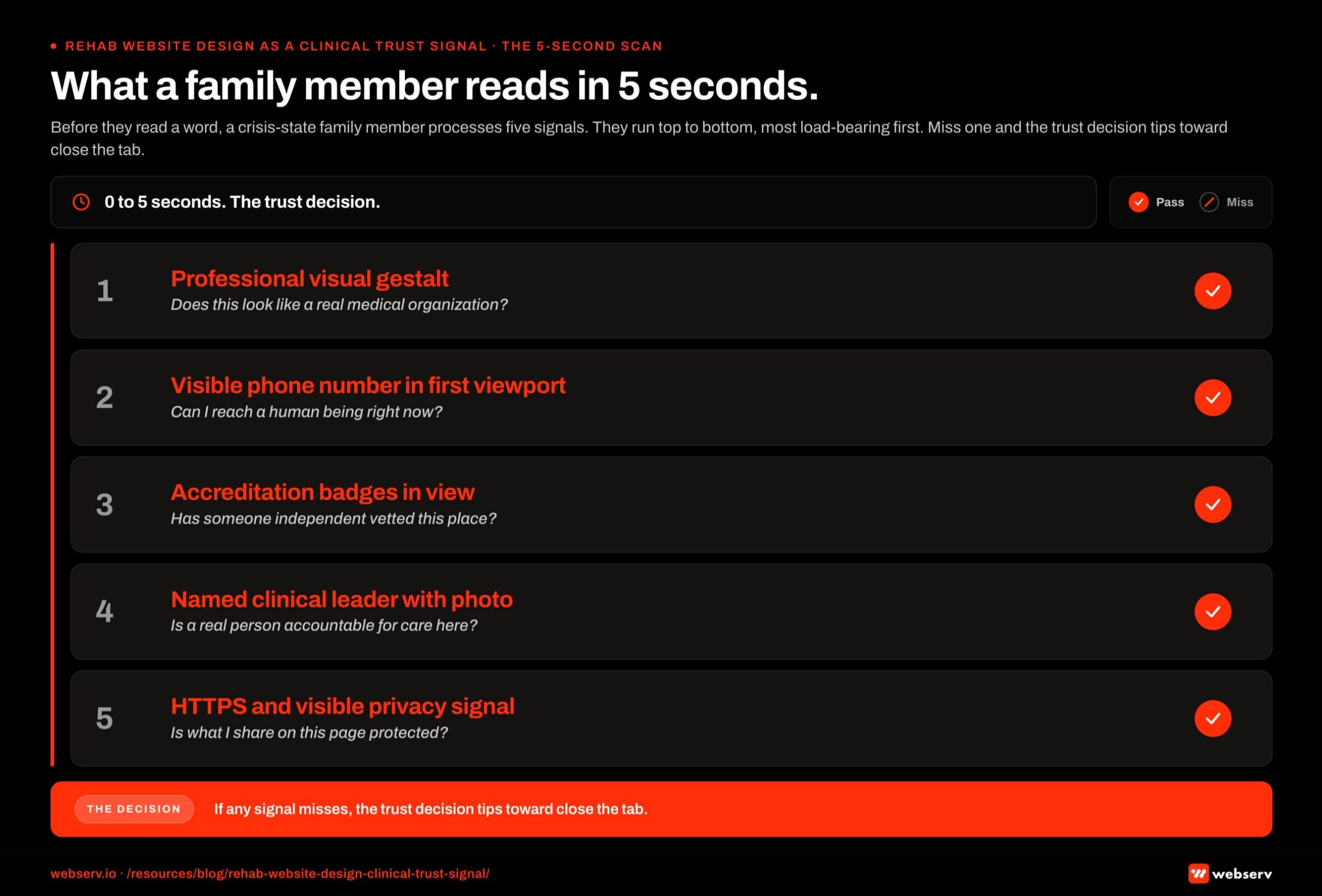 Vertical stacked hierarchy infographic titled ‘What a family member reads in 5 seconds.’
Five-second signals that family members process whether they realize it or not:
Does the site look professional? Stock photos, generic templates, broken layouts, and outdated styling all telegraph “this is not a serious place.” The family member does not consciously think this; they just feel an instinct to close the tab.
Is there a phone number visible? Not buried in the footer. Not behind a “contact us” click. In the first viewport, large, with an immediate call-to-action posture.
Are credentials visible? Accreditation badges (JCAHO, CARF, LegitScript), state licensing references, ASAM alignment statements. The family member does not know what these are, but their presence signals “this place is recognized by authorities.”
Is a clinical leader named and pictured? A real human with real credentials, attached by name and headshot to the front-facing parts of the site. Anonymous treatment centers do not pass the trust test.
Does the site look secure? Browser security icon. HTTPS encryption. Visible privacy notice. Family members handling sensitive information about a loved one are exquisitely sensitive to “this place looks sketchy.”
If any of these five signals is missing or wrong, the trust decision tips toward “close the tab.”
Google’s Search Quality Rater Guidelines apply YMYL evaluation at a higher threshold to healthcare than to almost any other category, and the human family member is applying their own version of the same evaluation in the first five seconds.
The Design Elements That Telegraph Clinical Credibility
Eight specific design elements function as clinical trust signals in 2026. Most rehab websites get three or four of them right and miss the others.
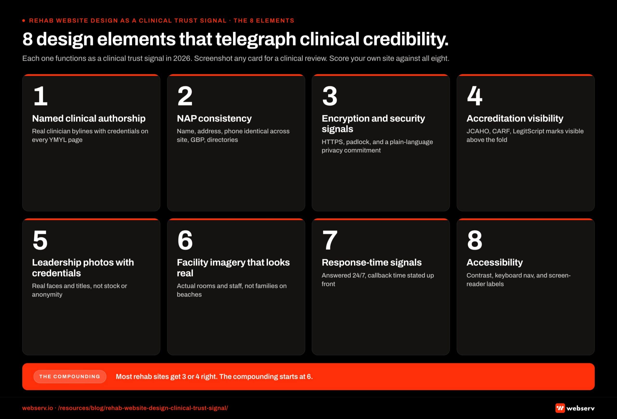 Numeric card grid infographic titled ‘8 design elements that telegraph clinical credibility.’
Named clinical authorship. Every YMYL page on the site should have a named, credentialed author attached. The clinical director or chief medical officer should be the face of the facility’s clinical content, not “the editorial team” or a marketing director.
Per Google’s 2026 YMYL framework, authorship is the single highest-impact compliance signal for healthcare content, which is why clinicians function as the AEO moat for treatment centers.
NAP consistency. Name, address, phone number consistent across the site, Google Business Profile, SAMHSA Treatment Locator, state licensing records, LegitScript listing, and any directory listings.
NAP mismatches signal to Google quality raters and to AI search systems that the entity is not verifiable, and they undermine local SEO performance. Entity SEO work for treatment centers starts here.
Encryption and visible security signals. HTTPS everywhere. Visible privacy notice and HIPAA disclosure. Cookie consent banners that work properly. An unencrypted healthcare site in 2026 signals to Google that patient data is not handled with care, and signals to family members that this facility does not take privacy seriously.
Accreditation visibility. JCAHO, CARF, LegitScript, state licensing, ASAM alignment, SAMHSA listing. The badges and references should appear in the first viewport on every primary page, not buried in the footer or hidden in an about page. The family member needs to see them while the trust decision is still open.
Leadership team photos with credentials. Real photos of real people with their names, titles, and credentials visible. Clinical director, chief medical officer, executive director, founder. Anonymous teams or stock-photo “team members” actively undermine credibility.
Facility imagery that looks real. Photos of the actual facility, not stock interior shots. Real rooms, real common areas, real treatment spaces. The family member is trying to imagine their loved one in this physical place. Stock photos make that imagination harder, not easier.
Response-time signals. “Available 24/7,” “we will call you within 1 hour,” “live chat with admissions counselor” framed as commitments. Family members in crisis are time-pressured. Sites that signal response speed convert them at higher rates than sites that don’t.
Accessibility. WCAG-compliant color contrast, alt text on every image, keyboard navigation, screen reader compatibility. Beyond the legal compliance angle, accessible design signals that the facility cares about all patients and families, including those with disabilities. The signal compounds.
The Four Design Pillars
Every treatment center website that actually drives admits gets four pillars right. Missing any one caps the value of the other three.
Trust signals. Credentials, accreditations, clinical staff bios, reviews, and licensing information positioned to build family confidence in the six-second first impression.
Conversion elements. CTAs, phone number placement, contact forms, chat, and the specific interaction patterns that turn traffic into called admissions.
Content architecture. Site structure, service pages, location pages, resource hub, and internal linking that supports both SEO ranking and family research patterns.
Compliance. LegitScript rules, HIPAA safeguards on contact forms and analytics, and WCAG accessibility standards. Compliance is not a legal afterthought. It is a design constraint from day one.
Every pillar has failure modes we see repeatedly on audits. The rest of this guide walks each pillar operationally with specific design decisions and the reasoning behind them.
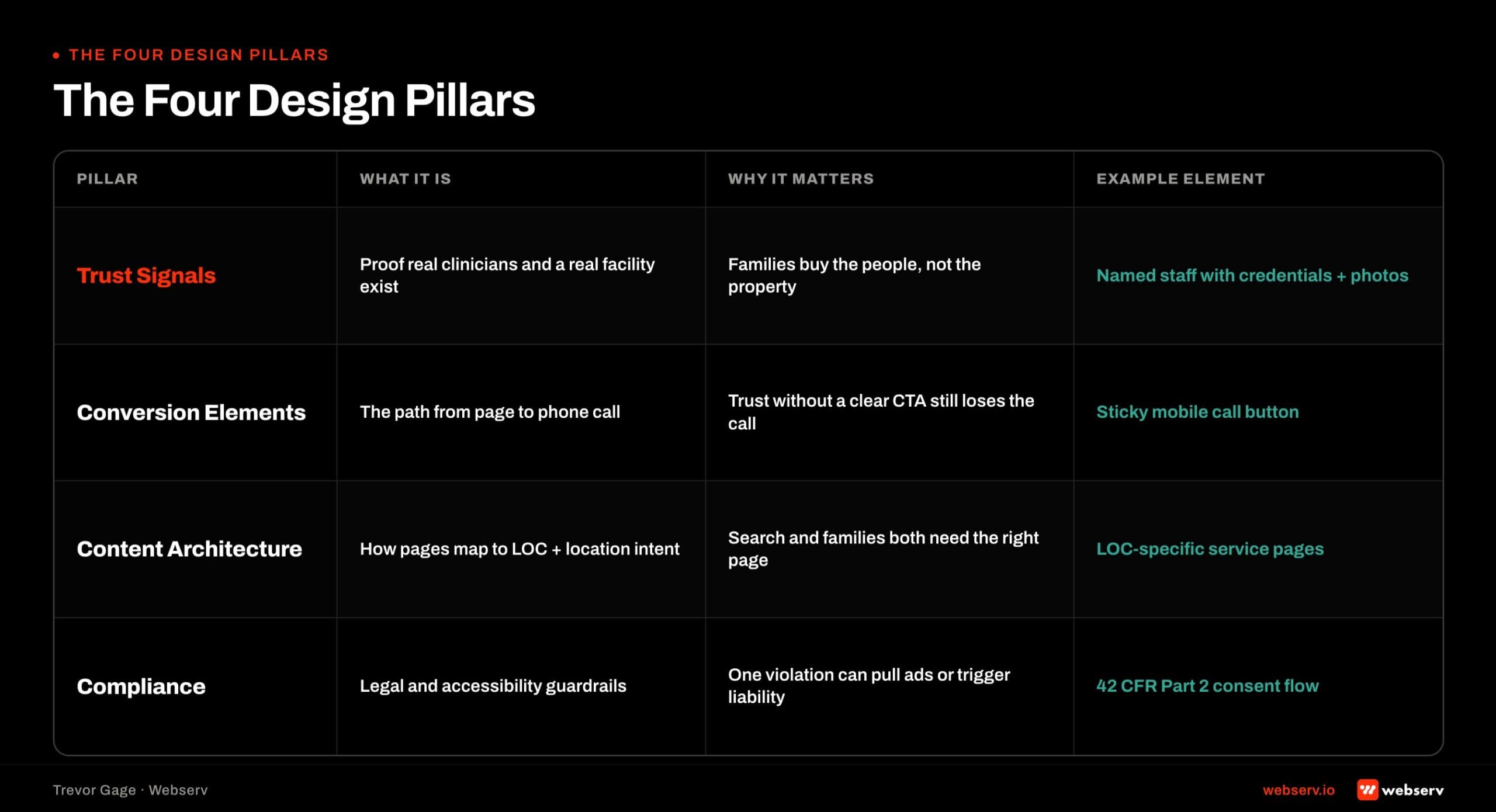 Four-pillar diagram of treatment center website design: Trust Signals, Conversion Elements, Content Architecture, and Compliance.
Pillar 1: Trust Signals
Trust signals are the design elements that answer the family member’s implicit six-second question. Is this facility safe. Are the clinicians real. Are the credentials real.
Accreditations placement. Joint Commission, CARF, LegitScript, and state licensing badges belong in the homepage hero or immediately below the fold, not in the footer. Facilities that hide accreditation badges in the footer treat them as legal disclosures. Family audiences read badges as safety signals.
Position accreditations where a family member scrolling on their phone will see them without having to search. Three to five badges in a horizontal row directly below the primary CTA is a common working pattern.
Clinical staff bios with credentials. The medical director, clinical director, and named clinicians need dedicated bio pages with credentials, education, and years of experience. Photos should be professional, warm, and consistent in style.
Facilities that leave clinical staff off the website or use generic stock photos of “doctors” surrender a substantial trust signal. Family members research the clinicians. Give them something to find.
Reviews and outcomes. Google reviews, patient testimonials (where compliant), and outcome data (where honestly measurable) all belong on the site. LegitScript restricts specific outcome claims and before-and-after imagery, but does not restrict general reviews or aggregated satisfaction data.
Third-party reviews (Google, Yelp) carry more weight than on-site testimonials. Family members trust reviews they can verify externally more than curated on-site quotes. Design should surface both.
Licensing and legal transparency. State licensing numbers, business registration, and insurance-verification transparency should be discoverable without effort. A dedicated “About” or “Credentials” page that consolidates this information into one scannable page beats scattered mentions across the site.
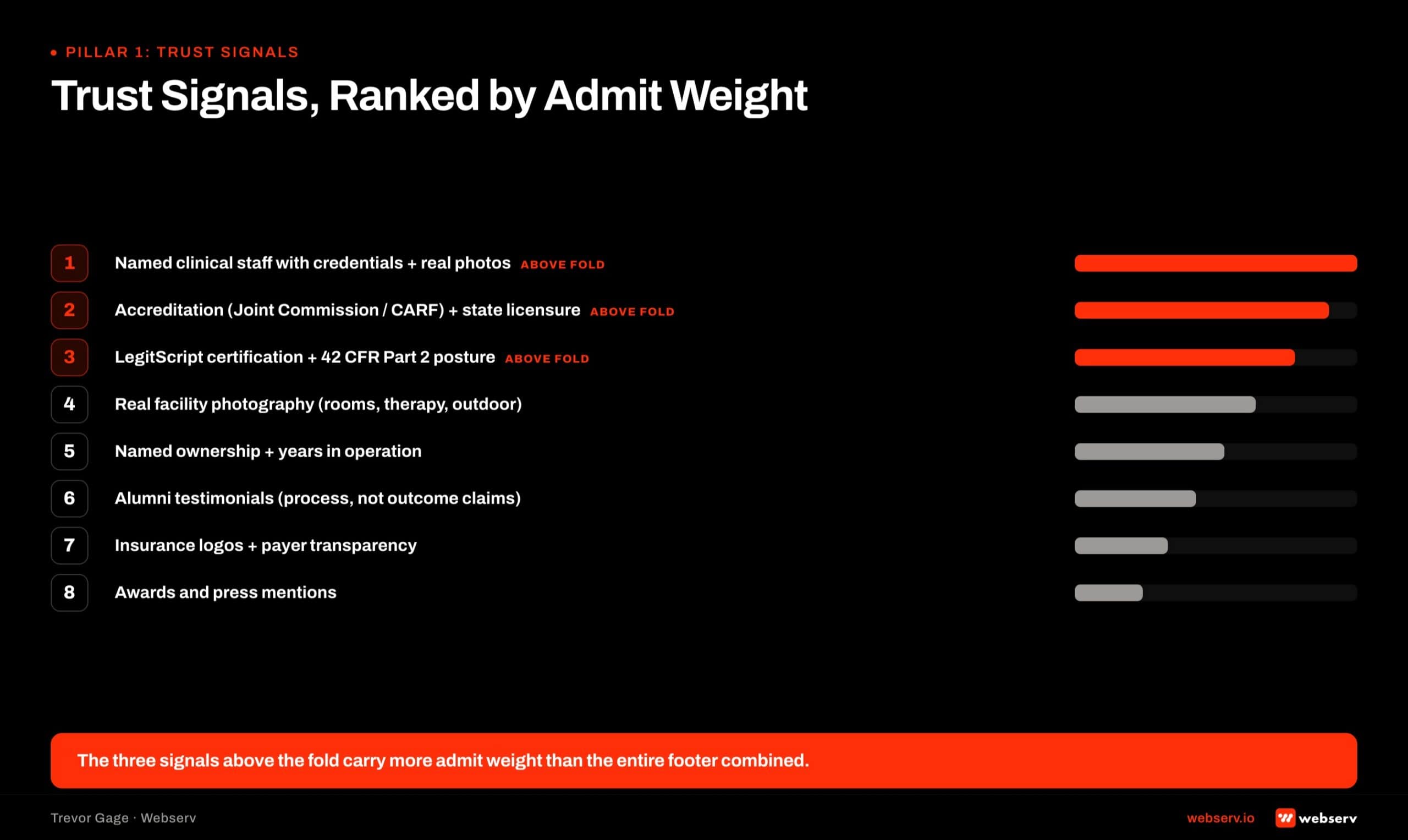 Ranked list of trust signals for treatment center websites by their weight on admits: state licensing, JCAHO/CARF/LegitScript badges, clinician bios with credentials, real facility photography, insurance-verified logos, patient outcomes data.
Pillar 2: Conversion Elements
Conversion elements are the design patterns that turn a scrolling visitor into a called admission. The design brief is not “beautiful.” The design brief is “calls the phone number or fills the form inside 90 seconds.”
Phone number placement. The phone number belongs in the top-right of the header on desktop and directly in the mobile navigation. Tap-to-call formatting on mobile is non-optional. Facilities running paid media should also feature a dedicated tracking phone number (via CallRail or CallTrackingMetrics) for attribution.
The phone number is the primary conversion action for most treatment center websites. Design decisions that hide, minimize, or de-emphasize the phone number are conversion sacrifices whatever aesthetic justification the designer offers.
Above-the-fold CTA. The primary CTA (usually “Verify Your Insurance” or “Speak With Admissions”) belongs above the fold on every landing page and the homepage. The CTA button should contrast the background clearly and use action language. Our treatment center homepage rubric scores CTA placement alongside the other homepage components.
The treatment center homepage conversion patterns cover this in more detail, including the specific hero-section elements that consistently move admissions traffic to phone calls.
Contact forms with HIPAA-compliant handling. Insurance verification forms, contact forms, and any form that captures prospect information have to be built with HIPAA safeguards baked in. Not all form builders sign BAAs. Not all form data flows are compliant by default.
Facilities running contact forms without HIPAA safeguards carry real compliance exposure. HIPAA-compliant contact form patterns in WordPress is the tactical piece for facilities on WordPress specifically.
Chat and live-response elements. Chat widgets can lift conversion but require staffing to deliver on the promise. A chat widget with no one behind it damages trust more than no chat at all. Facilities running chat need real coordinator coverage during the hours the widget is live.
Mobile-first everything. 60 to 80 percent of treatment center traffic arrives on mobile. Every conversion element (CTA, phone, form, chat) has to work on mobile first, desktop second. Design that starts on desktop and gets adapted to mobile usually produces mobile experiences that suppress conversions.
Pillar 3: Content Architecture
Content architecture is the site structure that supports both SEO ranking and family research patterns. Both audiences need distinct information paths. The architecture decision matters.
Service pages. Each level of care (detox, residential, PHP, IOP, OP) needs a dedicated service page. Each specific treatment approach (medication-assisted treatment, dual-diagnosis, trauma-informed care) needs a dedicated page if the facility offers it as a distinct program.
Service pages should target commercial-intent keywords for that level of care and program combination. “Residential drug rehab [city],” “PHP for dual diagnosis [state],” and equivalent long-tail patterns are the search intents to serve.
Location pages. Multi-location facilities need a page per location with local trust signals (specific address, licensing, staff, photography), local SEO markup, and clear routing to the location’s admissions phone number. Single-location facilities benefit from a dedicated “Contact and Directions” page even without multi-location architecture.
Insurance and admissions pages. Family audiences research insurance coverage before they call. A dedicated insurance page with major carrier logos, an insurance verification form, and clear “we work with your insurance” language reduces phone friction. Facilities that hide insurance information behind a phone call lose family research traffic to competitors.
Resource hub. The blog and educational content library serves SEO ranking, E-E-A-T signaling, and family research needs simultaneously. Facilities with a well-maintained resource hub compound organic traffic over time in ways facilities without one do not.
The blog and resource architecture that drives rehab admissions walks the specific structure that supports both ranking and admissions attribution.
Navigation structure. The primary navigation should surface levels of care, insurance, admissions contact, and about-us prominently. Nested menus should be shallow (two levels max on mobile). Every major navigation item should have a purpose in the family research path or the prospect qualification path.
Pillar 4: Compliance
Compliance is not a legal afterthought. It is a design constraint that shapes every visual and interactive element on the site.
LegitScript design constraints. Treatment center websites advertising on Google, Meta, or Bing need LegitScript certification. LegitScript rules restrict specific website features.
Before-and-after imagery of patients. Specific outcome claims (“90 percent success rate”). Endorsements from named celebrities without documented consent. Testimonials that make specific medical claims. Deceptive design that hides the treatment center’s actual services.
Designers who have not worked in behavioral health will build features that will not survive LegitScript audit. The certification review is thorough, and features that get flagged after certification require site changes to maintain the certification. Design against the LegitScript ruleset from day one.
HIPAA safeguards on data collection. Every form that captures prospect information touches PHI when the prospect discusses their treatment need. Contact forms, insurance verification forms, and chat transcripts all need HIPAA-compliant handling.
That means BAA coverage across the tool stack, encryption in transit and at rest, and access controls scoped correctly.
The HHS Office for Civil Rights has issued specific guidance on HIPAA and online tracking, including tracking pixels and analytics tools (HHS OCR, HIPAA and Online Tracking Technologies). Treatment center websites running Meta Pixel, standard Google Analytics, or general tracking scripts without HIPAA-aware configuration carry exposure.
WCAG accessibility standards. Web Content Accessibility Guidelines (WCAG 2.2 as of 2026) set the standard for accessible web design. Behavioral health facilities are subject to ADA Title III accessibility requirements, and treatment center websites regularly face accessibility lawsuits when they miss the standard.
Core WCAG requirements: sufficient color contrast (4.5:1 for normal text), keyboard navigation for every interactive element, alt text on every image, screen reader compatibility, and no content that flashes or auto-plays without user control. These are design constraints, not remediation projects. Build to WCAG from day one.
Privacy policy and legal pages. Every treatment center website needs a privacy policy that references HIPAA and 42 CFR Part 2. Terms of service. Cookie policy. Accessibility statement. These pages are required and should be linkable from the footer.
Photography and Visual Design
Photography is where most treatment center websites reveal they are copies of each other. The category default is stock photography of diverse people in neutral clinical settings. Family audiences pattern-match these images to every other treatment center they have researched. The website loses trust before the family reads a word.
Real facility photography beats stock imagery. Photos of your actual facility, your actual clinical staff, your actual grounds, and your actual amenities differentiate the site from the category. Even imperfect real photography beats polished stock imagery on every conversion measure worth tracking.
Facilities that argue against real photography usually cite privacy concerns. Legitimate concern. The solution is to photograph the facility, the staff, the exterior, and the amenities without photographing patients. Facility photography does not require patient consent because patients are not in the photos.
Lifestyle and clinical imagery. Behavioral health treatment involves both clinical intervention and lifestyle recovery. Website imagery should show both. Clinical settings (therapy rooms, medical offices, staff at work) alongside lifestyle settings (dining areas, recreation, common spaces).
Family imagery with consent. Family reunification imagery is powerful but requires documented consent from every person in the photo. Alumni testimonial imagery requires consent. Facilities that use family or alumni imagery without consent carry legal exposure regardless of intent.
Photography style. Warm, natural lighting. Neutral color palettes. Professional composition without feeling staged. Real people in real settings, not models pretending to be patients.
Iconography and illustration. Custom icon sets and illustration systems reinforce brand consistency and reduce reliance on stock imagery. Icons for insurance carriers, treatment types, levels of care, and amenities all benefit from custom design that matches the brand identity.
Video content. Video walk-throughs of the facility, staff introductions, and (with consent) alumni testimonials build trust in ways still photography cannot. Video production is more expensive but the trust-signal density per minute of family attention is higher.
COMMON MISTAKE
Using stock imagery of couples on beaches, hands reaching upward, or generic group therapy circles. Every rehab website uses variations of the same handful of stock images, and templates converge on the market average. Convergence at the market average is invisibility.
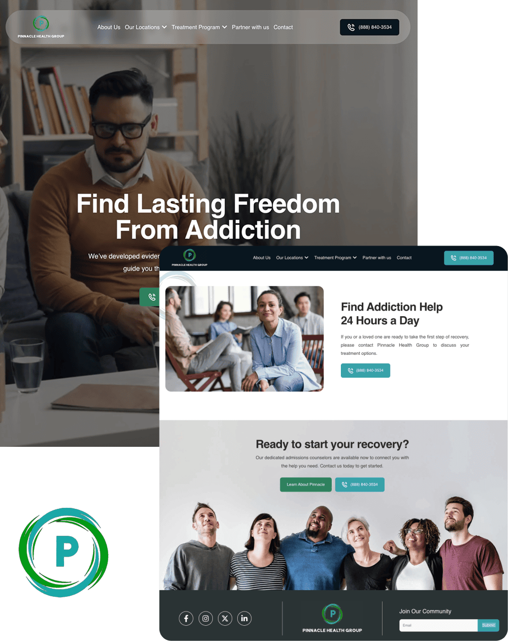
A unified platform built for multiple locations, programs, and audiences without feeling fragmented
- Reorganized multi-service site architecture
- ADA compliant responsive design system
- Future-ready CMS with modular templates
- Optimized for SEO and lead capture
The Design Failures That Destroy Clinical Trust
COSTLIEST MISTAKE
Stock photos of smiling families on beaches, paired with outcome-promise testimonials. The family member in crisis reads the photo as “nobody at this facility looks like this” and the testimonial as marketing copy — the clinical trust signal collapses in the first five seconds. The testimonials also risk 42 CFR Part 2 exposure and trigger Meta and Google ad-review rejections. Swap to real facility photography and de-identified outcome data with named clinical review.
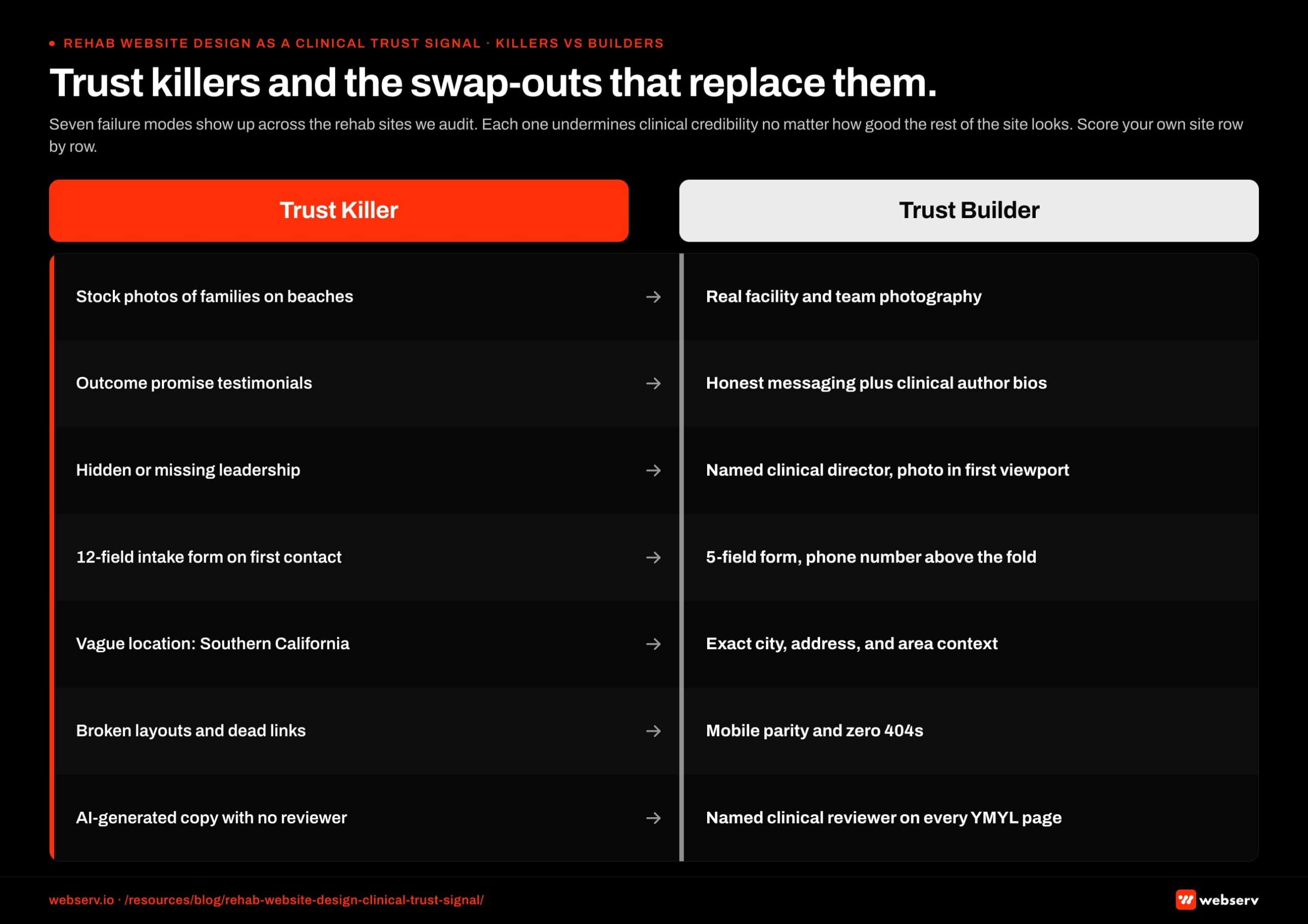 Two-column comparison infographic titled ‘Trust killers and swap-outs that replace them.’
Seven failure modes show up across the rehab websites we audit. Each one actively undermines clinical credibility regardless of how the rest of the site looks.
Failure 1: Stock photos of smiling families on beaches. The single most common rehab website design failure. The family member knows immediately that nobody at this facility looks like this. The implied promise is false. The trust signal collapses.
Failure 2: Outcome-promise testimonials. “I was an addict, now I have a life.” Visible patient testimonials with identifiable faces violate 42 CFR Part 2 confidentiality requirements.
They also trigger Meta and Google ad-review rejections, and signal to clinically-literate family members that this facility is willing to compromise patient privacy for marketing.
Failure 3: Missing or hidden leadership team. No clinical director named. No medical staff visible. No founder. A treatment center without visible leadership is a treatment center the family member assumes is hiding something. The trust signal collapses.
Failure 4: Long forms that suggest the facility does not understand crisis. Twelve-field intake forms on the primary contact page. Required fields for insurance details, demographics, and family history before the conversation has even started.
The family member in crisis bounces. Trimming intake forms from 12 fields to 5 produces 40 percent more inquiries, but the failure mode is not just conversion: the form length signals the facility does not understand the crisis context.
Failure 5: Vague or generic location information. “Located in beautiful Southern California.” “Serving the New England area.” Family members need to know exactly where the facility is, what city, what amenities the surrounding area provides, what the actual address is. Vague location signals that the facility is hiding something.
Failure 6: Outdated or broken design elements. Pages that render differently on mobile vs. desktop. Images that fail to load. Forms that submit nothing. Links to pages that don’t exist. Each broken element compounds the “this place is not serious” trust collapse.
Failure 7: AI-generated content with no clinical reviewer credit. Healthcare YMYL content in 2026 requires named clinical authorship and reviewer credit.
AI-generated medical copy with no human credentialed author is disqualifying per Google’s quality rater guidelines, and is increasingly recognizable to sophisticated family members who have been on enough treatment center websites to spot the pattern.
The treatment center website is the only marketing asset the operator owns that is also a clinical credibility statement. Every design decision either reinforces the clinical credibility or undermines it. The operators who hold the dual frame in their head while building the site produce websites that compound trust over years. The operators who treat design as a marketing exercise alone produce websites that convert in the short term and erode in the long term.
Preston Powell, CEO of Webserv
When to Redesign vs Refresh
Full redesign is a 8-16 week project. Refresh is a 4-6 week project. The decision has real cost implications.
Refresh wins when. The site’s information architecture is fundamentally sound but the visual design feels dated. The content is largely correct but needs updating. The conversion elements exist but need optimization. The brand identity is intact.
Full redesign wins when. The site’s information architecture does not support the current business (multi-location added, new levels of care, major service line change). The visual design does not communicate the current brand. The technology stack is not maintainable. Compliance work would require rebuilding most templates anyway.
The treatment center website redesign decision framework walks the full decision surface. The pattern most facilities miss: the sites that most need a redesign are the sites that most benefit from a refresh, because the underlying architecture is often sound and the perceived problem is visual.
Facilities that pursue full redesigns should also read why rebuilding your treatment center website can hurt your rankings to understand the SEO risk profile before committing.
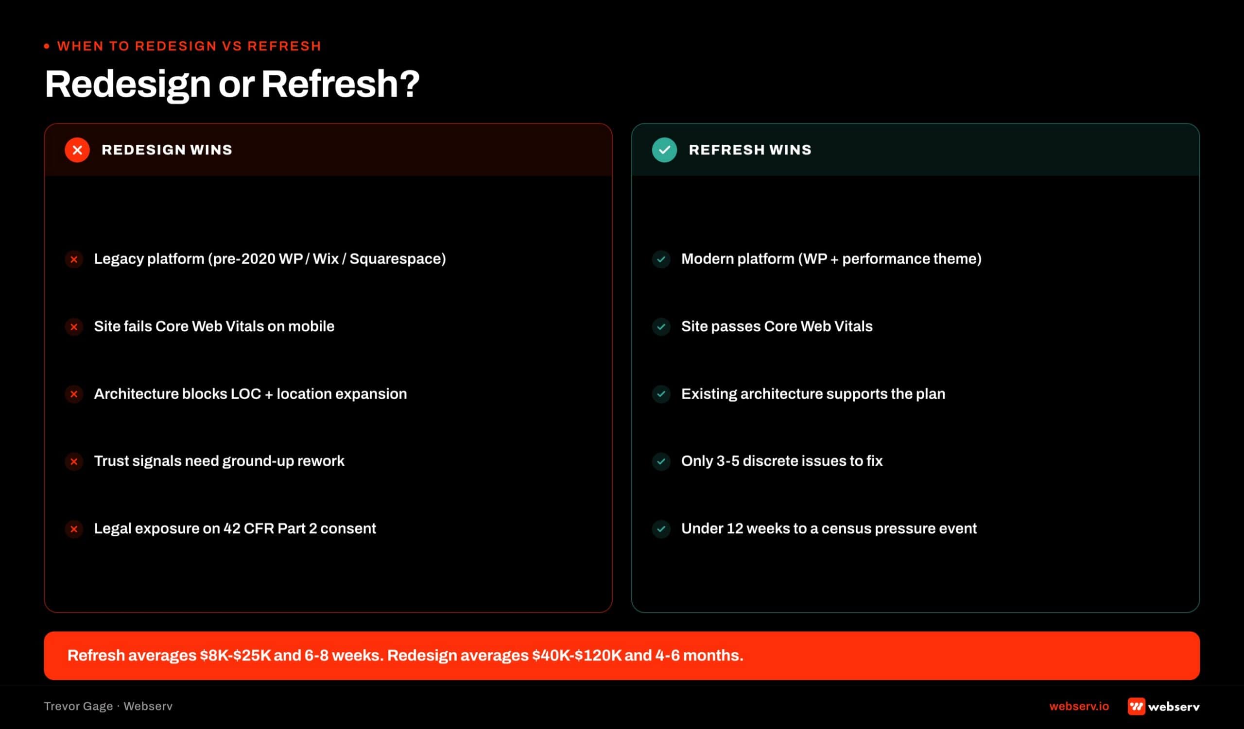 Decision framework for treatment center website teams: when to do a full redesign versus a targeted refresh.
Mistake 1: Stock Hero Imagery That Erases Your Differentiator
The homepage hero is the first six seconds. Stock imagery in the hero signals “generic treatment center” before the family reads a word. Family audiences pattern-match your hero photo to every other rehab website they have researched that day. The treatment center homepage scorecard covers what belongs in the hero instead.
What the mistake looks like. Diverse actors smiling in a soft-lit clinical space. Silhouettes on a beach at sunset. A cupped-hands photo with a plant growing between them. All of these images live in the same three stock photography libraries every other treatment center uses.
Why it costs admits. Trust starts with differentiation. If your homepage looks like every other homepage in the family’s research tab set, you have already lost the trust signal race before your copy loads.
The fix. Real facility photography. Your actual buildings. Your actual grounds. Your actual clinical staff at work. Even imperfect real photography beats polished stock imagery on every conversion measure worth tracking. Facility photography does not require patient consent because patients are not in the photos.
Cost band: $3,000 to $8,000 for a professional photo shoot at a single-location facility. Multi-location portfolios budget higher.
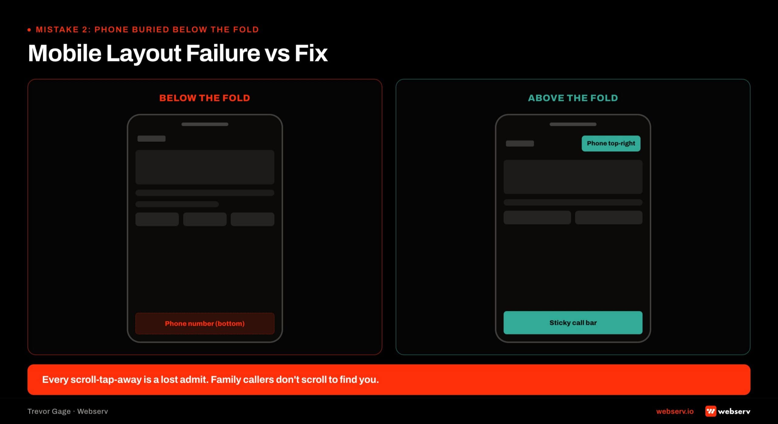
Mistake 2: Phone Number Buried Below the Fold on Mobile
Sixty to eighty percent of treatment center traffic arrives on mobile. The phone number is the primary conversion action for treatment center websites. Design decisions that hide, minimize, or de-emphasize the phone number on mobile sacrifice conversion for aesthetics.
What the mistake looks like. The phone number in the site footer with no header placement. The number in the header but too small to read on mobile without zooming. No tap-to-call formatting. The number visible on desktop but hidden behind a hamburger menu on mobile.
Why it costs admits. Every extra tap between a family member deciding to call and the number being callable costs conversion. The fastest treatment center websites have a tap-to-call number in the mobile header, one action from any page.
The fix. Sticky mobile header with a prominent tap-to-call phone number. Number visible on every page without a menu open. Larger font size than most designers instinctively pick. Contrast against the header background so the number reads clearly in bright daylight on a phone.
Cost band: 1 to 2 weeks of design and development work. This is the highest-ROI fix on the list.
Mistake 3: Missing Named Clinical Staff Bios
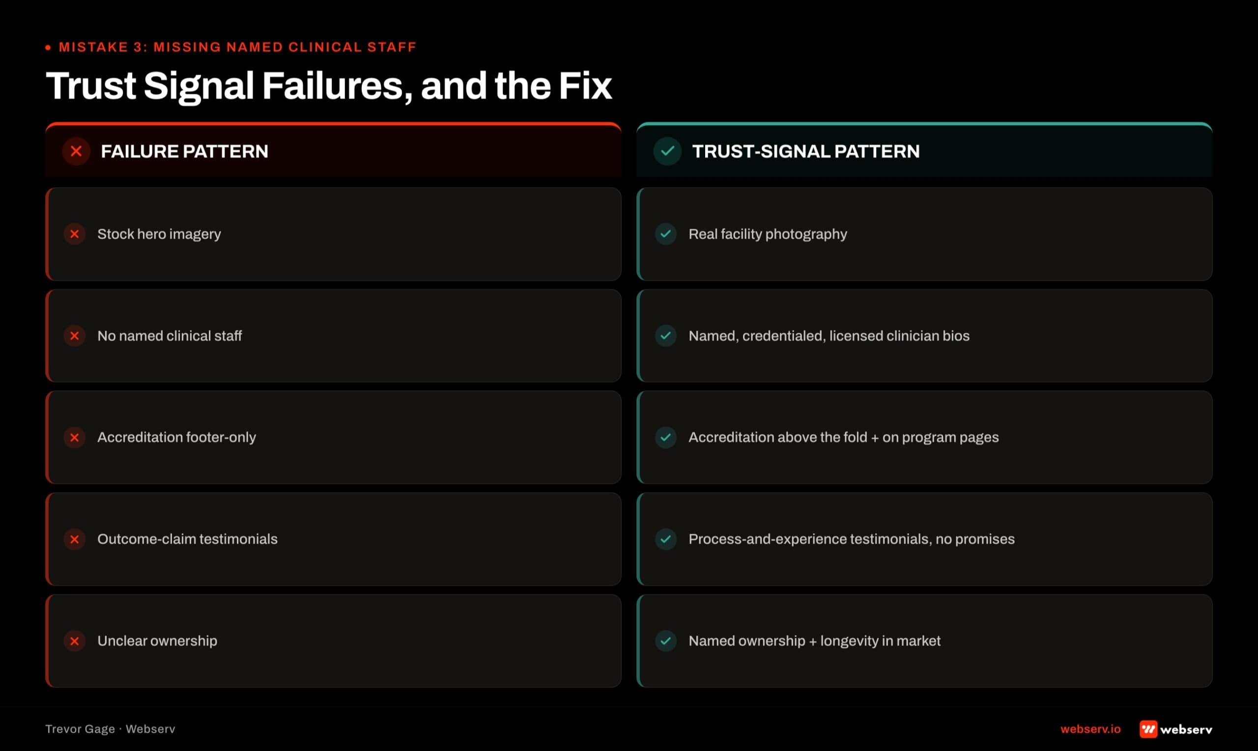
Family audiences research the clinicians before they call. Facilities that leave clinical staff off the website or hide bios behind generic “our team” language surrender a substantial trust signal.
What the mistake looks like. No medical director bio. No named clinical director. Stock photos of “doctors” instead of real staff photos. Bios that list credentials but never show the person’s face. A “team” page that lists first names only.
Why it costs admits. Named clinicians with credentials and photos build clinical trust in a way anonymous “our team” language cannot. AI-generated search results, Google’s Expert Advice block, and family research patterns all favor named-clinician content.
The fix. Dedicated bio pages for the medical director, clinical director, and named clinicians. Professional headshots in consistent style. Credentials, education, years of experience, and clinical specialties. Photo, name, credentials, and one paragraph on treatment philosophy is the minimum.
Cost band: 2 to 4 weeks. Requires clinical staff cooperation for photos and bio drafts. Legal review of credentials before publishing.
Mistake 4: Accreditation Badges Hidden in the Footer
Joint Commission, CARF, LegitScript, and state licensing badges are trust signals that answer the family member’s implicit safety question. Facilities that hide badges in the footer treat them as legal disclosures. Family audiences read badges as safety signals and expect them where their attention already is.
What the mistake looks like. Six accreditation badges in a small horizontal row at the bottom of the footer. Badges visible only on the “About” page. Text-only credential mentions with no visual badge treatment.
Why it costs admits. The homepage hero is the first six seconds. If accreditation is not visible during those six seconds, the family member has to actively hunt for the trust signal. Most family members do not hunt. They back-button.
The fix. Three to five accreditation badges positioned in the homepage hero or immediately below the fold. Horizontal row with consistent sizing. Linked to the specific accreditation verification page for each. Visible on every service page and location page, not just the homepage.
Cost band: 1 week of design and development work. Assumes badges are already licensed and downloadable from each accreditor.
COMMON MISTAKE
Publishing testimonials like “This program saved my life” or “I’ve been sober 3 years thanks to their treatment.” Both are outcome claims under LegitScript and federal marketing rules for treatment centers. LegitScript-safe testimonial framing focuses on experience (“the staff felt genuinely invested,” “the intake process was clear”) rather than outcomes. Get this wrong and you risk LegitScript decertification, which kills paid search eligibility.
Mistake 5: Testimonials That Make Outcome Claims
LegitScript restricts specific outcome claims in testimonials on treatment center websites. Testimonials that promise specific results (“I got clean and never looked back,” “90 percent success rate”) are LegitScript exposure that can affect certification status.
What the mistake looks like. Testimonials with percentage claims. Before-and-after imagery of former patients. Endorsements from named celebrities without documented consent. Testimonials that name a specific outcome (“my depression went away”) rather than an experience quality.
Why it costs admits. Two failure modes. First, LegitScript audit can flag the content and threaten certification, which threatens paid media eligibility on Google, Meta, and Bing. Second, family audiences are increasingly savvy and read outcome-claim testimonials as advertising rather than trust signals.
The fix. Testimonials focused on experience quality. Staff interactions. Facility environment. Family member perspectives on the admissions process. All testimonials documented with signed consent. Alumni photography requires model releases. Third-party reviews (Google, Yelp) carry more trust weight than curated on-site quotes and should be surfaced prominently.
Cost band: 2 to 3 weeks to audit existing testimonials, obtain new consented testimonials, and rewrite content. Legal review before publishing.
Mistake 6: Slow Mobile Page Speed That Fails Core Web Vitals
Family research often happens on mobile with variable connections. Every second of page load time costs conversion. Core Web Vitals matter for admits, not just SEO rankings.
What the mistake looks like. Homepage that takes 4+ seconds to become interactive on mobile 4G. LCP (Largest Contentful Paint) above 2.5 seconds. CLS (Cumulative Layout Shift) that causes content to jump as the page loads. Uncompressed hero images. Third-party scripts that block rendering.
Why it costs admits. Google publishes research showing conversion rates drop measurably for every additional second of load time on mobile. Family members researching treatment options at midnight on their phone will back-button rather than wait.
The fix. Image optimization (compress and convert to WebP where supported). Hero image lazy-loading below the fold. Defer non-critical JavaScript. Audit third-party scripts and remove any that do not directly drive conversion. Follow Google’s Core Web Vitals thresholds (web.dev, Core Web Vitals) as the target.
Cost band: 2 to 4 weeks depending on how many third-party scripts and image assets need remediation. The Core Web Vitals benchmarks for treatment centers is the tactical piece for facilities auditing their current performance.
Mistake 7: Accessibility Gaps That Draw ADA Lawsuits
Behavioral health facilities are subject to ADA Title III accessibility requirements. Treatment center websites regularly face accessibility lawsuits when they miss WCAG 2.2 standards.
What the mistake looks like. Text contrast below the 4.5:1 threshold for normal-size text. Images without alt text. Interactive elements that cannot be operated with keyboard-only navigation. Auto-playing video with no user control. Screen reader failures on the primary navigation.
Why it costs admits. Two failure modes. First, the legal exposure is real. ADA Title III lawsuits against healthcare websites are increasing and settlement costs run $10,000 to $50,000 or more per incident.
Second, accessibility failures affect the actual users who need the accessibility features, including family members researching treatment for elderly parents.
The fix. WCAG 2.2 audit against the current site. Contrast fixes on any text that fails the 4.5:1 ratio. Alt text on every image. Keyboard navigation for every interactive element. Screen reader testing on the primary conversion paths (homepage to phone, homepage to insurance form).
Cost band: 4 to 8 weeks for a real WCAG remediation. Faster if the site was built to WCAG standards initially. Slower if the site has years of accumulated accessibility debt. The Web Content Accessibility Guidelines (W3C, WCAG 2.2) is the standard reference.
OPERATOR INSIGHT
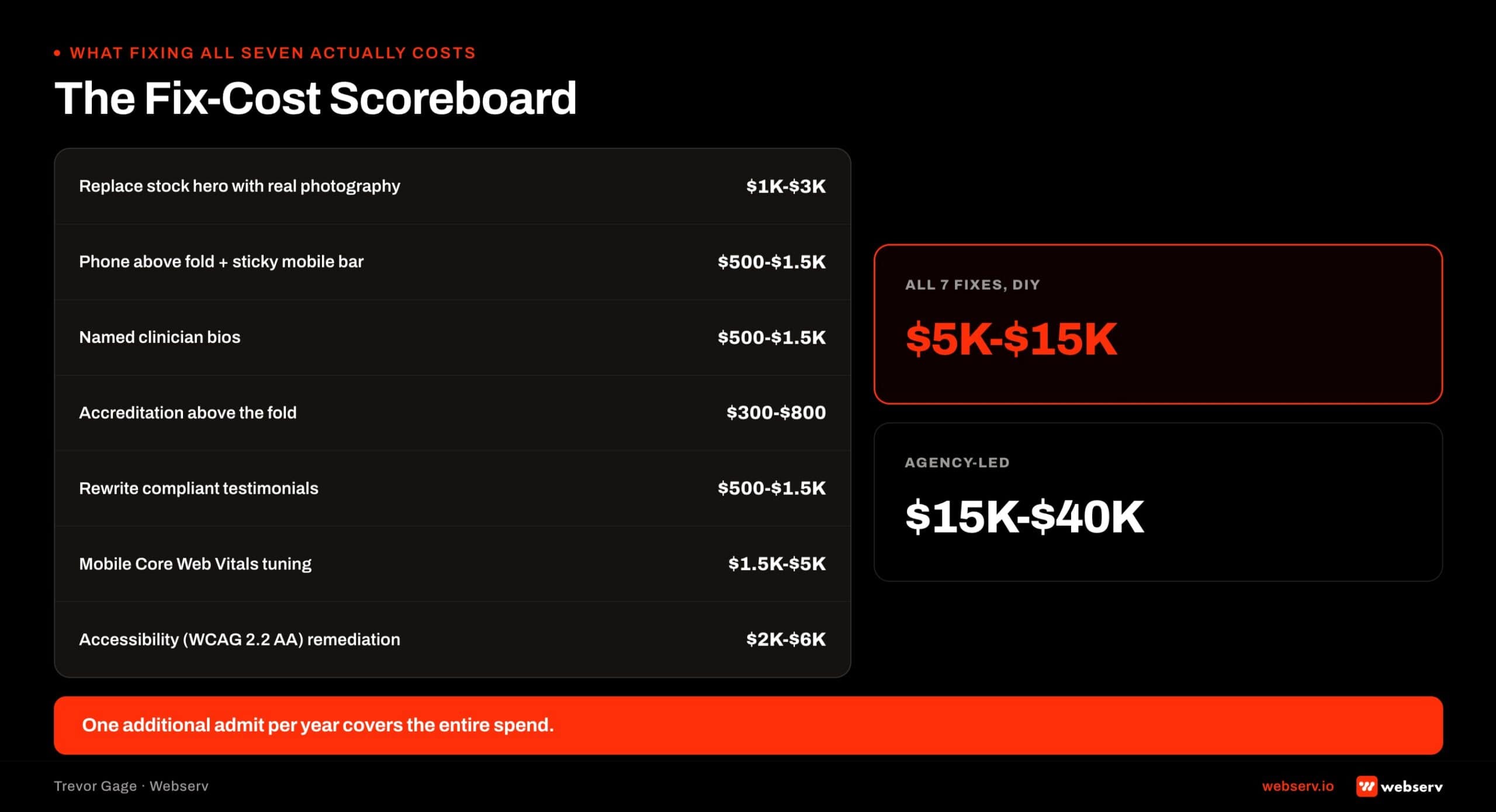
Fixing all seven mistakes on an existing site typically runs $8,000 to $18,000 for a mid-sized facility, split across design, development, photography, and compliance review. Full redesigns run 3-5x that. If the site is generating admits, prioritize fixes over rebuilds; if the site is not, the rebuild economics start looking more defensible.
What Fixing All Seven Actually Costs
A facility that fixes all seven mistakes without a full site rebuild usually runs a 4-8 week engagement at $15,000 to $40,000 depending on the extent of each fix.
The fixes distribute unevenly. Photography and staff bios cost more than accreditation badge placement and phone number optimization. Accessibility remediation often runs the highest of any single fix because the audit surfaces more issues than facilities anticipate.
Facilities that need all seven fixes AND a full brand refresh usually cross the threshold into a redesign scope. That decision walks in the treatment center website redesign framework. Reconfiguration inside the current design system almost always beats a full redesign when only the seven fixes are needed.
The seven fixes also protect the redesign investment if a full rebuild does happen later. Every fix (real photography, named staff bios, accreditation placement, LegitScript-safe testimonials, page speed, accessibility) survives a redesign because they are content and compliance decisions, not visual design decisions.
The perspective in this article comes from 9 years working exclusively inside behavioral health.
We are a team built by people in recovery who understand that behind every admission is someone asking for help. If that resonates, get to know us.
This works alongside behavioral health marketing guide and landing page design guide as part of a complete landing page strategy. It’s also worth pairing with clinical trust signals in website design.
Who Owns the Design Brief
Most rehab website redesigns produce thrash because the design brief has a single author.
When marketing owns the brief alone, the site over-indexes on conversion mechanics and misses clinical credibility. When clinical owns the brief alone, the site looks like a peer-reviewed journal article and misses the family-decision psychology.
The right answer is co-authorship. The design brief should have two named owners: the marketing director (for conversion mechanics, paid traffic support, and brand voice) and the clinical director or chief medical officer (for clinical credibility, named authorship strategy, and the YMYL trust signal layer).
The co-authorship model has a specific workflow. Marketing drafts the brief from the conversion side. Clinical reviews and adds the trust-signal layer. The two leads jointly approve the final brief before it goes to the design and development team. Mid-project changes also require joint approval.
Operators who try to skip the clinical involvement to save time produce sites that need to be partially rebuilt within 18 months once the clinical credibility issues become visible. Operators who include clinical leadership from the start produce sites that compound credibility and conversion together.
For multi-facility operators, the clinical signoff should come from the clinical leader who actually appears on the site. If the chief medical officer is the named author and trust-signal anchor, the CMO should be in the design review meetings, not delegating to a junior clinical team member.
This works alongside landing page design guide and website design strategy for treatment centers as part of a complete landing page strategy. It’s also worth pairing with homepage design that converts callers.
The Homepage
The Homepage’s Actual Job: Routing, Not Converting in Place
The first conceptual move that separates well-converting treatment center homepages from beautiful-but-broken ones is understanding what the homepage is actually supposed to do.
Paid landing pages are designed to convert in place. The audience arrives with high commercial intent from a paid ad, and the page exists to drive a phone call or VOB submission inside the same session. The architecture is single-purpose.
The homepage is different. The traffic mix is broader, the intent is more varied, and the visitor population includes patients, family members, referral sources, alumni, professional inquiries, staff candidates, and one-off visitors arriving from social or branded search.
The homepage cannot be optimized for a single conversion path because the audience is not single-purpose.
The right read on the homepage is as a routing surface. The visitor arrives. The homepage’s job is to recognize the visitor’s likely intent in the first 5 to 10 seconds and route them to the page that matches that intent.
Family members get routed to family-resource content or directly to the phone.
Patients get routed to level-of-care or modality pages or the phone. Referral sources get routed to clinical leadership bios and outcome content. Each route is a separate conversion path, but the homepage is the routing layer above all of them.
Most homepages we audit are trying to do too much. They try to be the conversion page, the credentials page, the brand statement, the alumni story, the insurance verification page, and the clinical leadership page all in one.
The result is a page that does none of those things well. The fix is a homepage that does one thing (route the visitor to their next step) and does it fast.
The homepage is not the conversion page. It is the routing page that sends the visitor to the conversion page. Treatment centers that try to make the homepage do everything end up with a page that does nothing well, and the call volume reflects it.
Preston Powell, CEO of Webserv
The 5-Second Above-the-Fold Decision
Nielsen Norman Group research on first impressions has consistently shown that web users form a credibility judgment in the first few seconds of arrival. For behavioral health, the timeline is even shorter.
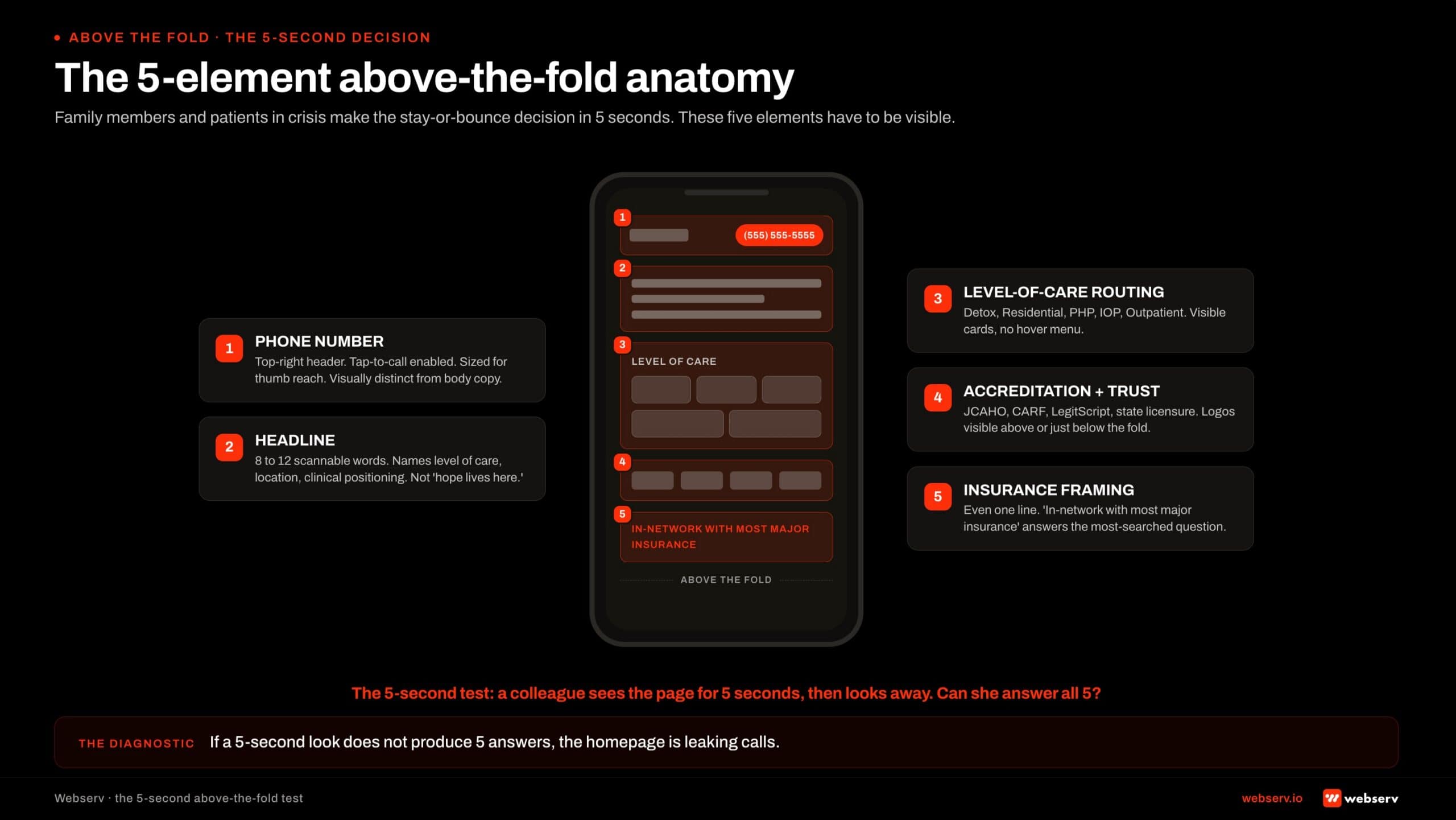 Annotated mobile wireframe mockup infographic titled ‘The 5-element above-the-fold anatomy.’
The family member at 11 PM searching for residential treatment for her son does not give the homepage 30 seconds to make its case. She gives it 5.
Five elements need to be visible above the fold on mobile.
Phone number, prominent, tap-to-call. Large enough to be hit by a thumb. Visually distinct from body copy. In the top right of the header on desktop and persistent at the top on mobile. The number should not require a scroll, a menu tap, or any thinking to find.
Headline that names what the facility actually does. Not “your journey starts here.” Not “hope lives here.” A specific, scannable headline that tells the visitor in 8 to 12 words that this is a behavioral health facility, what level of care it provides, and where it is located.
Levels of care visible as quick-routing options. Detox, residential, PHP, IOP, outpatient. The visitor should be able to tap the level of care she is researching and route directly to it. Hiding the level-of-care navigation behind a hover menu or a single “Programs” dropdown loses visitors.
Accreditation and trust signal. JCAHO, CARF, LegitScript, state licensure logos visible above the fold or just below. The accreditation strip is the trust shortcut family members use to decide whether the facility is legitimate within the first 5 seconds.
Insurance framing. Even a single line (“In-network with most major insurance” or “We accept most major insurance: verify in 5 minutes”) signals the answer to the most-searched question in behavioral health traffic. The line does not need to be detailed; it needs to be present.
The 5-second test for any treatment center homepage: a colleague who has never seen the site looks at the above-the-fold experience for 5 seconds, then looks away.
Can they tell what the facility does, where it is, what levels of care it provides, whether it is accredited, and how to call?
If the answer is no on any of those five points, the homepage is failing the 5-second test for the audience that matters.
Phone Number Architecture
If the homepage is a routing surface, the phone number is the single most important routing element on the page. Most treatment centers under-invest in phone number prominence by a factor of 3 or 4 against what conversion math suggests they should.
Three rules separate phone-converting homepages from phone-losing homepages.
Visible without a scroll on mobile. The phone number needs to be in the persistent header or above the fold on mobile, sized large enough to read at arm’s length, colored to be visually distinct from body copy.
Phone numbers buried in the menu, in the footer, or behind a “contact us” link lose 40 to 70 percent of potential callers.
Tap-to-call enabled. The HTML tel: link is one of the smallest technical details and one of the highest-impact. A phone number that requires the visitor to memorize or copy-paste 10 digits loses calls. A tap-to-call link converts the visitor with one thumb tap.
Consistent across the site, including the header. The same phone number in the same place on every page reinforces the routing path. Visitors who navigate to a service page expect the phone number to be in the same position they saw on the homepage.
Inconsistent placement increases cognitive load and reduces calls.
The phone number is not the only CTA on the homepage. VOB forms, insurance verification flows, contact forms, and chat widgets all have places in the architecture. But the phone is the highest-converting CTA in behavioral health, and the homepage should make it impossible to miss.
Levels-of-Care Quick Routing
The second-highest-value routing element on the homepage is the level-of-care navigation. Visitors arriving on the homepage from organic search, direct traffic, or referral all need to be able to find the program that matches their need within 10 seconds.
The pattern that works is a level-of-care strip visible above or just below the fold. Detox, residential, PHP, IOP, outpatient, sober living, and aftercare each get a quick-tap card with a one-line description and a route to the dedicated level-of-care page.
The pattern that does not work is a single “Programs” dropdown menu that hides the level-of-care options behind a hover or a tap.
Mobile users in particular struggle with dropdown menus, and the family member researching at 11 PM on a phone with one hand free does not patiently explore the navigation structure.
The level-of-care strip also helps the SEO frame. Each level-of-care card links to its dedicated page, which reinforces the internal-linking architecture that builds topical authority across the cluster.
The topical authority framework for treatment centers covers the broader read; the homepage’s level-of-care strip is the load-bearing entry point. The entity SEO frame for AI search covers the AI-side compounding that the same level-of-care architecture produces.
Insurance Signal Above the Fold
Insurance questions are the single highest-intent search behavior in behavioral health paid and organic traffic. Family members and patients searching “rehab covered by [insurance carrier]” or “does my insurance cover treatment” are 7 to 10 days from an inquiry call.
The homepage that addresses insurance above the fold captures this traffic; the homepage that buries insurance information in the footer does not.
The insurance signal does not need to be complex. A single line (“In-network with most major insurance”) and a “Verify Your Insurance” CTA that routes to the VOB form or the insurance page is enough.
The visitor does not need a 40-carrier list above the fold; she needs to know that the facility takes insurance and that she can verify her specific coverage easily.
Three constraints shape the insurance copy. Compliance: no specific outcome promises about coverage (LegitScript and Google healthcare policy forbid that). Honesty: no claims about “free treatment” or “treatment covered at no cost” that the facility cannot substantiate.
Transparency: in-network vs out-of-network status should be clear without requiring the visitor to call to find out.
The right pattern is to acknowledge insurance is a question, route the visitor to a VOB flow or insurance landing page, and let the insurance verification process produce the specific answer the visitor needs. The homepage’s job is the routing acknowledgment; the verification page’s job is the answer.
The “Are You In Crisis Now” Path
Every treatment center homepage should have a clear, immediate path for visitors who are in active crisis. The path is short: a visible crisis hotline reference, a clear “if you are in immediate crisis, call 988” line, and the facility’s own crisis-routing if applicable.
The compliance and ethical frame is real. Visitors arriving at a treatment center homepage in active crisis are a vulnerable population.
The homepage’s responsibility is to acknowledge the crisis state and route the visitor to immediate help.
That help is the facility’s own admissions line for medical and clinical needs, the 988 Suicide and Crisis Lifeline for psychiatric emergencies, and SAMHSA’s National Helpline for substance use crisis routing.
The visual treatment of the crisis path should be clear without being alarming.
A red or distinct-colored banner at the top of the page, a visible link in the navigation, and a section on the homepage that addresses the question “what to do if you are in immediate crisis” all work.
The pattern should be present on every page, not just the homepage.
The crisis-now path is not a conversion strategy. It is the ethical baseline that behavioral health facilities operate under. The conversion math is incidental to the ethical responsibility, but it is worth noting that facilities with clear crisis routing also produce more inquiry calls.
Visitors trust facilities that prioritize patient safety, and the trust signal compounds across the rest of the conversion architecture.
Design the homepage for the bounce decision, not the design awards. The mother at 11 PM is the load-bearing audience, and she does not care about the cinematic hero video.
She cares whether she can find the phone number, see that the facility is accredited, and route to the level of care her son needs. Every design decision should be evaluated against her 5 seconds.
Preston Powell, CEO of Webserv
The Homepage Audit Sequence
Six steps, in order, run end-to-end in an afternoon. The output is a ranked list of which 3 to 5 fixes will produce the largest conversion lift on the homepage.
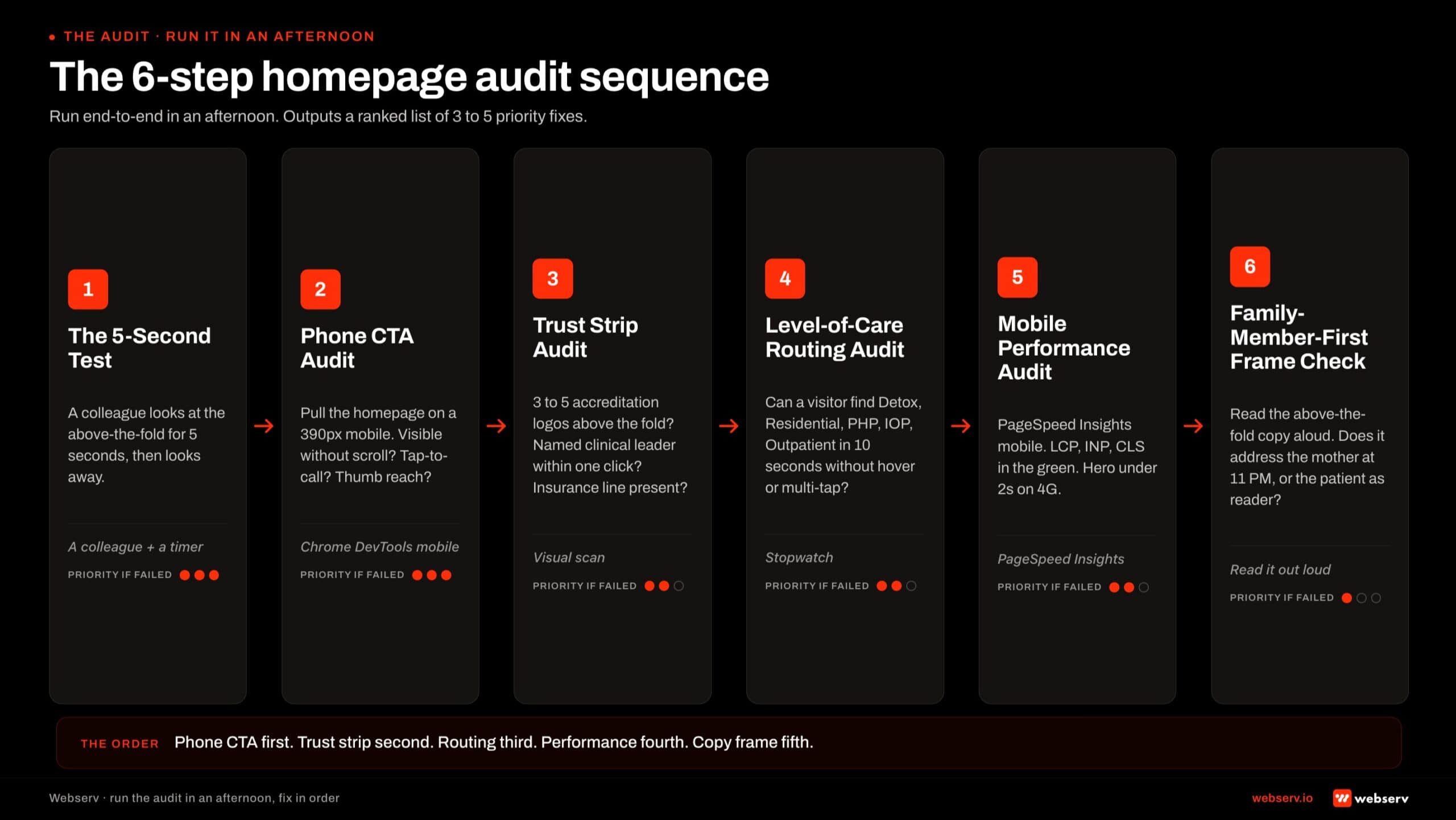 Horizontal six-step audit sequence infographic titled ‘The 6-step homepage audit sequence.’
Step 1: The 5-second test. Have a colleague who has never seen the site look at the above-the-fold mobile experience for 5 seconds, then look away.
Ask them what the facility does, where it is, what levels of care it provides, whether it is accredited, and how to call. Any gap in the answers is a load-bearing fix.
Step 2: Phone CTA audit. Pull the homepage on a 390-pixel mobile viewport. Is the phone number visible without a scroll? Is it tap-to-call enabled? Is it sized for thumb reach? Is it consistent across every interior page? Gaps here are the highest-priority fix because phone is the highest-converting CTA.
Step 3: Trust strip audit. Above-the-fold scan: are 3 to 5 accreditation logos visible? Is at least one named clinical leader with credentials visible or one click away? Is the insurance line present? Each missing element is a credibility judgment the homepage is leaving on the table.
Step 4: Level-of-care routing audit. Can the visitor find detox, residential, PHP, IOP, and outpatient in 10 seconds without opening a hover menu or multi-tap dropdown? The level-of-care strip should be visible or one tap away from the above-the-fold experience.
Step 5: Mobile performance audit. Run PageSpeed Insights on the homepage. Are LCP, INP, and CLS in the green for mobile? Is the hero loading in under 2 seconds on a 4G connection?
Failing Core Web Vitals on the homepage costs conversion across every visitor segment, and the fix is engineering rather than design.
Step 6: Family-member-first frame check. Read the above-the-fold copy out loud. Does it address the mother researching at 11 PM, or does it address the patient as the reader? Does the CTA language acknowledge that the family member is calling about someone else?
The vocabulary audit is the smallest fix on this list and one of the highest-impact for treatment center homepages designed by agencies that did not run the family-first frame.
The 6-step sequence typically surfaces 3 to 5 priority fixes per audit. The right next step is to address them in order of conversion impact (phone CTA first, then trust strip, then level-of-care routing, then performance, then copy frame) rather than trying to fix everything at once.
This works alongside website design strategy for treatment centers as part of a complete landing page strategy.
The Homepage Rubric
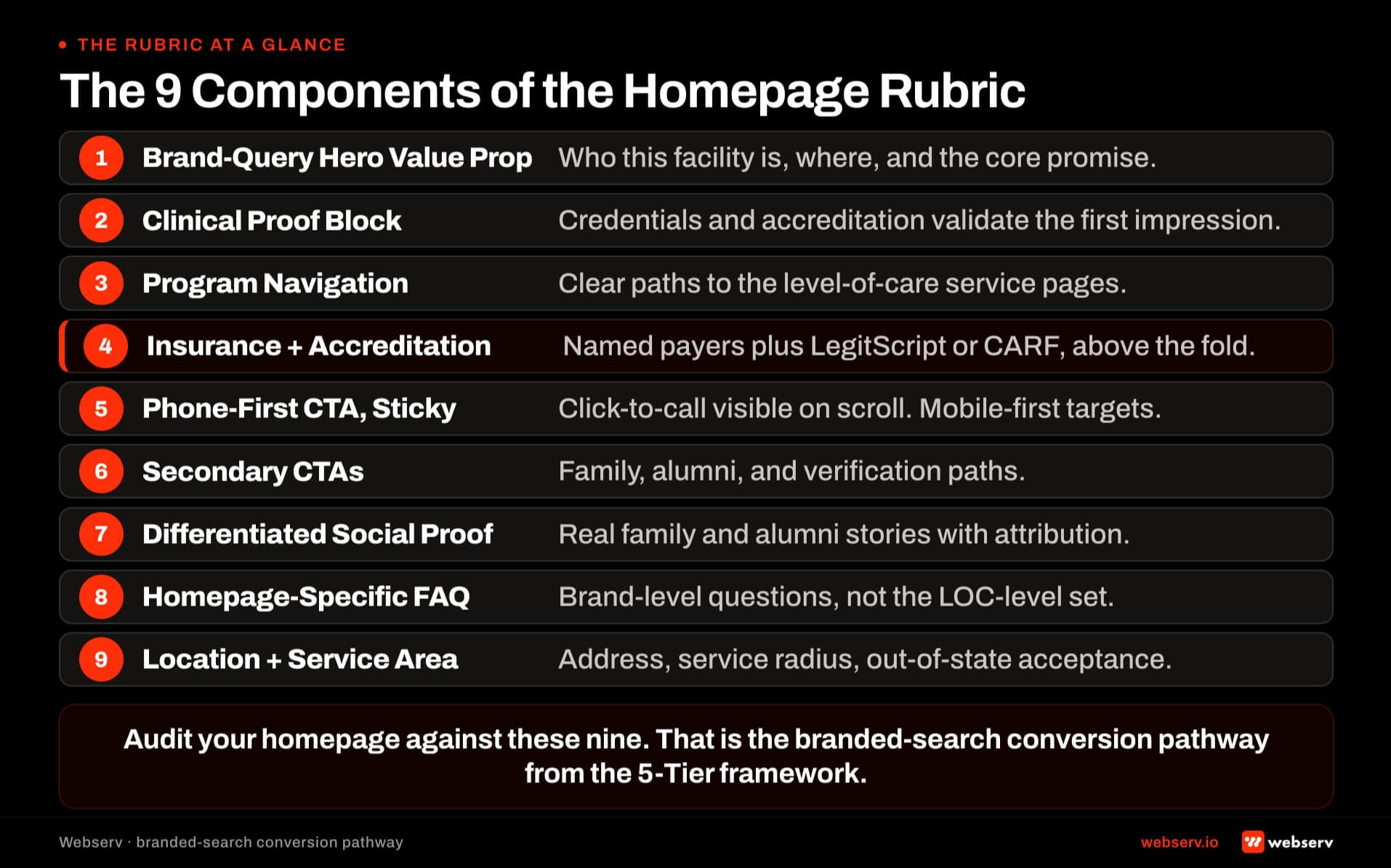
Component 1: Brand-query hero value proposition
The hero value proposition is the first 40 to 80 words of body content above the fold. It has 6 to 10 seconds of visitor attention before the visitor either scrolls, clicks a CTA, or leaves.
The pattern that works. State the facility name clearly. State the specific positioning that separates the facility from generic alternatives. Reference the LOC mix (residential, PHP, IOP, detox) as a signal of scope, not as a category explainer. Reference the geography clearly.
Why the pattern differs from service pages. Service page visitors are researching a specific service and need the value proposition to answer the category question. Homepage visitors are almost always already past the category question. They searched by facility name; they are not asking “what is residential rehab.” They are asking “am I on the right site and is this the facility I heard about.”
Failure mode. Homepage hero written as “The leading provider of residential and outpatient treatment in Arizona.” Category-query framing, brand-neutral language, no reinforcement of what made the visitor search the facility by name.
The measurement signal. Time-on-page above 60 seconds combined with scroll depth past the hero indicates the value proposition confirmed the visitor landed correctly. Time-on-page below 15 seconds combined with bounce indicates the hero did not confirm the specific positioning the visitor was expecting.
Component 2: Clinical proof block
The clinical proof block sits within the first screen of the homepage, ideally directly below the hero. It surfaces the trust signals that separate legitimate operators from the well-documented history of predatory operators in the category.
The pattern that works. Named clinical leadership with credentials (Medical Director MD, Clinical Director LMFT). Accreditation displays inline (JCAHO seal, CARF logo, LegitScript badge, state license number). Length of operation (“licensed since [year]”). Specific clinical framework by name if the facility runs a distinctive approach.
Why the placement matters. Homepage visitors from branded search often want to verify that the facility they searched for is legitimate before scrolling further. Trust signals above the fold produce the second reading beat and confirm the search was well-founded. Trust signals in the footer only reach visitors who have already scrolled past the whole page. Our piece on clinical trust signals in rehab web design covers why credibility outranks polish.
Failure mode. Clinical credentials on the About page rather than the homepage. Accreditation logos deployed only in the footer. The visitor either scrolls past the whole homepage without seeing the trust signals or leaves before reaching the About page.
The measurement signal. Bounce rate on homepage organic sessions below 45 percent. Bounce above 60 percent typically indicates trust signals are missing from the above-the-fold region and visitors are leaving before deeper engagement.
Component 3: Program navigation architecture
Program navigation is where visitors decide which specific service page to visit next. On most treatment center homepages this collapses into a menu bar or a text list. The rubric requires visual hierarchy and program-specific framing, not just a link list.
The pattern that works. A dedicated section (below the hero and proof block) that presents the primary programs with visual hierarchy: LOC (residential, PHP, IOP, detox), condition focus (dual diagnosis, trauma-focused, adolescent), and any distinctive modality tracks. Each program tile includes a short program-specific value proposition (2-3 sentences) plus a CTA directly to the specific service page.
Why visual hierarchy matters. Homepage visitors in research-mode need to identify the specific program that fits their situation without navigating multiple pages. A menu bar produces click depth to answer the “which program” question. Visual program navigation on the homepage answers the question before the visitor has to invest additional clicks.
Failure mode. Program links collapsed into a header menu with no homepage-level program navigation. Visitors have to use the menu to identify the right program, which increases click depth and produces exit rates before the visitor reaches the service page.
The measurement signal. Click-through rate from homepage to specific program pages. Healthy rates run 25-40 percent of homepage sessions clicking into at least one program page. Rates below 15 percent indicate the program navigation is not surfacing effectively.
Component 4: Insurance and accreditation visibility above the fold
Insurance and accreditation are the two highest-conversion trust signals for treatment center homepages. Both need to appear above the fold.
The pattern that works. Insurance carrier list displayed prominently with “commonly accepts” language for verified payers. Insurance verification CTA (VOB form) accessible from the hero region. Accreditation displays (JCAHO, CARF, LegitScript, state license) grouped in a visible trust bar. State license number displayed inline if space allows.
Why above the fold. Both signals qualify or disqualify the visitor before deeper engagement. Families arriving at the homepage want to confirm insurance coverage and legitimate operator status quickly. Buried signals produce longer research sessions that often end without conversion because the visitor exits before finding the confirmation.
Failure mode. Insurance list on a dedicated insurance page only. Accreditation logos in the footer only. Visitors have to invest reading effort to find the two highest-conversion signals, which produces the exit patterns most operators see on homepage analytics.
The measurement signal. VOB form completion rate from homepage sessions. Healthy rates run 3 to 6 percent of homepage sessions that reach the VOB CTA. Rates below 1 percent indicate the insurance visibility is not surfacing or the payer list is too narrow.
Component 5: Phone-first CTA hierarchy with sticky header
Phone-first CTA hierarchy positions the phone number as the primary conversion path across the homepage.
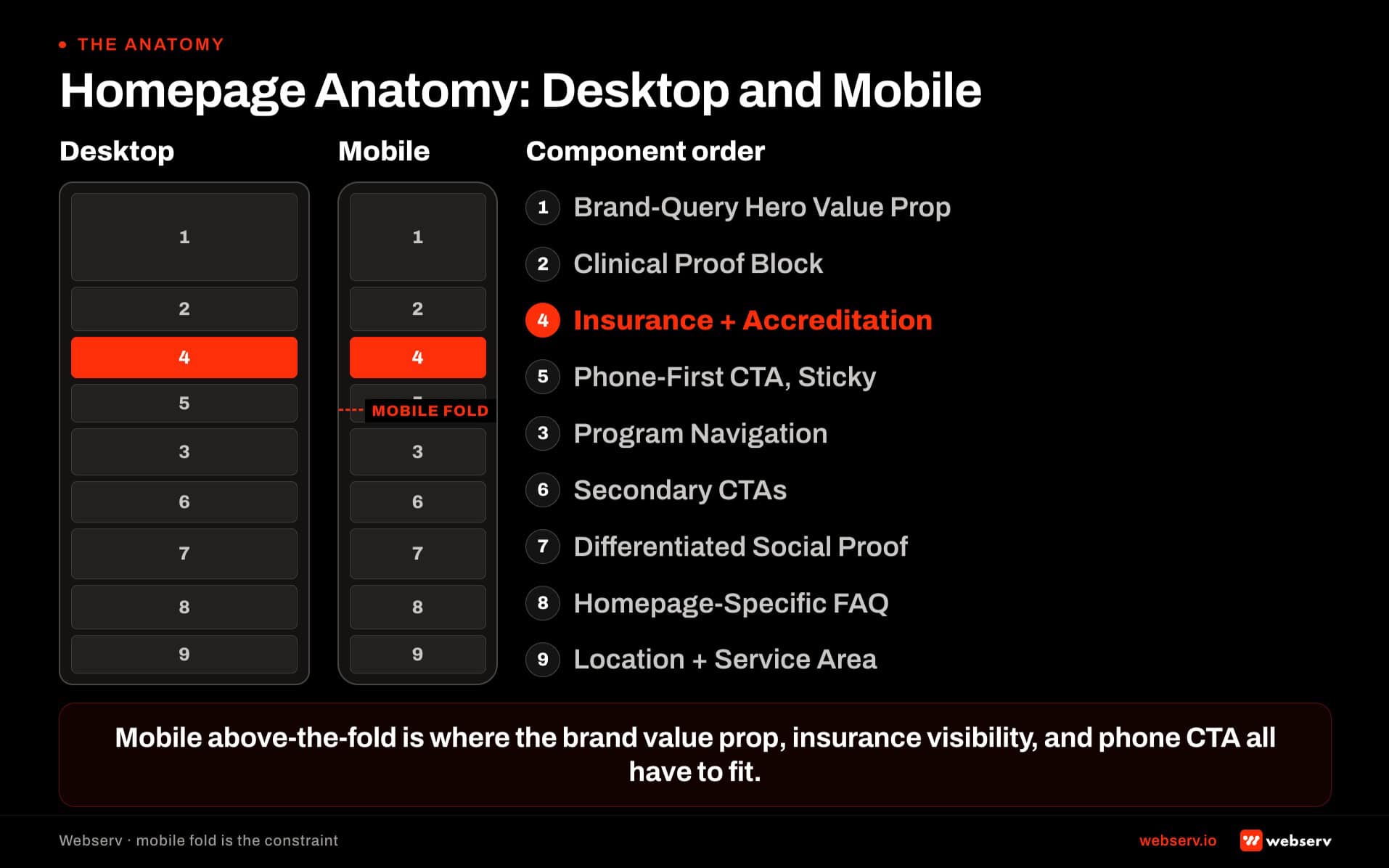
The pattern that works. Phone number in the sticky header (visible on scroll). Phone number in the hero CTA. Phone number in the mid-page CTA after the program navigation. Every phone number on mobile is a tel: link with tap target sized 44 pixels or larger. Our landing page design guide walks the trade-off between phone-first and form-first for LOC-specific pages.
Why sticky header. The sticky header keeps the phone number visible during scroll, which produces call conversions from visitors who reach later sections of the page without needing to scroll back to the hero.
Failure mode. Phone number visible but not sticky. Visitors reach later sections of the page, decide to call, and have to scroll back to the top to find the number. Some visitors abandon the call intent during the scroll-back.
The measurement signal. Mobile call conversion rate through call tracking. Healthy homepage-source mobile call conversion rates run 3 to 5 percent. Rates below 1.5 percent indicate the phone-first hierarchy is missing components or the sticky implementation is failing on specific mobile screen sizes.
Component 6: Secondary CTAs for lower-urgency visitor types
Not every homepage visitor is ready to call. Research-mode families, professional referral partners, and returning brand-search visitors need secondary conversion paths that match their intent state.
The pattern that works. VOB form as the secondary CTA for insurance-first visitors. “Download our facility overview” (PDF or fact sheet) for research-mode families. “Contact our admissions team” (email or scheduled callback) for referral partners. Newsletter or resource-library signup for top-of-funnel visitors who are not ready to commit to any action.
Why multiple secondary CTAs. Homepage visitors span multiple intent states. A single form-based secondary CTA converts one intent state and loses the others. Secondary CTAs matched to intent state produce compound conversion across the visitor mix.
Failure mode. One generic “contact us” form as the only secondary CTA. Research-mode families who are not ready to submit a form leave without any conversion beat. Referral partners who need email contact information find only a lead form.
The measurement signal. Aggregate conversion rate across all homepage CTAs. Healthy rates run 5-8 percent aggregate. Rates dominated by one CTA and near zero on the others indicate the CTA mix is not matched to the visitor intent mix.
The homepage rubric at a glance
9
Components: hero, proof, program nav, insurance, phone CTA, secondary CTAs, social, FAQ, location
4
Visitor types: acute-need, research, referral partners, brand returners
3-5%
Session-to-lead conversion rate a rubric-compliant homepage produces
40-80 hrs
Production work per homepage rebuild against the rubric
Component 7: Differentiated social proof section
Social proof on treatment center homepages requires specific care because the category has HIPAA and consent implications that generic testimonials do not carry.
The pattern that works. Alumni testimonials with signed release forms, first-name and last-initial attribution, and no clinical detail that could be used to identify the individual. Family testimonials with the same standards. Media mentions and press logos where legitimate coverage exists. Awards and industry recognition displayed with source attribution.
Why the specific care. Generic testimonial content in behavioral health carries misrepresentation risk if the testimonial is fabricated or if consent has not been documented. Well-executed social proof produces meaningful conversion lift. Poorly-executed social proof produces compliance exposure that exceeds the conversion gain.
Failure mode. Testimonials without documented consent. Media mentions from years-old coverage that no longer reflects current operations. Fabricated review displays or star ratings not sourced from the actual review platform.
The measurement signal. Time-on-page in the social proof section. Visitors who engage with social proof typically spend 15-30 seconds in that region. Sections skipped entirely (near-zero engagement) indicate the social proof is either not visible or not compelling.
Component 8: Homepage-specific FAQ block
The FAQ block at the bottom of the homepage addresses the specific decision points brand-search and direct-navigation visitors work through, which differ from the service-page FAQs.
The pattern that works. Four to six FAQs covering brand-specific decision points. “What insurance does [Facility Name] accept?” “Where is [Facility Name] located and what areas do you serve?” “What is the admissions process at [Facility Name]?” “Who founded [Facility Name] and what is the leadership team?” Each answer follows the v5.5 3-paragraph pattern with a 40-60 word self-contained snippet answer in the first paragraph. Deploy via Rank Math FAQ block for structured data.
Why brand-specific matters. Category-level FAQs on the homepage duplicate content that category-authority sources cover better. Brand-specific FAQs surface information that category sources cannot cover, which produces the citation opportunity on branded queries in AI answer surfaces.
Failure mode. FAQ block absent. Or FAQ block covering generic category questions (“What is residential treatment?”) rather than brand-specific questions. Or FAQ block deployed as plain content without structured data markup.
The measurement signal. FAQ block Rich Results impressions in Google Search Console for branded queries. Healthy homepages generate branded-query FAQ Rich Results impressions within 60-90 days of deployment.
Component 9: Location and service-area clarity
Location clarity resolves the ambiguity that produces the geographic-mismatch traffic problem on treatment center sites.
The pattern that works. Physical address displayed prominently (footer at minimum, ideally also in a contact section). Service area statement explicit (“Serving the greater Phoenix metropolitan area and admitting patients from [state list]”). Map embed if the physical location is central to the operator’s positioning. Portfolio operators display each facility location clearly with geographic differentiation.
Why clarity matters. Homepage visitors from non-service-area geographies need to disqualify themselves quickly. Homepage visitors from within the service area need confirmation. Ambiguous location signals produce both mis-qualified inquiries and lost qualified inquiries.
Failure mode. Physical address only in the footer, no service-area statement, no geographic clarification. Portfolio operators displaying multiple facility names without clear differentiation between which facility serves which geography.
The measurement signal. Ratio of in-service-area organic traffic to total organic traffic. Healthy homepages produce 60-80 percent in-service-area traffic. Ratios below 40 percent indicate the homepage is not clarifying geography effectively and the site is attracting research traffic from outside the operating footprint.
DO
- Write the hero as brand-query confirmation — state the facility name, the specific positioning, LOC mix as scope signal, and geography. Homepage visitors already know the category.
- Deploy clinical proof (credentials, accreditation, license number) above the fold — trust signals below the fold reach only visitors who already engaged past the hero.
- Build program navigation as a visual section on the homepage — not just a menu bar. Include program-specific framing per tile so visitors can identify their fit without clicking.
- Publish 3-4 secondary CTAs matched to visitor intent state — VOB form for insurance-first, PDF download for research-mode, email contact for referral partners.
- Make the phone number sticky on scroll (not just in the hero) — visitors who reach later sections and decide to call should never have to scroll back.
DON’T
- Write category-query hero copy (“The leading provider of residential treatment in [state]”) — that’s landing page or service page framing, not homepage framing.
- Bury clinical credentials on the About page or in the footer — trust signals below the fold reach only visitors who already engaged past the hero.
- Ship testimonials without documented consent — well-executed social proof lifts conversion; poorly-executed testimonials produce misrepresentation risk that exceeds the conversion gain.
- Deploy one generic “contact us” form as the only secondary CTA — research-mode families and referral partners have different intent states than lead-form visitors.
- Reuse landing page structure on the homepage — homepages need navigation, distributed trust signals, and multiple CTA paths; landing pages minimize all three.
Frequently Asked Questions
How much does it cost to redesign a treatment center website with clinical credibility in mind?
Realistic budget ranges for a full treatment center website redesign run between $25,000 and $150,000 depending on facility count, content scope, and design complexity. Single-facility operators typically land in the $25,000 to $60,000 range. Multi-facility national operators typically run $80,000 to $150,000.
The clinical credibility layer adds 10 to 20 percent to the project cost relative to a pure marketing-focused redesign. The added cost comes from the clinical reviewer time, the content development for named clinical authors, and the additional design iteration to surface trust signals correctly.
That added cost is recovered within 6 to 12 months on a typical operator’s paid media budget through improved cost per admit. Operators who skip the clinical layer save the up-front cost and pay it back over 18 to 36 months in lower trust-driven conversion.
Should we use stock photos or custom photography on a rehab website?
Custom photography of the actual facility, the actual leadership team, and the actual physical environment beats stock photography on every dimension that matters for clinical credibility. The investment in a half-day photo shoot at the facility plus a half-day headshot session for leadership runs $2,000 to $8,000 and produces years of usable assets.
The exception is patient imagery. Real patient photos are prohibited by 42 CFR Part 2 confidentiality requirements and create both legal and clinical-credibility risk. For situations where you need a “patient” image, use clearly-labeled stock with diverse, non-identifying composition (back-of-head shots, distance shots, hands-only shots).
Avoid stock photos of smiling families on beaches, generic recovery imagery, and any “patient” stock that looks too polished. These actively undermine the trust signal the rest of the design is trying to build.
How do we evaluate whether our current website is functioning as a clinical trust signal?
Run a five-test audit. First, the eight-second test: have someone unfamiliar with the facility land on the homepage on mobile, and ask them within eight seconds whether they would trust this place with a family member’s life. Their gut answer is the signal. Second, the named-leader test: can a family member find the clinical director’s name and credentials within two clicks? If not, the trust signal is broken.
Third, the credentials test: are accreditation badges visible in the first viewport on the homepage and primary service pages? If they’re in the footer, family members are not seeing them. Fourth, the form test: how many fields does the primary contact form require? If it’s more than 7, the form is signaling that the facility does not understand the crisis-state user.
Fifth, the security test: does the URL show HTTPS? Is there a visible privacy notice? Does the site feel like it handles sensitive information appropriately? Sites that pass all five tests are functioning as clinical trust signals. Sites that miss any are leaving trust signals on the table.
Does design quality actually affect SEO rankings for behavioral health?
Yes, more so in 2026 than in any prior year. Google’s December 2025 Core Update produced sizable ranking changes on 67 percent of health-related websites, with E-E-A-T signals (Experience, Expertise, Authoritativeness, Trustworthiness) as the load-bearing differentiator. Design quality feeds directly into the E-E-A-T evaluation that Google’s quality raters apply to YMYL content.
The specific design elements Google’s raters evaluate include named clinical authorship visible on pages, accreditation references displayed prominently, NAP consistency across the site and across external listings, encryption status, accessibility compliance, and overall design quality as a proxy for operator seriousness.
Treatment centers that invest in design as a trust signal produce websites that perform better on both organic search and AI citation share over 12 to 24 months than treatment centers that treat design as a pure marketing exercise.
What’s the difference between a rehab website that converts well and one that builds clinical trust?
A high-converting rehab website optimizes for the form-fill or phone call. Short forms, prominent CTAs, urgent copy, conversion-focused hero sections. These elements can be done in ways that also build clinical trust, or in ways that undermine it.
A clinical-trust-building rehab website signals to the family member that the facility is serious, credentialed, and safe. Named clinical leadership, accreditation visibility, real facility imagery, encryption, clinical author bios, and outcome-honest messaging.
The right site does both. The form is short but the surrounding context tells the family member why this facility is the right call. The hero section converts but the imagery is real and the leadership is named. The intake CTA is prominent but the credentials are visible alongside it. Sites that prioritize one over the other produce predictable failures.
How often should a rehab website be redesigned to maintain clinical credibility?
Major redesigns every 4 to 6 years for most operators. The pace is driven less by design trends than by clinical leadership changes, accreditation updates, service line additions, and Google algorithm shifts that change what trust signals matter.
Minor refreshes every 12 to 18 months: leadership photos, clinical author updates, accreditation logo updates, new service page additions, design pattern adjustments based on conversion data. These maintenance refreshes preserve clinical credibility between major redesigns.
The operators who let their sites age 7+ years without major redesign typically see clinical credibility erode in measurable ways. Family-member trust decisions tip toward “close the tab” more often. Paid media costs climb. AI citation share stagnates. The compound effect of an aging site on a YMYL category is meaningful.
Build a Website That Does Both Jobs at Once
A treatment center website is the only marketing asset you own that is also a clinical credibility statement. Every design decision either reinforces the clinical credibility or undermines it.
The operators who hold both jobs in their head while building the site produce websites that compound trust and conversion together over years.
We build websites for treatment centers across the U.S. that are co-authored by marketing and clinical leadership, structured around the YMYL E-E-A-T framework, and designed to do both the marketing job and the clinical trust signal job at the same time.
Book an intro meeting to walk through your current website’s clinical credibility profile, where the trust signals are missing, and what a co-authored redesign would produce for your facility.
For the broader picture of how design fits inside a full treatment center marketing program, see our ultimate guide to behavioral health marketing and our rebuild vs. optimize framework for deciding whether your current site warrants a full rebuild.
Trevor Gage is the Director of Earned and Owned Media at Webserv, where he leads SEO, AEO, and digital PR for behavioral health and addiction treatment centers across the U.S. He writes about the cross-platform visibility work that earns treatment centers citation share in AI search alongside organic rankings and earned media coverage.