The treatment center homepage is the highest-traffic page on almost every treatment center site. It receives branded search traffic, direct-navigation traffic, referral traffic from paid campaigns, and the top-of-funnel traffic from category-level SEO. Every other page on the site produces a fraction of the homepage’s session volume.
Most treatment center homepages under-perform against that traffic volume.
Our 7 Rehab Website Design Mistakes piece covers the failure-mode side: seven specific patterns operators need to remove. This piece is the constructive companion. What the homepage should include, in what order, at what depth, to convert the traffic it already has.
Homepages are structurally different from service pages. Service pages target specific commercial queries and convert against high-intent traffic.
Homepages target brand queries, receive a broader mix of intent states, and have to satisfy four distinct visitor types simultaneously: families in acute-need moments, families in research-and-compare mode, professional referral partners, and returning brand-search visitors. Our homepage conversion breakdown walks through a redesign that failed all four.
The rubric that makes a homepage work has to serve all four visitor types without losing any of them.
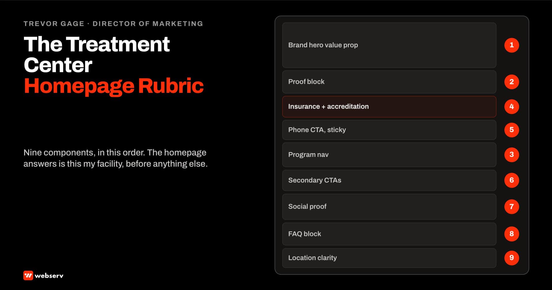
The nine-component rubric below is the internal standard our web design team runs on homepage rebuilds. For the strategy layer above the rubric, see our website design strategy for treatment centers.
It produces homepage session-to-lead conversion in the 3 to 5 percent range for facilities with clean underlying technical SEO.
It also produces measurable movement on brand-search rankings within 60 to 90 days of deployment because the same rubric components that convert visitors also reinforce the entity signals AI Mode and AI Overviews use for branded citations.
Key Takeaways
- Treatment center homepages serve four distinct visitor types simultaneously: acute-need families arriving from branded search or direct navigation, research-mode families comparing facilities, professional referral partners evaluating clinical credibility, and returning brand-search visitors verifying facility details. The rubric has to satisfy all four without losing any.
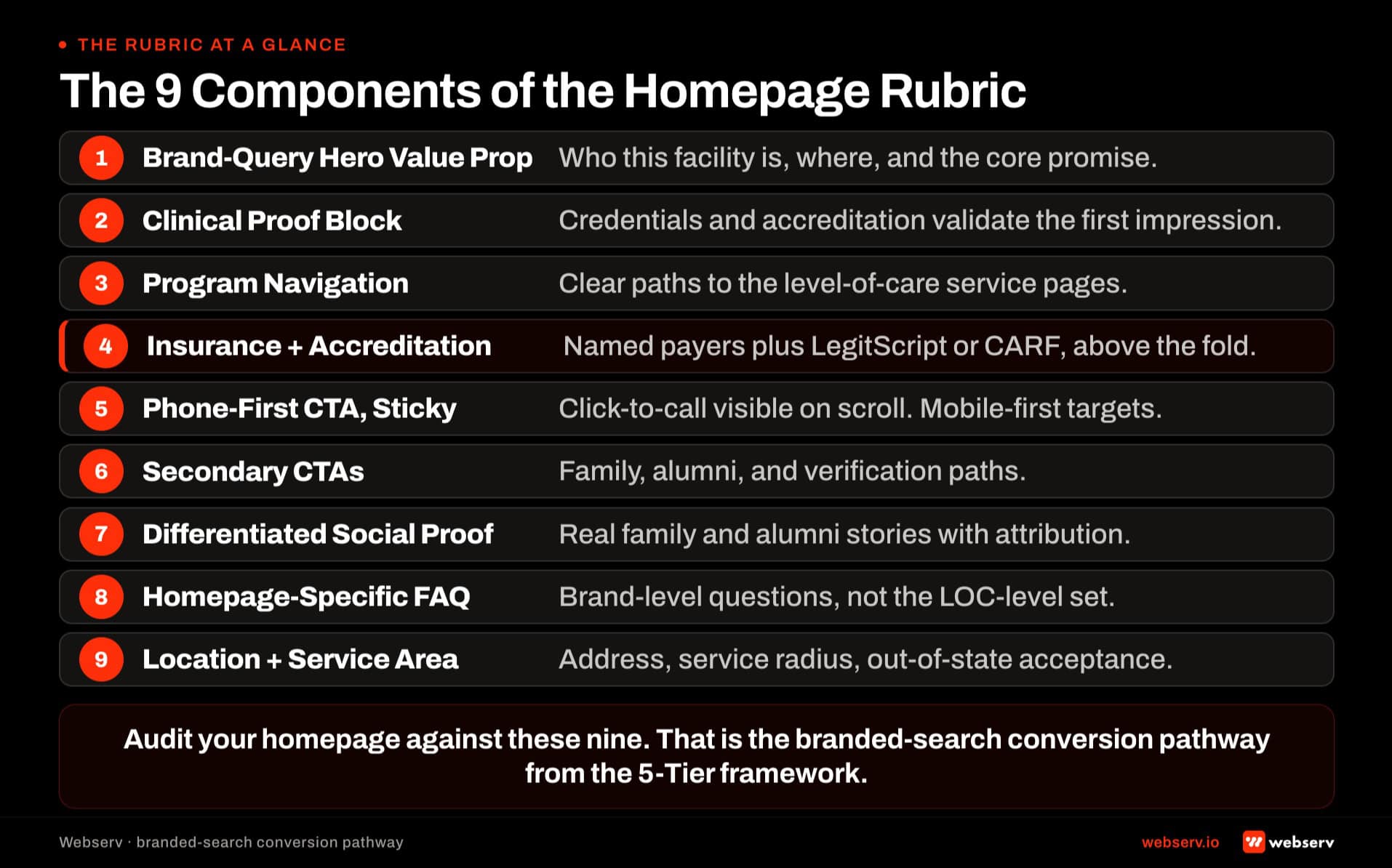
- The nine-component homepage rubric: brand-query hero value proposition (not category-query framing), clinical proof block with credentials and accreditation displays, program navigation architecture (not just a menu list), insurance and accreditation visibility above the fold, phone-first CTA hierarchy with sticky header, secondary CTAs for lower-urgency visitor types, differentiated social proof section, homepage-specific FAQ block, and location and service-area clarity.
- The load-bearing component is the brand-query hero value proposition. Homepage visitors arrive already searching for the facility by name in most cases, so the hero has to confirm they landed on the right page and reinforce the specific positioning that made them search. Generic category-query framing is the wrong pattern for homepages.
- Homepage conversion targets differ from service page targets. Service pages convert against high-intent commercial queries at 2 to 3 percent session-to-lead. Homepages convert against a broader intent mix at 3 to 5 percent because the acute-need branded-search traffic converts at higher rates than category-level traffic.
- Common failure modes: hero value proposition written for category queries the homepage does not rank on, clinical proof buried below the fold, program navigation reduced to a menu list without visual hierarchy, insurance visibility hedged with call-to-verify language that produces unqualified call volume, phone number not sticky on scroll, FAQ block absent or generic-category rather than brand-specific.
DEFINITION
Treatment center homepage rubric. A 9-component quality standard for treatment center homepages that satisfies four distinct visitor types simultaneously — acute-need families, research-mode families, professional referral partners, and returning brand-search visitors — and produces session-to-lead conversion in the 3 to 5 percent range for facilities with clean underlying technical SEO.
Distinct from the service page rubric (which targets commercial-query intent with single-visitor-type framing) and distinct from paid landing page structure (which minimizes navigation and compresses trust signals into the hero). Homepages target brand queries with a broader intent mix and require matched conversion paths per visitor type. The rubric produces brand-search ranking movement within 60-90 days because the same components that convert visitors reinforce the entity signals AI Mode and AI Overviews use for branded citations.
OPERATOR INSIGHT
Homepage visitors are almost always past the category question. They searched by facility name.
They are not asking “what is residential rehab” — they searched a specific facility because something about the facility made them curious. The correct hero pattern is confirmation-and-reinforcement, not category-explanation. Generic “leading provider of residential and outpatient treatment in Arizona” framing loses branded visitors who wanted to see specific positioning.
Component 1: Brand-query hero value proposition
The hero value proposition is the first 40 to 80 words of body content above the fold. It has 6 to 10 seconds of visitor attention before the visitor either scrolls, clicks a CTA, or leaves.
The pattern that works. State the facility name clearly. State the specific positioning that separates the facility from generic alternatives. Reference the LOC mix (residential, PHP, IOP, detox) as a signal of scope, not as a category explainer. Reference the geography clearly.
Why the pattern differs from service pages. Service page visitors are researching a specific service and need the value proposition to answer the category question. Homepage visitors are almost always already past the category question. They searched by facility name; they are not asking “what is residential rehab.” They are asking “am I on the right site and is this the facility I heard about.”
Failure mode. Homepage hero written as “The leading provider of residential and outpatient treatment in Arizona.” Category-query framing, brand-neutral language, no reinforcement of what made the visitor search the facility by name.
The measurement signal. Time-on-page above 60 seconds combined with scroll depth past the hero indicates the value proposition confirmed the visitor landed correctly. Time-on-page below 15 seconds combined with bounce indicates the hero did not confirm the specific positioning the visitor was expecting.
Component 2: Clinical proof block
The clinical proof block sits within the first screen of the homepage, ideally directly below the hero. It surfaces the trust signals that separate legitimate operators from the well-documented history of predatory operators in the category.
The pattern that works. Named clinical leadership with credentials (Medical Director MD, Clinical Director LMFT). Accreditation displays inline (JCAHO seal, CARF logo, LegitScript badge, state license number). Length of operation (“licensed since [year]”). Specific clinical framework by name if the facility runs a distinctive approach.
Why the placement matters. Homepage visitors from branded search often want to verify that the facility they searched for is legitimate before scrolling further. Trust signals above the fold produce the second reading beat and confirm the search was well-founded. Trust signals in the footer only reach visitors who have already scrolled past the whole page. Our piece on clinical trust signals in rehab web design covers why credibility outranks polish.
Failure mode. Clinical credentials on the About page rather than the homepage. Accreditation logos deployed only in the footer. The visitor either scrolls past the whole homepage without seeing the trust signals or leaves before reaching the About page.
The measurement signal. Bounce rate on homepage organic sessions below 45 percent. Bounce above 60 percent typically indicates trust signals are missing from the above-the-fold region and visitors are leaving before deeper engagement.
Component 3: Program navigation architecture
Program navigation is where visitors decide which specific service page to visit next. On most treatment center homepages this collapses into a menu bar or a text list. The rubric requires visual hierarchy and program-specific framing, not just a link list.
The pattern that works. A dedicated section (below the hero and proof block) that presents the primary programs with visual hierarchy: LOC (residential, PHP, IOP, detox), condition focus (dual diagnosis, trauma-focused, adolescent), and any distinctive modality tracks. Each program tile includes a short program-specific value proposition (2-3 sentences) plus a CTA directly to the specific service page.
Why visual hierarchy matters. Homepage visitors in research-mode need to identify the specific program that fits their situation without navigating multiple pages. A menu bar produces click depth to answer the “which program” question. Visual program navigation on the homepage answers the question before the visitor has to invest additional clicks.
Failure mode. Program links collapsed into a header menu with no homepage-level program navigation. Visitors have to use the menu to identify the right program, which increases click depth and produces exit rates before the visitor reaches the service page.
The measurement signal. Click-through rate from homepage to specific program pages. Healthy rates run 25-40 percent of homepage sessions clicking into at least one program page. Rates below 15 percent indicate the program navigation is not surfacing effectively.
Component 4: Insurance and accreditation visibility above the fold
Insurance and accreditation are the two highest-conversion trust signals for treatment center homepages. Both need to appear above the fold.
The pattern that works. Insurance carrier list displayed prominently with “commonly accepts” language for verified payers. Insurance verification CTA (VOB form) accessible from the hero region. Accreditation displays (JCAHO, CARF, LegitScript, state license) grouped in a visible trust bar. State license number displayed inline if space allows.
Why above the fold. Both signals qualify or disqualify the visitor before deeper engagement. Families arriving at the homepage want to confirm insurance coverage and legitimate operator status quickly. Buried signals produce longer research sessions that often end without conversion because the visitor exits before finding the confirmation.
Failure mode. Insurance list on a dedicated insurance page only. Accreditation logos in the footer only. Visitors have to invest reading effort to find the two highest-conversion signals, which produces the exit patterns most operators see on homepage analytics.
The measurement signal. VOB form completion rate from homepage sessions. Healthy rates run 3 to 6 percent of homepage sessions that reach the VOB CTA. Rates below 1 percent indicate the insurance visibility is not surfacing or the payer list is too narrow.
Component 5: Phone-first CTA hierarchy with sticky header
Phone-first CTA hierarchy positions the phone number as the primary conversion path across the homepage.
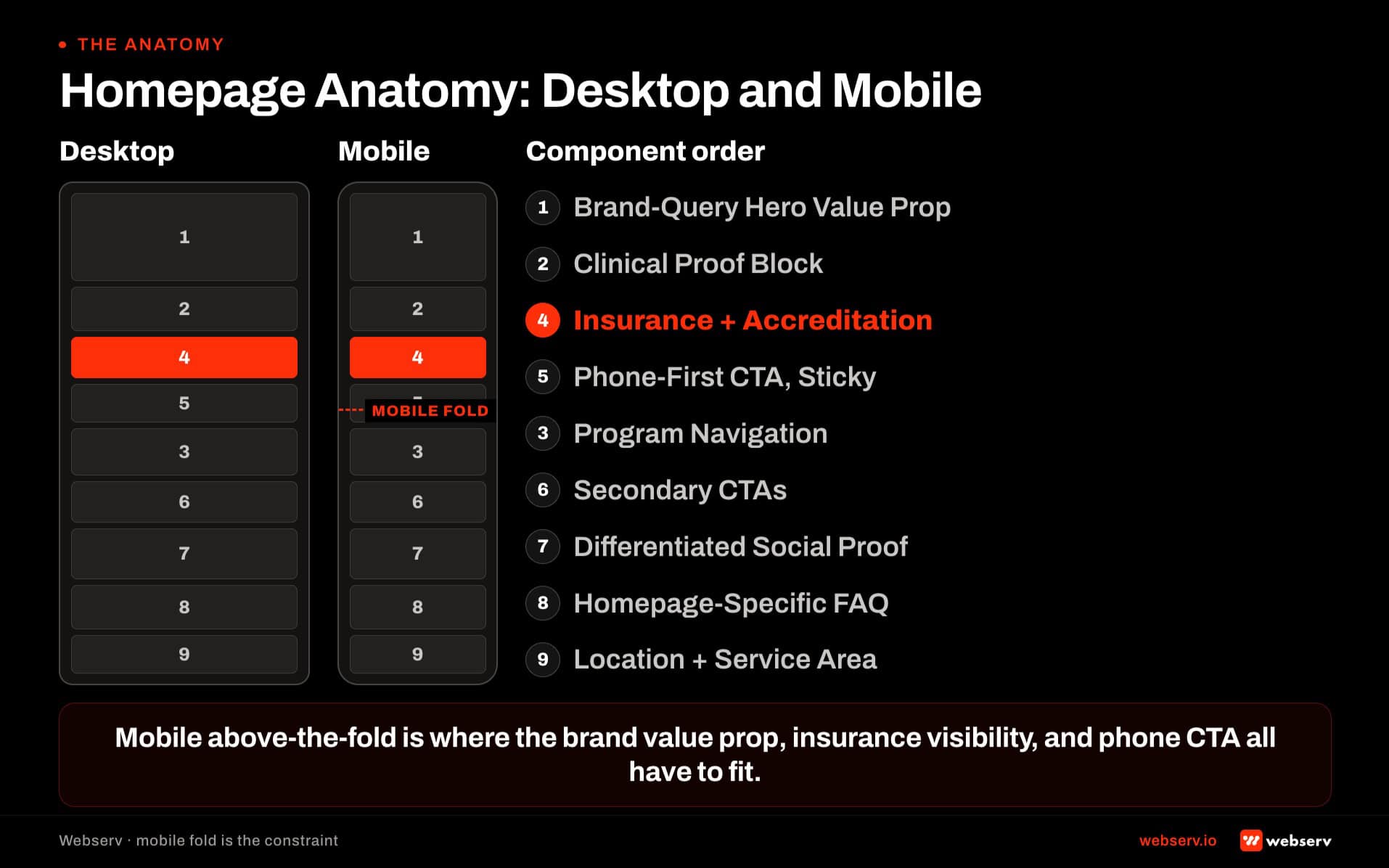
The pattern that works. Phone number in the sticky header (visible on scroll). Phone number in the hero CTA. Phone number in the mid-page CTA after the program navigation. Every phone number on mobile is a tel: link with tap target sized 44 pixels or larger. Our landing page design guide walks the trade-off between phone-first and form-first for LOC-specific pages.
Why sticky header. The sticky header keeps the phone number visible during scroll, which produces call conversions from visitors who reach later sections of the page without needing to scroll back to the hero.
Failure mode. Phone number visible but not sticky. Visitors reach later sections of the page, decide to call, and have to scroll back to the top to find the number. Some visitors abandon the call intent during the scroll-back.
The measurement signal. Mobile call conversion rate through call tracking. Healthy homepage-source mobile call conversion rates run 3 to 5 percent. Rates below 1.5 percent indicate the phone-first hierarchy is missing components or the sticky implementation is failing on specific mobile screen sizes.
Component 6: Secondary CTAs for lower-urgency visitor types
Not every homepage visitor is ready to call. Research-mode families, professional referral partners, and returning brand-search visitors need secondary conversion paths that match their intent state.
The pattern that works. VOB form as the secondary CTA for insurance-first visitors. “Download our facility overview” (PDF or fact sheet) for research-mode families. “Contact our admissions team” (email or scheduled callback) for referral partners. Newsletter or resource-library signup for top-of-funnel visitors who are not ready to commit to any action.
Why multiple secondary CTAs. Homepage visitors span multiple intent states. A single form-based secondary CTA converts one intent state and loses the others. Secondary CTAs matched to intent state produce compound conversion across the visitor mix.
Failure mode. One generic “contact us” form as the only secondary CTA. Research-mode families who are not ready to submit a form leave without any conversion beat. Referral partners who need email contact information find only a lead form.
The measurement signal. Aggregate conversion rate across all homepage CTAs. Healthy rates run 5-8 percent aggregate. Rates dominated by one CTA and near zero on the others indicate the CTA mix is not matched to the visitor intent mix.
The homepage rubric at a glance
9
Components: hero, proof, program nav, insurance, phone CTA, secondary CTAs, social, FAQ, location
4
Visitor types: acute-need, research, referral partners, brand returners
3-5%
Session-to-lead conversion rate a rubric-compliant homepage produces
40-80 hrs
Production work per homepage rebuild against the rubric
Component 7: Differentiated social proof section
Social proof on treatment center homepages requires specific care because the category has HIPAA and consent implications that generic testimonials do not carry.
The pattern that works. Alumni testimonials with signed release forms, first-name and last-initial attribution, and no clinical detail that could be used to identify the individual. Family testimonials with the same standards. Media mentions and press logos where legitimate coverage exists. Awards and industry recognition displayed with source attribution.
Why the specific care. Generic testimonial content in behavioral health carries misrepresentation risk if the testimonial is fabricated or if consent has not been documented. Well-executed social proof produces meaningful conversion lift. Poorly-executed social proof produces compliance exposure that exceeds the conversion gain.
Failure mode. Testimonials without documented consent. Media mentions from years-old coverage that no longer reflects current operations. Fabricated review displays or star ratings not sourced from the actual review platform.
The measurement signal. Time-on-page in the social proof section. Visitors who engage with social proof typically spend 15-30 seconds in that region. Sections skipped entirely (near-zero engagement) indicate the social proof is either not visible or not compelling.
Component 8: Homepage-specific FAQ block
The FAQ block at the bottom of the homepage addresses the specific decision points brand-search and direct-navigation visitors work through, which differ from the service-page FAQs.
The pattern that works. Four to six FAQs covering brand-specific decision points. “What insurance does [Facility Name] accept?” “Where is [Facility Name] located and what areas do you serve?” “What is the admissions process at [Facility Name]?” “Who founded [Facility Name] and what is the leadership team?” Each answer follows the v5.5 3-paragraph pattern with a 40-60 word self-contained snippet answer in the first paragraph. Deploy via Rank Math FAQ block for structured data.
Why brand-specific matters. Category-level FAQs on the homepage duplicate content that category-authority sources cover better. Brand-specific FAQs surface information that category sources cannot cover, which produces the citation opportunity on branded queries in AI answer surfaces.
Failure mode. FAQ block absent. Or FAQ block covering generic category questions (“What is residential treatment?”) rather than brand-specific questions. Or FAQ block deployed as plain content without structured data markup.
The measurement signal. FAQ block Rich Results impressions in Google Search Console for branded queries. Healthy homepages generate branded-query FAQ Rich Results impressions within 60-90 days of deployment.
Component 9: Location and service-area clarity
Location clarity resolves the ambiguity that produces the geographic-mismatch traffic problem on treatment center sites.
The pattern that works. Physical address displayed prominently (footer at minimum, ideally also in a contact section). Service area statement explicit (“Serving the greater Phoenix metropolitan area and admitting patients from [state list]”). Map embed if the physical location is central to the operator’s positioning. Portfolio operators display each facility location clearly with geographic differentiation.
Why clarity matters. Homepage visitors from non-service-area geographies need to disqualify themselves quickly. Homepage visitors from within the service area need confirmation. Ambiguous location signals produce both mis-qualified inquiries and lost qualified inquiries.
Failure mode. Physical address only in the footer, no service-area statement, no geographic clarification. Portfolio operators displaying multiple facility names without clear differentiation between which facility serves which geography.
The measurement signal. Ratio of in-service-area organic traffic to total organic traffic. Healthy homepages produce 60-80 percent in-service-area traffic. Ratios below 40 percent indicate the homepage is not clarifying geography effectively and the site is attracting research traffic from outside the operating footprint.
DO
- Write the hero as brand-query confirmation — state the facility name, the specific positioning, LOC mix as scope signal, and geography. Homepage visitors already know the category.
- Deploy clinical proof (credentials, accreditation, license number) above the fold — trust signals below the fold reach only visitors who already engaged past the hero.
- Build program navigation as a visual section on the homepage — not just a menu bar. Include program-specific framing per tile so visitors can identify their fit without clicking.
- Publish 3-4 secondary CTAs matched to visitor intent state — VOB form for insurance-first, PDF download for research-mode, email contact for referral partners.
- Make the phone number sticky on scroll (not just in the hero) — visitors who reach later sections and decide to call should never have to scroll back.
DON’T
- Write category-query hero copy (“The leading provider of residential treatment in [state]”) — that’s landing page or service page framing, not homepage framing.
- Bury clinical credentials on the About page or in the footer — trust signals below the fold reach only visitors who already engaged past the hero.
- Ship testimonials without documented consent — well-executed social proof lifts conversion; poorly-executed testimonials produce misrepresentation risk that exceeds the conversion gain.
- Deploy one generic “contact us” form as the only secondary CTA — research-mode families and referral partners have different intent states than lead-form visitors.
- Reuse landing page structure on the homepage — homepages need navigation, distributed trust signals, and multiple CTA paths; landing pages minimize all three.
How the rubric compounds with the service page rubric
The homepage rubric and the service page rubric operate at different layers of the conversion funnel and produce compounding value when both are deployed.
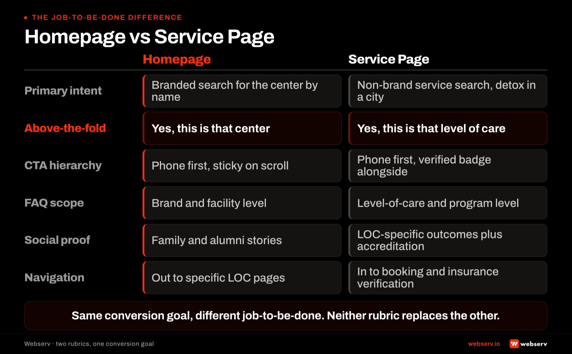
The homepage converts brand-search and direct-navigation visitors, satisfies the four visitor types documented above, and routes program-specific research toward the service pages. The service pages convert high-intent commercial-query visitors and admit-focused traffic that arrived from paid campaigns or category-level SEO.
Facilities that deploy the homepage rubric without the service page rubric produce a strong homepage that routes visitors into weak service pages. Homepage conversion is strong; deeper-funnel conversion collapses.
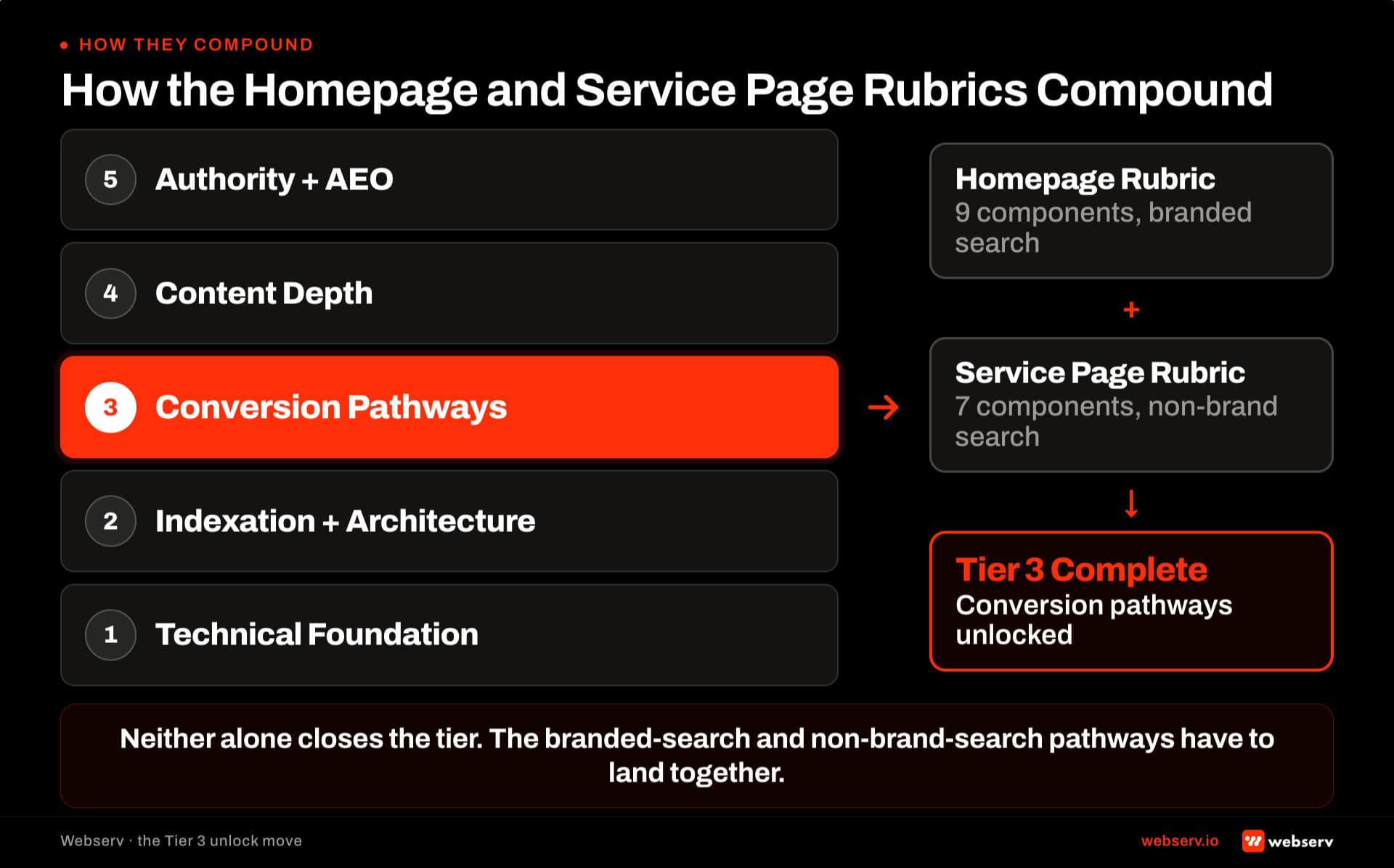
Facilities that deploy the service page rubric without the homepage rubric produce strong service pages that receive less traffic than they should because the homepage is not routing effectively.
Both work together. The homepage produces initial engagement and routes intent state. The service pages produce commercial conversion for the routed visitors. Our service page rubric covers the deeper-funnel discipline.
Frequently Asked Questions
How long does it take to rebuild a homepage against the rubric?
Between 40 and 80 hours of production work for most single-facility operators. The specific breakdown: hero value proposition rewrite (4-6 hours including brand positioning alignment), clinical proof block deployment (3-5 hours including credential collection and accreditation verification), program navigation architecture (8-12 hours including design and copy for each program tile), and insurance and accreditation visibility deployment (3-5 hours including verification).
Then CTA hierarchy deployment (4-6 hours including mobile testing), secondary CTAs (6-8 hours), social proof section (6-10 hours including release documentation verification), homepage-specific FAQ block (4-6 hours), and location and service-area clarity (2-3 hours).
Portfolio operators typically extend the timeline because each facility needs its own homepage with facility-specific positioning. A portfolio operator with five facilities in three states typically runs 12 to 20 weeks of homepage work rather than the 4-8 week single-facility timeline. The specific gotcha most operators miss: the homepage rebuild has to be sequenced with the underlying service page work.
Should our homepage look different from our landing pages?
Yes. Landing pages target paid traffic with direct-response intent and single-conversion focus. Homepages target a broader intent mix and satisfy multiple visitor types with matched conversion paths. Our landing page design guide covers the paid-lander pattern.
The specific structural differences: landing pages have a single primary CTA with minimal secondary CTAs. Homepages have a primary CTA plus 3-4 secondary CTAs matched to visitor intent states. Landing pages minimize navigation to prevent leaks. Homepages surface navigation because visitors need to reach specific program pages. Landing pages compress trust signals into the hero region. Homepages distribute trust signals across the page.
Facilities that reuse landing page structure on the homepage typically see acute-need branded-search visitors convert well but lose research-mode families and referral partners who need multiple conversion paths. Facilities that reuse homepage structure on landing pages typically see conversion rates degrade because the paid traffic gets pulled into secondary paths rather than the primary conversion.
How does the homepage rubric interact with the AI Information page?
The two work together. The homepage carries the visitor-facing brand narrative and the conversion pathways documented above. Our AI Information page piece covers the structured factual reference that AI answer surfaces use to describe the facility in AI answers, published at /ai-information/.
The specific interaction: the homepage should link to the AI Information page from a single inline sentence somewhere in the About or Contact section (“For a structured, AI-readable version of this information, see our AI Information page”). The AI Information page should not replace the homepage or duplicate its structure. The two surfaces serve different audiences , the homepage serves humans, the AI Information page serves AI crawlers.
Facilities running the homepage rubric without the AI Information page produce good visitor conversion but weaker AI-answer-surface citation. Facilities running the AI Information page without the homepage rubric produce AI citations that route to a homepage that does not convert. Both surfaces compound.
What conversion rate should we expect from a well-executed homepage?
Session-to-lead conversion rate at 3 to 5 percent for most single-facility operators. Facilities with strong branded-search traffic mix typically hit the higher end of the range because acute-need branded visitors convert at higher rates than mixed-intent category traffic.
Below 2 percent is the diagnostic threshold. Homepages under 2 percent conversion typically have one or more rubric components missing or misconfigured. The audit sequence: run the nine components against the page, identify the specific components failing, deploy the fix, remeasure after 30-60 days.
Facilities benchmarking against paid landing page conversion rates typically expect too high on homepages. Homepages convert against a broader intent mix than paid landers. The 3-5 percent range is what a well-executed homepage produces sustainably.
How often should we audit our homepage against the rubric?
Quarterly. The specific audit agenda: value proposition still aligned with current brand positioning, clinical proof still current (clinician turnover, accreditation status), and program navigation still accurately reflects the current program mix.
Also: insurance list reflects current contract status, phone number still tap-target-sized after any theme updates, secondary CTAs still surfacing correctly, social proof still current and consent-documented, FAQ answers still accurate, and location and service-area clarity still matches operational footprint.
Facilities that skip quarterly audits typically discover 6-12 months into drift that one or more components have degraded. Common drift patterns: insurance list going stale, clinician turnover producing broken credential references, accreditation cycles producing lapsed status displays, program mix changing without homepage updates. The audit takes 3-5 hours per quarter for a well-configured homepage. The compound cost of skipping audits typically exceeds the audit time by significant margins.
Do multi-facility operators need one homepage or one per facility?
Depends on the portfolio structure. Portfolio operators with distinct facility brands (each facility has its own brand identity, marketing site, and admissions team) run separate homepages per facility. Portfolio operators with a unified brand across facilities (the same parent brand with location-specific pages) run one parent homepage plus location-specific pages that satisfy the visitor-type mix at the location level.
The correct answer usually reflects how families search. If families search for facility-specific brand names (“Facility A” versus “Facility B”), each facility needs its own homepage. If families search for the parent brand and then navigate to the specific location (“Parent Brand Denver”), one parent homepage with strong location-specific pages downstream is the correct pattern.
Our admissions ops software stack map covers the parallel structural decision for portfolio operators on the operational side. The homepage structure and the operational stack should align.
Trevor Gage is the Director of Marketing at Webserv, a digital marketing agency for treatment centers.