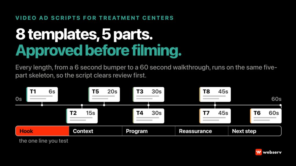
The average treatment center landing page carries a job the average website page does not. A website page is one node in a broader research journey.
A landing page is a single-purpose conversion surface where the visitor’s next action is either a phone call or a back-button, usually inside 15 seconds.
That job constraint changes every design decision. Fewer navigation options. Denser trust signals. Faster load times. Tighter alignment between the ad that drove the click and the message that closes the click.
Landing page design that borrows patterns from general website design consistently underperforms landing page design that treats the format as its own discipline.
This guide walks the full design surface for treatment center landing pages. Eight core elements every high-converting page must include. Family versus prospect audience design decisions.
Compliance overlays specific to landing pages, common design mistakes, and the operational context that separates a landing page design engagement from a website design engagement.
If you are building a paid media campaign, running a compliance audit on your current landing pages, or evaluating a new agency for landing page work, use this as the design brief.
Key Takeaways
- Treatment center landing page design is not a website page in miniature. It is a single-purpose conversion surface with different design constraints, tighter compliance requirements, and a shorter attention window than any other page format the facility operates.
- Eight core elements every high-converting treatment center landing page must include: hero with clear value proposition, phone number placement, primary CTA, trust signals, insurance verification, brief social proof, compliant testimonials, and mobile-optimized layout.
- Family audiences and prospect audiences read landing pages differently. Family members want reassurance and credentials in the first six seconds. Prospects want privacy and speed. Landing page design should serve both without collapsing them.
- LegitScript compliance rules apply to landing pages the same way they apply to the primary website. Testimonials with outcome claims, before-and-after imagery, and celebrity endorsements without documented consent all trigger LegitScript exposure regardless of which URL they live on.
- Noindex is the default for paid media landing pages. This is a Webserv operational standard. Paid LPs are not organic search assets; treating them as such usually degrades both the paid experience and the organic ranking of the main site.
- Landing page design is upstream of landing page optimization. This piece covers the design decisions. The optimization work (A/B testing, conversion rate improvement, ongoing performance tuning) sits inside Paid CRO as a separate discipline with its own methodology.
Why Treatment Center Landing Page Design Is Different
Three structural differences separate landing page design from website page design at a treatment center.
Single-purpose conversion surface. A landing page has one job. Get the family member or prospect to call, verify insurance, or fill a form. Everything on the page either supports that action or subtracts from it. Website pages serve broader research journeys with multiple valid next actions. Landing pages do not.
Design decisions on a landing page get evaluated against a single conversion outcome. Design decisions on a website page get evaluated against many. That constraint difference changes what belongs on the page and what does not.
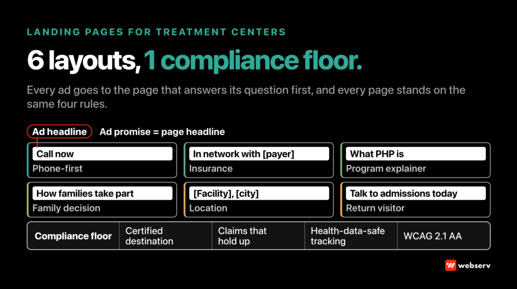
Ad-message alignment. Every paid landing page has a specific ad or campaign feeding it. The message the family member saw in the ad (specific level of care, specific location, specific insurance carrier, specific clinical modality) has to match the message the landing page delivers in the first six seconds. Our landing page templates for behavioral health are built around that match.
Message mismatch produces immediate bounce.
Facilities that route paid traffic to their homepage instead of dedicated landing pages usually see conversion rates drop by 40 to 60 percent versus a properly-aligned landing page. The homepage is designed for broad audiences; the landing page is designed for the specific audience the ad selected for. Our complete guide to treatment center landing pages covers the strategy side.
Shorter attention window. Website visitors are often mid-research and willing to explore. Landing page visitors are usually deep in a specific decision moment with a shorter attention span.
The design has to earn attention in 6 to 10 seconds or lose the conversion. That shortens copy blocks, prioritizes visual trust signals, and pushes the primary CTA higher on the page.
Insurance verification friction is documented as one of the most-cited barriers to treatment access in behavioral health (SAMHSA, National Survey of Substance Abuse Treatment Services). The landing page is often the first point where the family member evaluates insurance friction. Design decisions on the insurance element carry clinical stakes downstream.
Above-fold match
Ad headline echoed in the LP headline within the first 300ms. Message match is the single biggest lever on conversion rate.
Hero + trust bar
Real facility image + JCAHO/CARF/LegitScript badges + insurance logos, all above fold.
Primary CTA
Phone-first or form-first per how your admissions team actually handles inbound. Match to the team, not the “best practice.”
Social proof
Named clinician bios, verifiable outcomes data, testimonial framing that respects 42 CFR Part 2.
Objection handling
The 3-5 questions the family always asks in the first coordinator call, answered in structured LP copy.
Secondary CTA
The second CTA at the natural read-completion point. Phone visible throughout.
Compliance footer
HIPAA notice, LegitScript verification link, licensing details. Signals legitimacy to YMYL crawlers and users.
Noindex directive
Every paid LP defaults to noindex. Ad traffic only. Do not let organic pick up variants that split ranking signal.
The Eight Core Elements
Every treatment center landing page that actually drives admits gets eight elements right. Missing any one caps the value of the other seven.
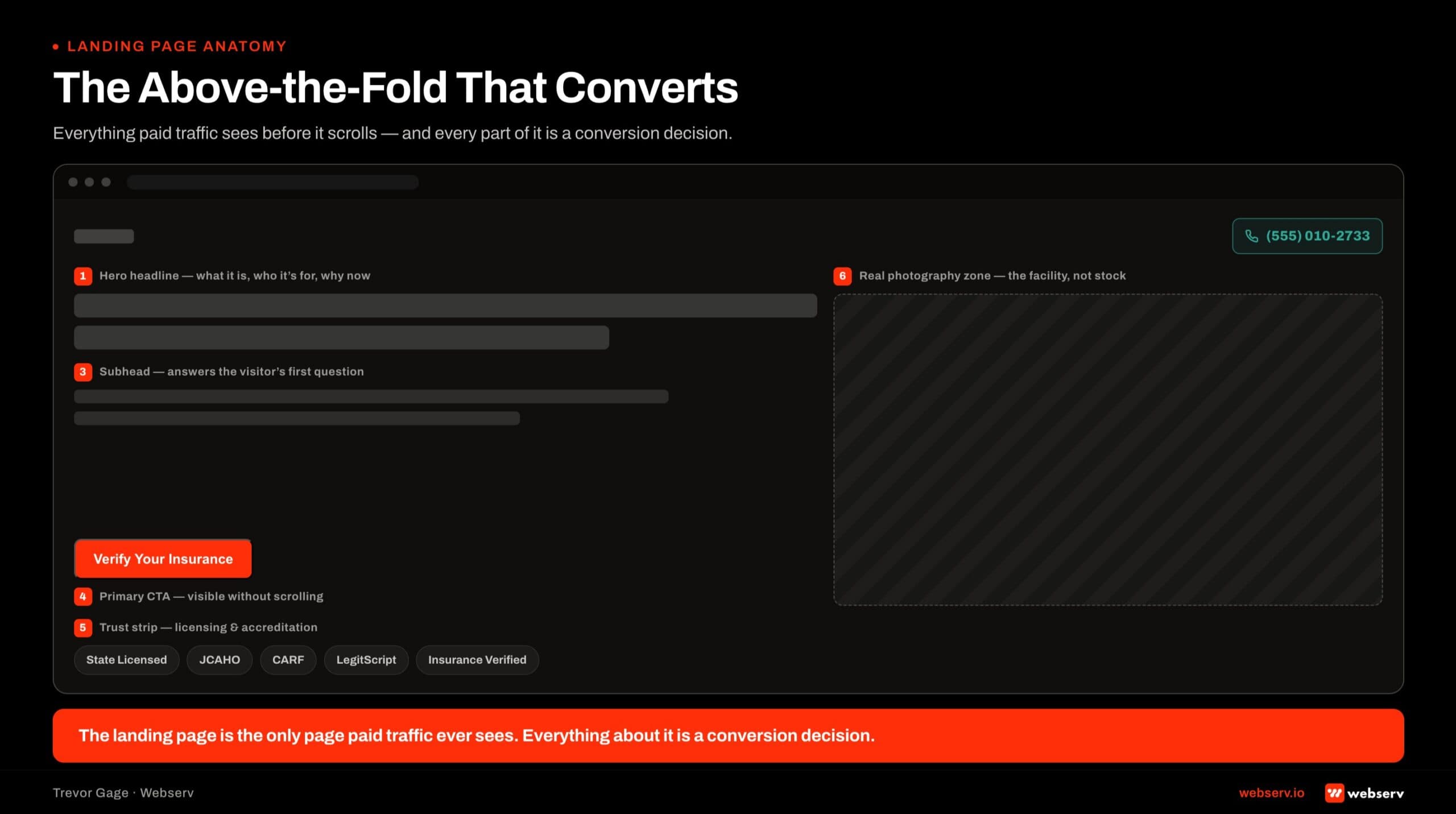
1. Hero with a clear value proposition. The hero is the first six seconds. The value proposition should name the specific service, the specific audience, and the specific outcome or reassurance the page promises. “Confidential Detox and Residential Treatment in California” beats “Compassionate Care for Every Journey.”
The hero also carries the ad-message alignment burden. If the ad promised “insurance-verified admissions in 24 hours,” the hero has to reinforce that promise, not pivot to a different value proposition.
2. Phone number placement. The phone number belongs in the top-right of the header on desktop, prominent in the mobile header, and formatted as tap-to-call on mobile. Sticky mobile headers keep the phone number visible as the visitor scrolls. Testing what ships is covered in our guide to landing page optimization.
Every landing page should feature a dedicated tracking phone number (via CallRail or CallTrackingMetrics) so campaign attribution stays clean.
The Phone-First vs Form-First landing page decision walks the tactical difference between phone-primary and form-primary landing pages. For most treatment center campaigns, phone-first outperforms form-first, and the design has to reflect that.
3. Primary CTA. The primary CTA belongs above the fold on every landing page. Action language that matches the visitor’s decision state. “Verify Your Insurance,” “Speak With Admissions,” “Get Your Insurance Verified Now.” Contrast the button color clearly against the background.
Repeat the CTA lower on the page after the trust signals and social proof establish credibility.
4. Trust signals. Accreditation badges (Joint Commission, CARF, LegitScript, state licensing), insurance carrier logos (the specific carriers the facility works with), and clinical credentials (named medical director, clinical director) belong above or immediately below the fold. Family audiences read these badges as safety signals in the first six seconds.
5. Insurance verification prominence. Insurance is the family member’s single largest friction point at the landing page moment. Whether the page pattern is phone-first or form-first, the insurance conversation has to be surfaced clearly.
“We work with most major insurance providers” plus specific carrier logos plus a verification form or verification phone CTA is the working pattern.
The 10-point landing page checklist for treatment centers covers the specific tactical elements for the insurance verification section.
6. Brief social proof. Reviews, star ratings, alumni counts, or “trusted by X families in the last Y years” language provides social proof without requiring the visitor to leave the landing page. Third-party review scores (Google, Yelp) carry more trust weight than curated on-page testimonials and should be surfaced first.
Keep social proof brief on landing pages. Website pages can support longer testimonial sections. Landing pages need the social proof compact enough to fit into the six-second attention window.
7. Compliant testimonials. Testimonials on landing pages follow the same LegitScript rules as testimonials on the main website. Focus on experience quality, staff interactions, and facility environment. Avoid outcome claims, before-and-after imagery, and specific medical assertions. Every testimonial requires documented consent.
8. Mobile-optimized layout. Sixty to eighty percent of treatment center paid media traffic arrives on mobile. Every element (hero, CTA, phone, form, trust signals, social proof, testimonials) has to work on mobile first, desktop second. Landing pages designed desktop-first and adapted to mobile usually produce mobile experiences that suppress conversions.
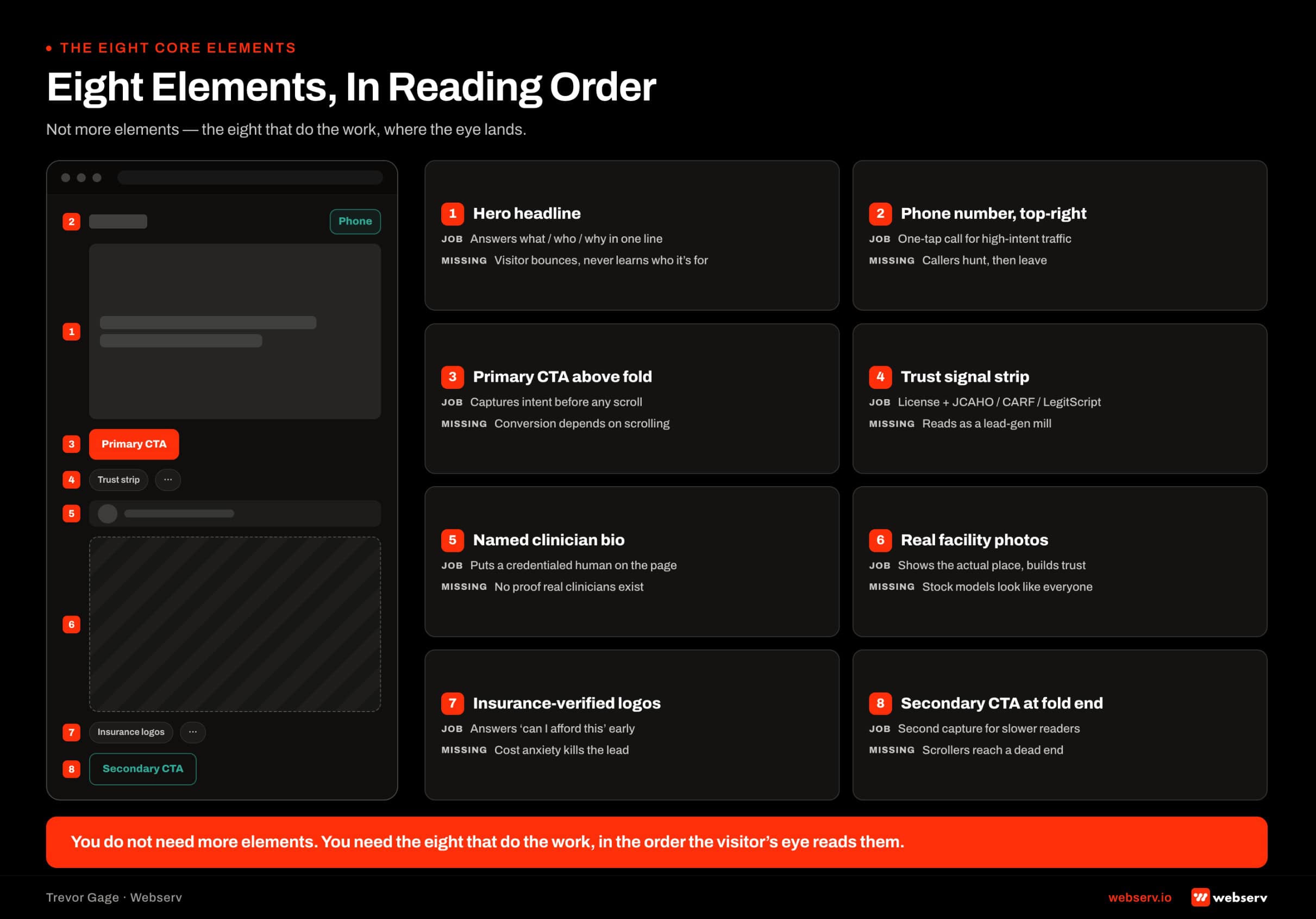 Wireframe of a treatment center landing page showing the eight core elements in reading order and labeled: hero headline that answers what and who, top-right phone number.
Family vs Prospect Audience Design
Family members and prospects read landing pages differently. Both audiences are valid. The design has to serve both without collapsing them into one audience.
Family audience patterns. Family members researching treatment for a loved one arrive at landing pages in a specific decision state. Sleep-deprived. Emotional. Time-pressured. Skeptical of anything that looks like advertising. Trust signals dominate the family audience’s evaluation.
Accreditation badges, named clinical staff, real facility photography, and third-party reviews all shift the family audience’s evaluation from “is this real” to “is this the right facility.”
Landing pages designed for family audiences emphasize reassurance, credentials, and privacy. The insurance question is usually a family member question because the family is often the primary payer or the person navigating benefits.
Family-audience CTAs work well when they emphasize the conversation (“Speak With Our Admissions Team”) rather than the transaction.
Prospect audience patterns. Prospects (the person entering treatment) read landing pages with a different set of concerns. Privacy. Speed. Not being judged. Not having to explain themselves. Prospect-audience CTAs work well when they emphasize direct action (“Get Confidential Help Now”) and de-emphasize the conversation dynamic.
Prospects are also usually mobile-first at a different level of intensity than family audiences. Late-night research on a phone in a private moment is a common prospect pattern. The mobile experience matters more for prospects than for family audiences that might be researching on a laptop with the family present.
The dual-audience design decision. Most treatment center landing pages serve both audiences without segmenting. That is often the right call because segmenting requires more traffic to run properly and most facilities do not have the paid media volume to support A/B tested audience segmentation.
The dual-audience pattern uses hero copy that speaks to both (“Confidential Detox for Adults in California”) while the trust signals and social proof do the reassurance work family audiences need. The CTA language stays flexible enough for either audience to click.
Facilities with materially higher volume can segment landing pages by audience (family LP vs prospect LP) and run each against its own ad audience. This is a Paid CRO optimization decision more than a design decision. The design work supports either architecture.
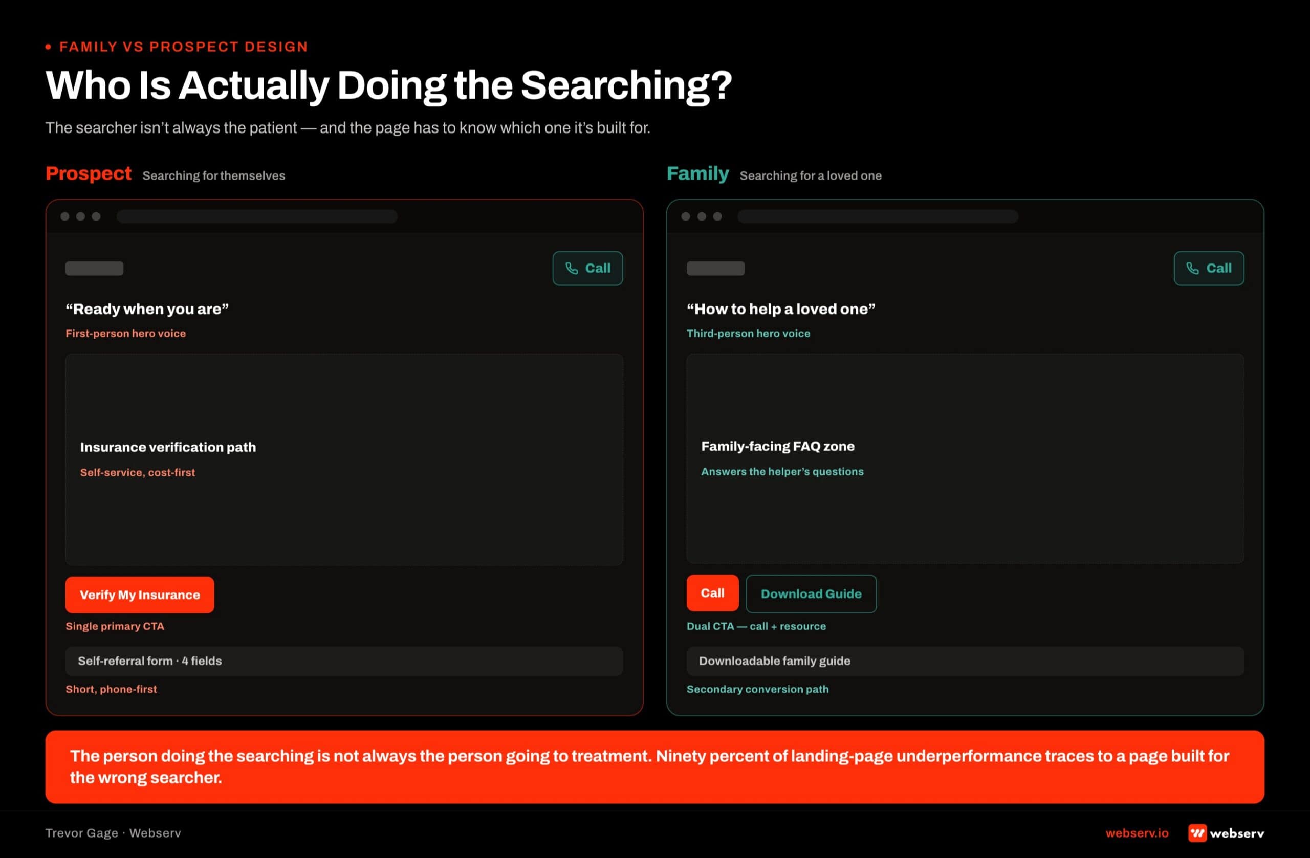 Side-by-side wireframe comparison of treatment center landing pages designed for prospect versus family audiences: prospect page uses first-person hero, single primary call CTA, prominent phone number, insurance verification path.
Compliance in Landing Page Design
Landing page compliance is not different from website compliance in principle. It is different in enforcement intensity. LegitScript audits landing pages the same way it audits the primary website.
HIPAA rules govern forms and analytics on landing pages the same way they govern forms on the main site. WCAG accessibility standards apply to every URL the facility runs.
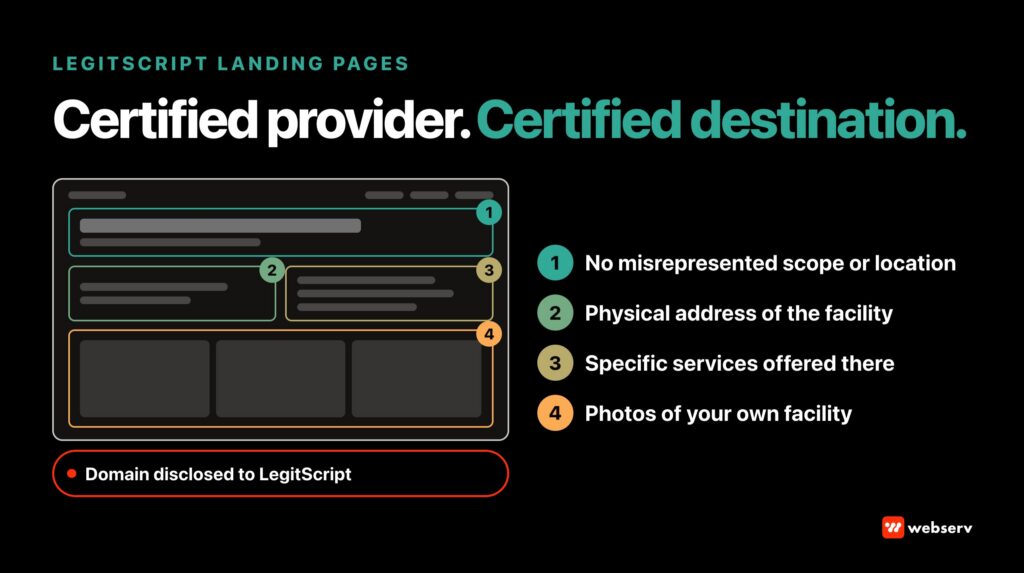
LegitScript on landing pages. Testimonials with outcome claims. Before-and-after imagery. Celebrity endorsements without documented consent. Deceptive claims about services the facility does not deliver. All of these produce LegitScript exposure on landing pages the same way they produce exposure on the main site.
The additional landing page vector: landing pages often live on subdomain URLs or campaign-specific URLs. Facilities that treat these URLs as “outside” the LegitScript audit surface routinely find that the audit includes every URL under the facility’s control.
Design against LegitScript rules from day one on every landing page, not just the primary site.
HIPAA on landing pages. Every form that captures prospect information touches PHI. Insurance verification forms, contact forms, and chat transcripts on landing pages all need HIPAA-compliant handling. This includes the specific analytics and tracking pixels running on the landing page.
HHS Office for Civil Rights guidance on HIPAA and online tracking applies to landing pages in the same way it applies to primary website pages (HHS OCR, HIPAA and Online Tracking Technologies). Meta Pixel, Google Analytics, and other tracking scripts on landing pages that touch PHI require HIPAA-aware configuration.
WCAG on landing pages. Accessibility standards apply to landing pages. ADA Title III lawsuits against healthcare websites include landing pages when the same URL is discoverable and used commercially.
Contrast ratios, keyboard navigation, alt text, and screen reader compatibility all need to hold on landing pages the same way they hold on the main site.
OPERATOR INSIGHT
Paid LPs and organic content need separate URL strategies. Paid LPs are conversion machines with focused message match, aggressive CTAs, and typically thin content by design. Google penalizes those characteristics in organic ranking. Noindex your paid LPs and let your organic pages carry the ranking load; both jobs get done better.
Noindex Is the Default for Paid Landing Pages
Webserv’s operational default is noindex on paid media landing pages. This is a specific operational decision worth explaining.
Why noindex. Paid media landing pages are single-purpose conversion surfaces designed for specific campaigns. Organic search indexing of these pages usually produces one of three bad outcomes. Duplicate content issues with the main website.
Ranking dilution across the site’s topical authority. Or organic traffic landing on pages designed for a specific paid audience, producing conversion patterns the main site would not produce.
Noindex tells search engines to skip the landing page in organic indexing while still allowing paid traffic to load the page normally. The paid campaign runs unaffected. The organic ranking of the main site stays clean. The landing page does its conversion job without dragging on the broader SEO strategy.
Exceptions to noindex. Some landing pages are genuinely designed to rank organically (location pages, service pages that also serve as landing pages, resource pages). These should not be noindexed because organic indexing is part of their intended function.
The distinction is whether the page is designed for a specific paid audience versus designed for general search discovery.
Communicating the noindex. Facilities running paid media should communicate the noindex default to any agency working on the landing pages. Some agencies default to indexing landing pages and treat noindex as a special request. Webserv treats noindex as the default; indexing is the special request that requires a specific reason.
The Paid CRO capability walks the fuller decision framework for landing page indexing, testing, and optimization. This design piece covers only the design decisions that surround the noindex default.
Photography and Visual Design for Landing Pages
Photography direction on landing pages follows the same principles as the primary website with some landing-page-specific tightening.
Real facility photography beats stock imagery. Family audiences pattern-match stock imagery to every other treatment center they have researched. Real photography of the actual facility differentiates the landing page from the category. Even imperfect real photography beats polished stock imagery on every conversion measure worth tracking.
Hero imagery is single-frame heavier. Website pages can carry multiple hero patterns across pages. Landing pages have one hero and it has to do all the work. The hero image is often the highest-impact design decision on the whole landing page.
Lifestyle over clinical. Landing pages usually convert better on lifestyle imagery (dining, recreation, common spaces, grounds) than clinical imagery (therapy rooms, medical offices, clinical equipment). Family audiences want to know the facility feels safe and human. Clinical imagery can read as institutional in the six-second first impression.
Visual hierarchy that supports the CTA. The hero image should not compete with the CTA. Composition, color, and contrast decisions on the hero should draw the eye toward the primary CTA button, not away from it.
Landing pages where the hero image visually dominates the CTA typically underperform landing pages where the visual hierarchy supports the conversion action.
COMMON MISTAKE
Using the homepage as a landing page. Homepages carry navigation, footer clutter, and a broad audience assumption. Ad traffic needs a page designed for one intent, with one hero, one CTA path, and no exits. Point paid campaigns at the homepage and cost per admit will disappoint even with strong creative upstream.
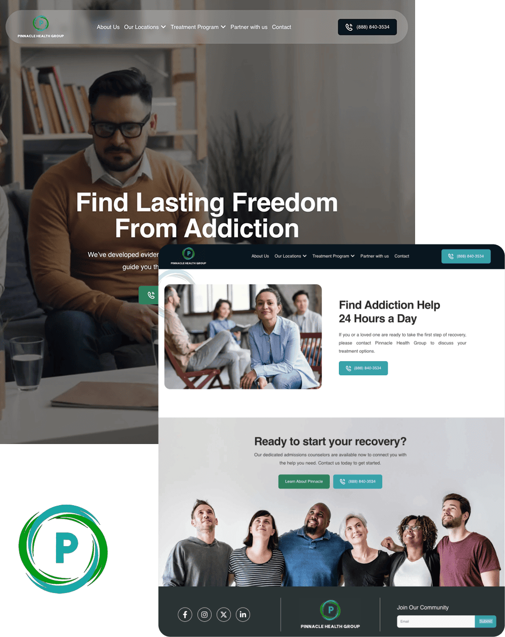
A unified platform built for multiple locations, programs, and audiences without feeling fragmented
- Reorganized multi-service site architecture
- ADA compliant responsive design system
- Future-ready CMS with modular templates
- Optimized for SEO and lead capture
Common Landing Page Design Mistakes
Five design mistakes we see repeatedly on landing page audits.
Homepage-as-landing-page. The facility runs paid media traffic to their homepage instead of a dedicated landing page. Conversion drops 40 to 60 percent versus a properly aligned landing page because the homepage is designed for broad audiences, not the specific audience the ad selected for.
Ad-message mismatch. The ad promised “insurance-verified admissions in 24 hours” but the landing page pivots to “compassionate care since 1998” without reinforcing the ad promise in the hero. Family and prospect audiences click back within seconds of a mismatch.
Too many CTAs. The landing page has three or four different conversion actions (phone, form, chat, download). Attention splits across all of them and none convert well. Landing pages need one primary CTA with maybe one secondary. Anything else fragments attention.
Full navigation menu on the landing page. The landing page carries the same full navigation as the main website, giving visitors dozens of exit paths from the conversion surface.
Landing pages should have minimal navigation (usually just the logo, phone number, and primary CTA) to keep attention on the single conversion action.
Slow mobile load. Paid media on mobile networks with variable connections punishes slow landing pages hard. Every second of load time costs conversion. Landing pages that load in 4+ seconds on mobile 4G typically lose 30 to 50 percent of the mobile traffic before the page becomes interactive.
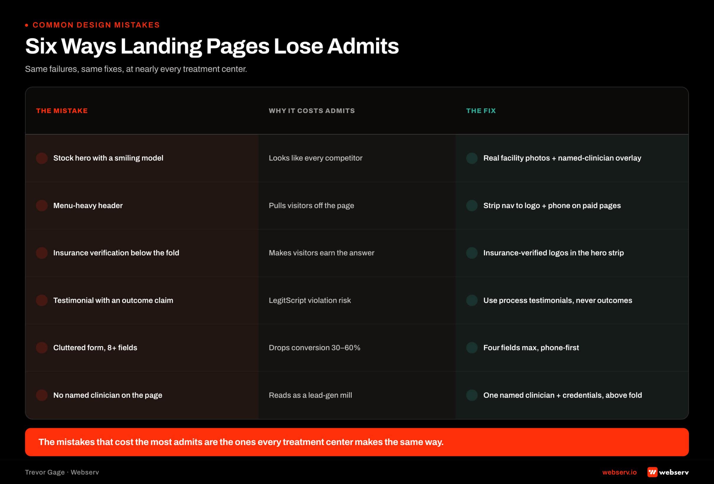 Six-mistake grid for treatment center landing page design showing common failures and fixes: stock hero imagery replaced with real facility photography, menu-heavy headers stripped to logo and phone.
What a Webserv Engagement Looks Like
Webserv’s landing page design work runs inside the Performance Creative capability. Landing pages sit alongside Web Design, Web Development, and Ad Creative as one of the four sub-practices.
Discovery phase. Audit of current landing pages and paid media campaigns. Ad-message alignment review. Trust signal inventory. Compliance audit against LegitScript, HIPAA, and WCAG. Conversion path mapping.
Design phase. Wireframes for each landing page template. Ad-to-page message alignment mapping. Visual design system. Photography direction (real facility beats stock). Trust signal placement decisions. Mobile-first layout decisions.
Development phase. Landing page build. HIPAA-compliant form and analytics stack. CallRail or CallTrackingMetrics dynamic number insertion. Noindex meta configuration. Accessibility QA against WCAG standards.
Launch and optimization. Post-launch analytics and A/B testing runs inside Paid CRO as a separate discipline. This design engagement scopes the initial launch. Ongoing optimization is a separate retainer scope.
Pricing depends on landing page count and campaign complexity. Single-page engagements typically run $3,000 to $8,000. Multi-page campaign builds run $8,000 to $25,000. The Fast-Track Diagnostic ($3,000, credited toward the first month if you engage) is the low-friction entry to scope the specific work.
Most in-house teams hit a wall not because they lack knowledge, but because they lack bandwidth.
When you are ready to hand it off, Webserv has spent 9 years executing exactly this for treatment centers nationwide.
Frequently Asked Questions
What makes treatment center landing page design different from regular landing page design?
Three structural differences. Family-mediated decision-making means the design has to serve two audiences (family and prospect) in the same six-second first impression. LegitScript compliance overlays specific rules on testimonials, imagery, outcome claims, and disclosure that generalist landing page designers do not know.
And the specific insurance verification friction that dominates the family research pattern shapes the CTA and trust-signal architecture.
Treatment center landing page design also carries higher stakes than most other verticals. The prospect’s decision has clinical and mortality consequences. Design decisions that exploit desperation or hide friction can produce admits that complete treatment at lower rates than admits from ethical landing pages.
The result is a design brief with more constraints than general healthcare landing pages and a higher trust-signal density requirement. Generalist agencies routinely miss these vertical-specific decisions.
Should I have one landing page or multiple landing pages for my facility?
Multiple, aligned to your paid media campaigns. Each major campaign (level of care, location, insurance carrier, clinical modality) should have its own landing page that aligns with the specific ad message driving the traffic.
Sending all paid traffic to a single generic landing page usually underperforms dedicated campaign-aligned pages by 40 to 60 percent.
The minimum landing page count for a treatment center running paid media is usually 4 to 8 pages. One per level of care (detox, residential, PHP, IOP), one per major insurance carrier where applicable, and one per major clinical modality if the facility runs modality-specific campaigns.
Larger facilities and multi-location operators can scale to 15 to 30 landing pages depending on campaign structure. Each additional landing page has ongoing maintenance cost, so the count should match the paid media strategy rather than expanding for its own sake.
Where should the phone number go on a treatment center landing page?
Top of the header on desktop. Prominent in the mobile header with tap-to-call formatting. Sticky mobile header so the phone number stays visible as the visitor scrolls. A dedicated tracking phone number (via CallRail or CallTrackingMetrics) for campaign attribution.
The phone number is the primary conversion action for most treatment center landing pages. Design decisions that hide, minimize, or de-emphasize the phone number sacrifice conversion for aesthetics. Every landing page audit we run surfaces at least one facility where the phone number is buried below the fold on mobile.
The Phone-First vs Form-First landing page framework walks the deeper tactical decision on which conversion pattern fits which campaign type. Both patterns require prominent phone number placement.
Should treatment center landing pages be indexed by Google?
No. Noindex is the default for paid media landing pages. Organic indexing of paid landing pages usually produces duplicate content issues, ranking dilution across the site’s topical authority, or organic traffic landing on pages designed for specific paid audiences.
Exceptions exist for landing pages that are genuinely designed to rank organically (location pages, service pages that also serve as landing pages, resource pages). These should not be noindexed because organic indexing is part of their intended function.
The distinction is whether the page is designed for a specific paid audience or designed for general search discovery. Paid audiences get noindex. Search audiences get indexed. Both are legitimate design patterns for different purposes.
What trust signals should a treatment center landing page include?
Accreditation badges (Joint Commission, CARF, LegitScript, state licensing) above or immediately below the fold. Insurance carrier logos for the specific carriers the facility works with. Named clinical credentials (medical director, clinical director) with photos where possible.
Third-party review scores (Google, Yelp) prominently displayed. Brief social proof (alumni counts, years in operation, families served).
The pattern that works: family audiences read trust signals as safety signals in the first six seconds. Landing pages that surface accreditations, insurance transparency, and clinical credentials above the fold consistently outperform landing pages that bury these signals in the footer.
Testimonials belong on landing pages but require LegitScript-compliant framing (experience quality rather than outcome claims) and documented consent. Third-party reviews usually carry more trust weight than curated on-page testimonials and should be surfaced first.
How much does a treatment center landing page design cost?
Single-page engagements typically run $3,000 to $8,000. Multi-page campaign builds run $8,000 to $25,000 depending on landing page count, custom design work versus template adaptation, and integration with call tracking and CRM stack.
The cost variance is driven by landing page count, custom design depth, photography and content production, integration surface (CRM, EMR, call tracking, contact forms), and any compliance remediation the current landing pages require.
Facilities budgeting landing page design should also model ongoing costs. A/B testing, conversion rate optimization, and periodic design refreshes as campaigns evolve. Landing pages are operational assets, not one-time projects, and the design engagement is typically the first phase of a longer conversion-optimization relationship.
Do I need separate landing pages for family audiences versus prospect audiences?
Not for most facilities. Segmenting landing pages by audience requires paid media volume that most facilities do not have to run properly. A single well-designed landing page that serves both audiences (family trust signals plus prospect-friendly conversion actions) usually outperforms two segmented landing pages that each run on lower volume.
Larger facilities and enterprise portfolios with high monthly paid media budgets can support audience segmentation. Family-audience landing pages emphasize reassurance and credentials. Prospect-audience landing pages emphasize privacy and speed. Each targets a specific ad audience that the facility can segment cleanly.
The break-even point for audience segmentation is usually around 300+ leads per month from paid media. Below that threshold, the segmentation math does not support two landing pages producing better conversion than one well-designed dual-audience page.
Closing
Treatment center landing page design is a specific discipline distinct from website page design and distinct from generalist landing page design. Family-mediated decision-making, LegitScript compliance, insurance verification friction, and mobile-first behavior all change the design brief in ways generalist agencies routinely miss.
The eight core elements are knowable. The audience decisions are workable. The compliance overlays are learnable. What separates a landing page that drives admits from a landing page that just looks good is whether the design was built for this specific vertical’s constraints from day one.
If you are evaluating landing page design for a new campaign, auditing existing landing pages, or working with an agency you suspect is not vertical-native, start with the $3,000 Fast-Track Diagnostic. Two-week audit, credited 100 percent toward the first month if you engage.
Trevor Gage is the Director of Marketing at Webserv, where he leads content and SEO for the agency’s behavioral health and addiction treatment clients. He writes about the operator lens on rehab marketing at the Webserv blog.