MARKETING AGENCY FOR REHABS
Performance Marketing for Rehabs that fills beds not dashboards.
Turn spend into admissions with proven digital marketing strategies for treatment centers.

Trusted by 200+ Treatment centers nationwide


The Rehab Marketing Agency behind real growth.
Most agencies measure success in clicks and impressions. We measure it in admits. Nine years building systems that fill beds for treatment centers like yours.
WHY WEBSERV
We don't just market. We help people get into treatment.
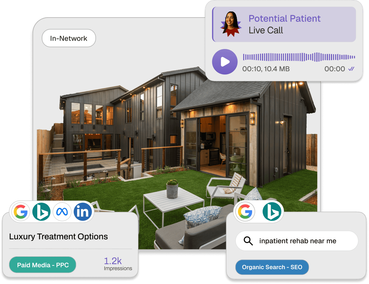
Most agencies hand off leads and disappear. We built the complete patient acquisition system. From paid media, organic content, website, and admissions operations into one system we integrate your strategy into one system that drives admits, not just traffic.
And, we’re building this with the community, not just for it.
This is Predictable Patients™, and it’s how we’ve helped 200+ treatment centers build sustainable growth.
We don't dabble in healthcare. We don't serve other industries. We work exclusively with addiction treatment and mental health facilities. Your team will understand ASAM levels, payer mix challenges, state regulations, and the pressure of maintaining census while delivering quality care.
Most agencies optimize for traffic and form fills. We optimize for approved VOBs and admits. We track every lead from first click through insurance verification to admission. If a campaign drives traffic but doesn't fill beds, we kill it—even if the metrics look great.
We don't just hand off leads. We work inside your CRM, admissions workflows, and call tracking systems. We help you score leads by insurance viability, route high-intent calls to the right staff, and eliminate friction in your VOB process.
We build attribution systems that connect every admit back to the campaign, keyword, or content piece that started the journey. You'll know your cost-per-admit by channel, VOB approval rates by source, and exactly where to scale or cut spend.
COMPLETE PATIENT ACQUISITION
Full-funnel marketing services built for Rehabs
We don’t just run ads. We build the complete system: your website, paid media, SEO, CRM, and admissions operations all working together to turn patient demand into predictable growth.
Organic Admissions
Build sustainable, long-term patient acquisition through search visibility and content authority.
Paid Admissions
Drive immediate results with targeted advertising and optimized conversion experiences.
Admission Ops
Streamline your admissions process with data-driven operations and conversion tracking.
How an Inpatient Rehab Scaled Paid Media to 95 Admits in One Quarter
Learn how an Inpatient Rehab reduced cost per admission by 24% while driving 30% more admits through campaign consolidation, PMAX optimization, and strategic budget reallocation.
Read Their StoryAdmits from Paid Media
How Southern California Sunrise scaled organic conversions
Learn how Southern California Sunrise grew with intent-driven topical authority to scale traffic and optimize conversion paths.
Read Their StoryAdmissions from SEO
How Profound Scaled Google Ads to 31 Admits in One Quarter
Learn how Profound Treatment reduced cost per viable by 42% while scaling paid search volume through match type optimization and regional targeting refinements.
Read Their StoryIncrease in Conversions
Real Admissions Infrastructure Creates Real Results
When workflows, tracking, and team enablement work together, conversion rates don't just improve. They multiply.
Paid Media Close Rate
THE DIFFERENCE
Generalists hand off leads. We build Admissions engines.
The difference between traffic and admits is systems. We’ve spent nearly a decade perfecting the systems, workflows, and strategies that turn patient demand into predictable admissions growth.
THE PROBLEM
Most Agencies
Optimize for clicks, impressions, and form fills
Treat addiction treatment like any other industry
Hand off leads and disappear
Report on vanity metrics that don't fill beds
Can't track from ad click to final admission
Work across dozens of industries with no depth
OUR APPROACH
Webserv
Optimize for approved VOBs and admits
Nine years exclusively in behavioral health
Build complete systems from ads to admissions
Report on cost per admit and patient acquisition
Track every lead from first click to final admission
Specialize exclusively in addiction treatment and mental health
THE DEFINITIVE GUIDE
Rehab Patient Acquisition: The Complete Guide
Everything a treatment center operator needs to know about building a predictable patient acquisition system — from paid media strategy to admissions operations.
WHAT'S COVERED
- How to build a full-funnel patient acquisition system
- Paid search & paid social strategy for treatment centers
- SEO and organic growth for rehabs
- Admissions operations & CRM setup
- Benchmarks, KPIs, and how to measure real ROI
- How to evaluate and hold your agency accountable
OUR MISSION
Built with the Community,
Not Just for It.
We’re not here to chase every industry trend or work with anyone who’ll pay. We chose behavioral health because we believe in the work treatment centers do. Every admit we help generate is a life changed. Every system we build helps a facility focus on what matters: getting people into treatment and keeping them there. This isn’t just marketing to us, it’s meaningful.

Ready to fill beds consistently?
Let's Build your Patient Acquisition System
30-minute strategy session to discuss your census goals, current challenges, and how we can help you scale admissions sustainably.
- 9 years exclusively serving behavioral health
- Helped clients generate 2,000+ admits in 2025
- We'll create a custom roadmap for your facility
Trusted by 200+ Treatment centers nationwide


