A program we worked with two years ago had built its entire admit pipeline on a single Kaiser network contract. The pipeline was full. The center stopped paying for marketing because the beds were occupied every day.
Then they lost the network status. The pipeline went to zero overnight. The center almost had to close the doors and started doing their own billing in a panic.
That is payer concentration risk made visible. The full picture has more dimensions than concentration alone, but the lesson is the same.
Most centers cannot manage payer mix strategy in-house. Picking the right RCM partner, one that actually publishes payer-mix optimization data and reports on the revenue impact, is the single biggest lever on this metric.
Payer mix is the underlying portfolio question that determines whether everything else in the business works. Treat it as a back-office accounting summary and the rest of the admissions operation runs blind.
A program with the wrong payer mix is one network change away from a cash crisis. A program with the right payer mix can absorb a payer exit, ride out a rate change, and keep running.
The branded search campaign that produces high-LTV payer admits is more valuable than the paid social campaign with the same cost-per-admit and worse payer types.
Mitch Marowitz, Director of Paid Admissions, Webserv
This guide explains what payer mix actually is, why the dashboard version most operators see is incomplete, and how to read payer mix as the strategic input that drives marketing, admissions, and clinical scope decisions.
Key Takeaways
- Payer mix is the underlying portfolio question that determines whether the rest of the business works. The pie-chart version most operators see (which payer pays the most this quarter) answers the wrong question. The questions that matter are concentration, per-admit revenue variance, length-of-stay support, denial recovery, and stability.
- Concentration risk is the most expensive failure mode. A program with 80% of revenue from three payers is one network change away from a 25% revenue drop. A general guideline: no single payer should represent more than 30% of admits, and the top three payers combined should not exceed 60%.
- Different marketing channels produce different payer mixes. Branded search produces admits weighted toward stronger commercial coverage. Paid social often produces admits weighted toward state exchange plans with lower per-admit reimbursement. Optimizing on cost-per-admit alone subsidizes the wrong channels.
- Payer mix is a strategic input, not a quarterly report. Marketing teams that build payer-mix-aware reports (cost per collected dollar by channel and payer type) rebalance investment toward what is actually producing return. Payer mix design precedes the marketing question.
What payer mix actually is
Payer mix is the breakdown of where a treatment center’s revenue comes from across its insurance partners.
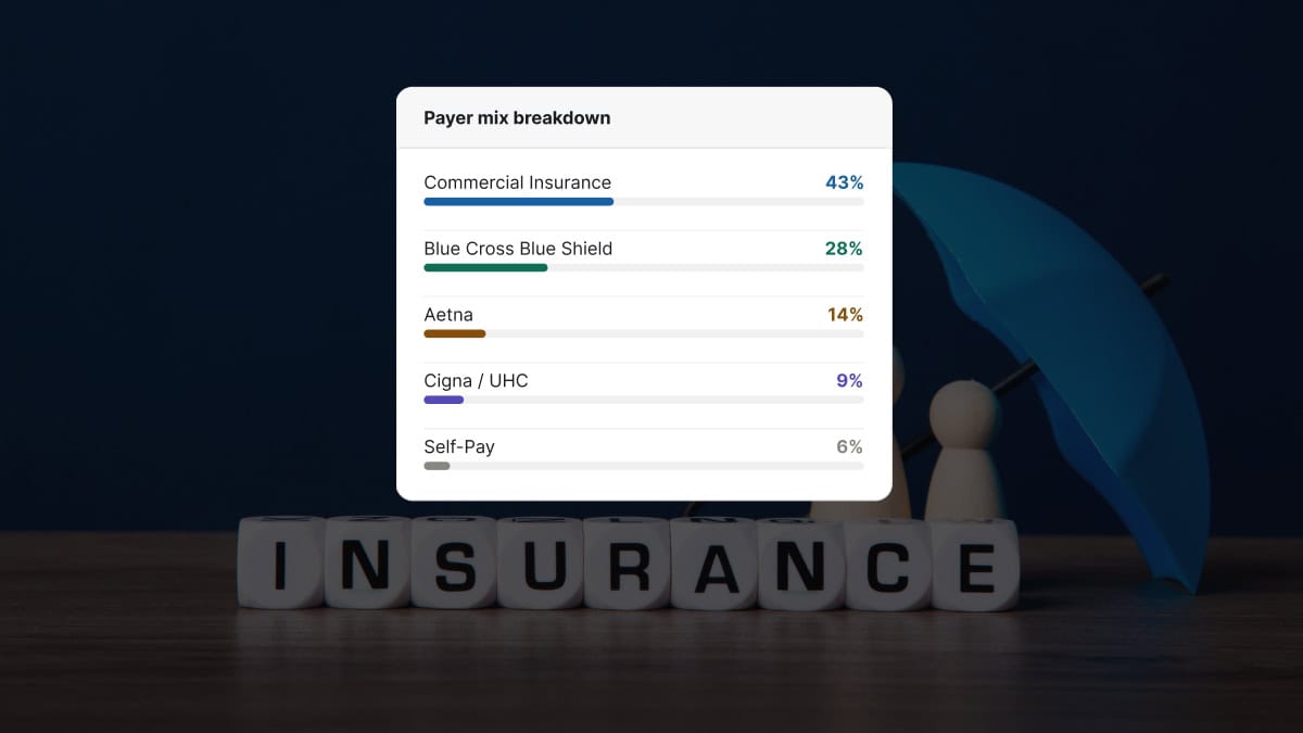
The simplest version is a pie chart. 30% Blue Cross Blue Shield. 25% Cigna. 20% Aetna. 15% UnitedHealthcare. 10% other.
That version answers one question: which payer is paying us the most this quarter?
That is not the question that matters.
The questions that actually matter for the operation are whether the payer mix is concentrated, whether it is stable, whether the per-admit reimbursement is competitive, whether the audit risk profile is manageable, and whether the marketing channels are producing the payer types the program wants more of. A serious verification of benefits workflow surfaces some of these dimensions at intake; payer mix analysis surfaces them at the portfolio level.
A pie chart cannot answer any of those.
Five dimensions of a real payer mix analysis
Most treatment center owners only see the pie chart. The five dimensions below are what a billing operation that takes payer mix seriously is tracking on every program.
1. Concentration. What share of revenue comes from the top three payers? A program with 80% of revenue from three payers is one network change away from a 25% revenue drop. A program with 80% spread across ten payers can absorb the loss of any one of them.
2. Per-admit revenue. Different payers reimburse at different rates for the same level of care. A Cigna MRC1 admit and a Cigna MRC2 admit and a BCBS PPO admit can produce three different revenue numbers for the same 28-day continuum. The pie chart says they are all equal weight. They are not. Strong insurance verification captures the per-admit reimbursement variance before admission, which lets admissions calibrate intake against the right numbers.
3. Length-of-stay support. Some payers approve full residential at 14 days routinely. Others compress most authorizations to 7 days. A payer that pays 30% more per day but caps stays at 50% of typical may produce less total revenue per admit than a payer with average rates and full lengths of stay.
4. Denial recovery rate. A payer that denies 15% of claims and pays 85% on first appeal is not the same partner as a payer that denies 10% and pays 30% on appeal. The pie chart treats them as identical. The cash position of the program does not. Tracking denial recovery rate by payer is the report that drives operational improvement.
5. Payer stability. Magellan exited the marketplace last year. Blue Cross Blue Shield of Maine deleted 14,000 policies after discovering out-of-state exchange fraud. UnitedHealthcare quietly updated its accepted code set without notice. Mental health parity rules are supposed to prevent payer-side compression of BH coverage relative to physical health, but enforcement gaps mean payers still apply quiet rules that affect BH claims more aggressively. A payer that paid reliably for years can become a problem inside a quarter.
A program that monitors all five dimensions has an actual payer mix strategy. A program that only sees the pie chart is reading a snapshot from last quarter.
Concentration risk: the most expensive failure mode
COSTLIEST MISTAKE
A treatment center running 60% of admits on a single regional BCBS plan is one prior-auth policy change away from losing 60% of its forecast in a single quarter. The plan does not have to leave the network. It only has to tighten prior auth criteria, drop the facility from its preferred provider list, or reset its reimbursement schedule at the annual contract renewal. A working guideline: no single payer above 30% of admits, and the top three combined below 60%. Programs that ignore this are running a marketing plan on top of a revenue plan the CFO already knows will not hold.
The Kaiser-dependent program is one example. The pattern shows up across the industry.
A treatment center on the East Coast runs 60% of its admits on a single regional BCBS plan. The plan is profitable. The reimbursement is reliable. The center has stopped pursuing other payer relationships because the current setup is working.
When that BCBS plan changes its prior auth criteria, or its preferred provider list, or its reimbursement schedule, the program loses 60% of its forecast in a single quarter.
The remedy is not to abandon the strong payer relationship. The remedy is to deliberately build secondary payer relationships that can absorb a primary disruption without taking the program down.
A general guideline: no payer should represent more than 30% of admits, and the top three payers combined should not exceed 60% of admits.
Programs that operate above those thresholds are running on a single point of failure.
How payer mix changes faster than operators think
The pie chart from 12 months ago is not the pie chart today. Three forces shift payer mix outside operator control.
The first is payer-level structural change. Magellan exited the marketplace last year and stopped paying altogether for the programs that had built around them. Some Blue Cross plans periodically purge or restructure their out-of-state exchange policies, removing entire segments of admits from the eligible pool. Federal parity programs can also drive coverage changes at the state level that ripple through commercial plans.
The second is payer-level rule change. UnitedHealthcare’s accepted code set updates produce silent revenue declines for billing operations that do not catch the change quickly. Cigna’s medical necessity criteria shifts compress lengths of stay across an entire panel of patients without any single denial being unusual. A utilization review team that has worked the same payer for years catches these shifts faster than one that does not.
The third is regional regulatory shift. State exchange plans get re-priced annually. State licensing boards change documentation requirements. State Medicaid programs adjust covered services and provider eligibility.
Programs that monitor payer mix monthly catch these shifts inside a quarter. Programs that look at payer mix annually find out about them after a measurable revenue drop.
The numbers agencies quote you mean very different things depending on payer mix.
Before you benchmark your performance or compare quotes from other agencies, read this. Real data from real OON treatment center campaigns with no cherry-picked numbers.
Read the report → Free and ungatedThe marketing implication most centers miss
This is the part of the conversation that does not happen between billing and marketing teams often enough.
Different marketing channels produce different payer mixes.
Branded search produces admits weighted toward operators who already know the program and have higher-quality coverage. Paid social often produces admits weighted toward state exchange plans with lower per-admit reimbursement. Direct mail in a specific zip code produces admits with the payer mix of that zip code.
A center optimizing marketing on cost-per-admit alone is treating all of those channels as equal value. They are not.
The right framing is cost per collected dollar, calibrated by channel and payer type.
The branded search admit at $4,000 cost-per-admit on a $50,000 lifetime collected is a stronger marketing program than the paid social admit at $3,000 cost-per-admit on a $25,000 lifetime collected.
Marketing teams that build payer-mix-aware reports can rebalance channel investment toward what is actually producing return. Marketing teams that work from cost-per-admit alone are subsidizing the wrong channels every quarter. The right marketing partner for a treatment center should produce these reports without being asked.
This is also where the connection to admissions becomes operational. The admissions team sees the payer types coming in by channel before the billing report shows up. Sharing that data weekly between marketing, admissions, and billing is the cycle that compounds over a quarter.
What this means for revenue strategy
THE DATA UNDERNEATH THIS
Rate-weighted payer mix design is only as good as the rate data you plug in. For the reimbursement half of the calculation, PayerLenz publishes benchmarks from 29,000+ adjudicated behavioral health claims across 260+ payer groups and 19 states, with each row scored for confidence. That is the input a payer mix model needs before it can tell you which payers to court and which to phase out.
Treatment center revenue strategy starts with payer mix design. That order matters. The broader revenue cycle architecture flows from this single decision.
Before a program decides what marketing to invest in, what services to expand, or what referral relationships to build, the question is which payer types fit the clinical model, the geographic market, and the cash flow needs of the business.
A luxury residential program targeting working professionals needs a payer mix weighted toward strong commercial PPOs with full residential coverage. A community-based IOP serving a regional market needs a different payer mix entirely.
The payer mix question precedes the marketing question. Marketing then targets channels and audiences that produce the right payer types. Admissions calibrates intake to admit the right payer types preferentially when bed scarcity forces a choice. Billing maintains the right relationships and operational standards for the targeted payer types, including a tight verification of benefits loop that catches payer changes early.
When all of those layers are aligned, payer mix becomes a strategic asset rather than a quarterly accounting summary.
When they are not aligned, the operation is running on whatever payer mix happens to walk through the door, which means the revenue strategy is whatever the local market happens to produce.
What to ask your billing partner this quarter
Three questions surface whether a billing partner is treating payer mix as strategy or as a report.
First, ask for the concentration analysis. What share of last quarter’s revenue came from the top three payers? If the answer is over 60%, the conversation about diversification is overdue.
Second, ask for per-admit revenue by payer for the last 90 days.
The blended pie chart will hide a 30% to 50% reimbursement variance across payers in the same panel. The detailed view shows where the program is actually earning, and where it is treating the wrong patients at scale.
Third, ask which payers in the current mix have made structural changes in the last 12 months. Network changes. Code-set updates. Provider eligibility revisions. A billing partner that cannot answer is not monitoring the mix at the level the program needs.
Payer mix is the foundation of the revenue strategy. Most treatment centers operate on a snapshot of it from last quarter. The programs that treat it as a live portfolio are the ones still growing when the next payer change hits.
Frequently asked questions about treatment center payer mix
What is an ideal payer mix for a residential treatment center?
There is no universal ideal. The right payer mix depends on the facility’s contract footprint, geographic market, level of care portfolio, and revenue strategy. A defensible heuristic is no single payer above 30 percent of revenue, with the top 3 payers accounting for no more than 60 percent. Beyond that, concentration risk dominates strategy decisions.
For most residential programs, a healthy mix is 40 to 60 percent commercial PPO, 15 to 30 percent commercial HMO, 10 to 20 percent Medicaid managed care, and 5 to 15 percent self-pay or single-case agreement. The variability reflects market conditions and facility positioning, but the diversification principle holds across structures.
What changes the calculation is contract quality. A program with strong rates on one payer can tolerate higher concentration on that payer because the per-admit economics justify the risk. A program with weak rates across the book needs aggressive diversification to protect against single-payer revenue swings.
How often should we re-evaluate our payer mix?
Quarterly at minimum. Payer mix shifts faster than most operators expect. New employer contracts shift commercial allocation. Medicaid expansion or contraction changes the public payer book. Single-case agreement renewals or terminations can shift OON exposure in weeks. A quarterly review catches the drift before it becomes a structural problem.
The quarterly review covers four things: actual mix versus target mix by payer, average reimbursement rate per admit by payer, denial rate by payer, and concentration trend over the prior 4 quarters. Each metric tells part of the story. Tracking them together produces actionable revenue intelligence.
Programs that re-evaluate annually or less frequently usually miss the early signals of a payer concentration problem until it has already affected revenue. The cost of fixing the problem after it materializes is much higher than the cost of catching it in the early shift.
Can we change our payer mix once we are established?
Yes, deliberately. Payer mix is partially shaped by which contracts you accept, which insurance is most common in your service area, and which payers your marketing emphasizes. All three are levers a treatment center can pull, though each operates on a different timeline.
Contract negotiation typically produces mix changes within 6 to 12 months. Service area expansion (new locations, new state licensing) produces mix changes within 12 to 24 months. Marketing emphasis (which insurance carriers your campaigns highlight, which payer-specific landing pages you build) produces mix changes within 3 to 9 months.
The fastest meaningful lever is usually marketing emphasis. Programs that explicitly market acceptance of underutilized payers in their book often shift mix 5 to 15 percent within two quarters. The work is concrete and the attribution is measurable.
Does payer mix vary by level of care?
Significantly. Detox usually has the highest concentration of commercial PPO because the acute clinical need overrides payer-shopping behavior. Residential follows detox patterns but with somewhat more Medicaid managed care representation. PHP and IOP typically have more diverse mixes including more Medicaid, more self-pay, and more variable commercial concentration.
The pattern matters operationally. A multi-level-of-care program needs different payer strategies for each level. Detox marketing emphasizes speed-to-admission and insurance breadth. Residential marketing emphasizes clinical depth and outcome positioning. PHP and IOP marketing often emphasizes flexibility and continuum of care.
Programs that run a single payer mix strategy across all levels of care typically underperform programs that segment the strategy. The work is more complex but the revenue impact justifies it.
How does payer mix affect our marketing budget allocation?
Marketing budget should follow payer mix economics, not just admit volume. If a particular payer category produces admits at a lower cost-per-admit but higher net revenue per admit, that payer category deserves a disproportionate share of marketing investment. Most treatment centers allocate budget proportionally to admit volume regardless of revenue contribution, which produces suboptimal returns.
The right allocation framework is to map each major payer to its current cost-per-admit, average net revenue per admit, denial rate, and contract stability. Multiply through to get net revenue per marketing dollar by payer. Allocate budget proportionally to that ratio.
Operators who run this analysis typically reallocate 20 to 40 percent of their marketing budget within the first quarter of seeing the data. The result is usually a 15 to 25 percent improvement in marketing-attributed net revenue against the same overall budget.
The perspective in this article comes from 9 years working exclusively inside behavioral health.
We are a team built by people in recovery who understand that behind every admission is someone asking for help. If that resonates, get to know us.
Kyle McHenry is the founder of Revenue Logic, a behavioral health revenue cycle management firm. He has spent 15 years working with treatment center operators on verification, utilization review, and claims management.