When we start a treatment center website project, the first question is usually “Can you show us sites that get it right?” This gallery is our answer: 14 real treatment center websites, each chosen because it shows one practice clearly.
None of them is perfect, and none is a Webserv client. We picked each for one thing it does well, from making the phone number impossible to miss to explaining insurance in plain language. We looked at every page live on November 10, 2026, on desktop and on a phone.
The mix is deliberate: large nonprofit systems alongside independent, privately insured programs closer in size to most of our readers.
Use it as a reference when you brief a designer or review your own site. It’s part of how we approach website design for treatment centers.
Key Takeaways
- The examples are grouped by seven practices: the call path, levels of care, insurance, real photography, named clinicians, accreditation, and the admissions process.
- The strongest sites make the next step obvious on a phone, not only on a desktop.
- Plain language about insurance and cost builds more trust than logos and promises.
- Real photos of real facilities and named clinicians with credentials answer the question families are really asking: is this place legitimate?
- Every site here has rough edges too. The point is to borrow the practice, not copy the site.
How we chose these examples
We started from practices that affect whether a family calls and whether that call is a good fit:
- Call path: the phone number and next step are obvious on desktop and mobile.
- Levels of care: programs are explained so a family can tell residential from PHP from IOP.
- Insurance: the coverage page explains what happens next, beyond listing accepted insurers.
- Real photography: the facility shown is the facility you’d attend.
- Named clinicians: leadership and clinical staff appear with names and credentials.
- Accreditation and licensing: credentials, such as Joint Commission or CARF accreditation, are visible and verifiable.
- Admissions process: a page explains what happens from first call to first day.
We included both large nonprofit systems and smaller for-profit programs that accept private insurance, drawn from operators listed on SAMHSA’s FindTreatment.gov.
We excluded current and former Webserv clients, facilities named in state or federal enforcement actions we found, and directories or referral sites. Each site appears once, under the practice it shows best. We describe what we saw, and we didn’t rank them.
COMMON MISTAKE
Copying a whole site you admire. A design that works for a 75-year-old nonprofit system won’t fit a 20-bed residential program. Pull the specific practice, such as how a site explains insurance, and build it into your own structure.
Call path: making the next step obvious
Mountainside Treatment Center (Connecticut, with New York and New Jersey locations)
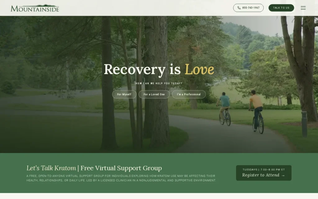
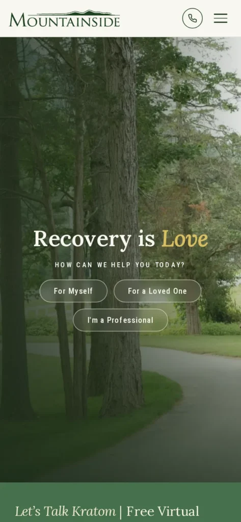
Mountainside’s header has a click-to-call “Talk to Us” button that opens options to call, text, chat, or send an inquiry. A strip above the homepage hero repeats the phone number with “Most major insurance accepted.” The homepage then splits visitors by who they are: “For Myself,” “For a Loved One,” and “I’m a Professional.”
What to borrow: offer more than one way to reach you, and route visitors by who they are.
Windmill Wellness Ranch (Texas)
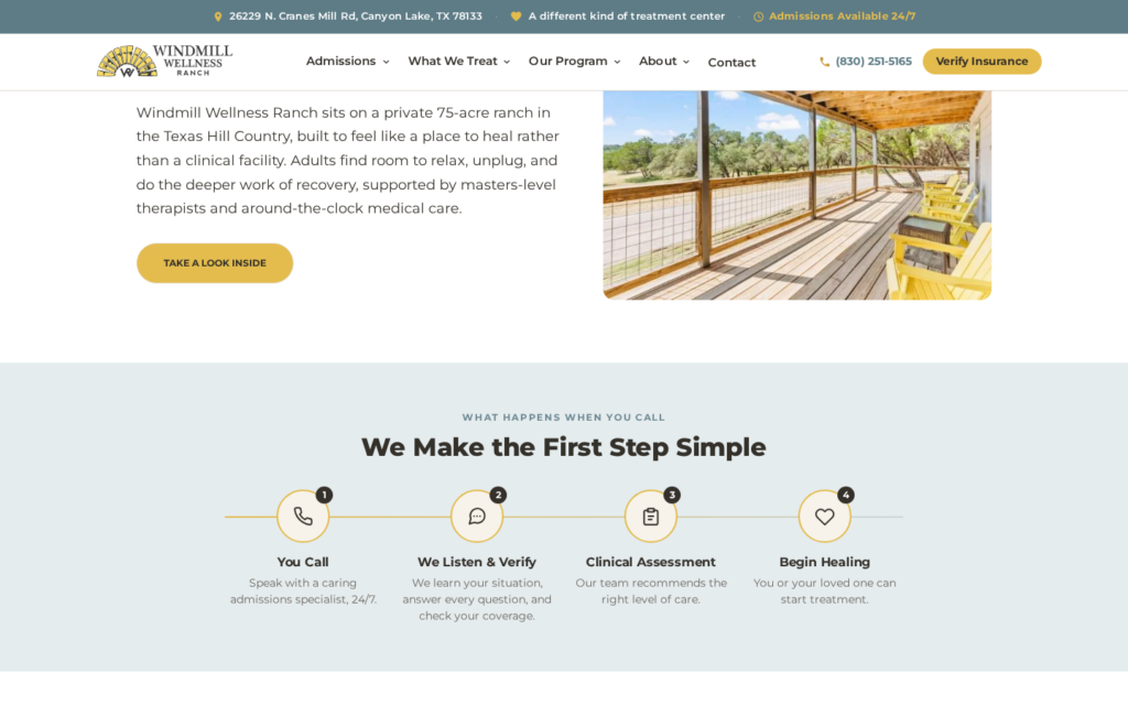
Windmill’s top bar offers “Call 24/7” and “Verify Insurance” on every page, next to a line saying admissions are available 24/7. The header phone number is click-to-call.
Below the hero, a “We Make the First Step Simple” section walks through what happens after you call in four steps, from the first conversation to the start of treatment.
What to borrow: tell callers what happens after they dial, not only the number to dial.
Levels of care: helping families understand the options
Rogers Behavioral Health (Wisconsin and multiple states)
Rogers’ levels of care page uses a simple graphic that runs from less intensive to more intensive: outpatient, IOP, PHP, residential, and inpatient. Each level has its own section with typical length and which locations offer it.
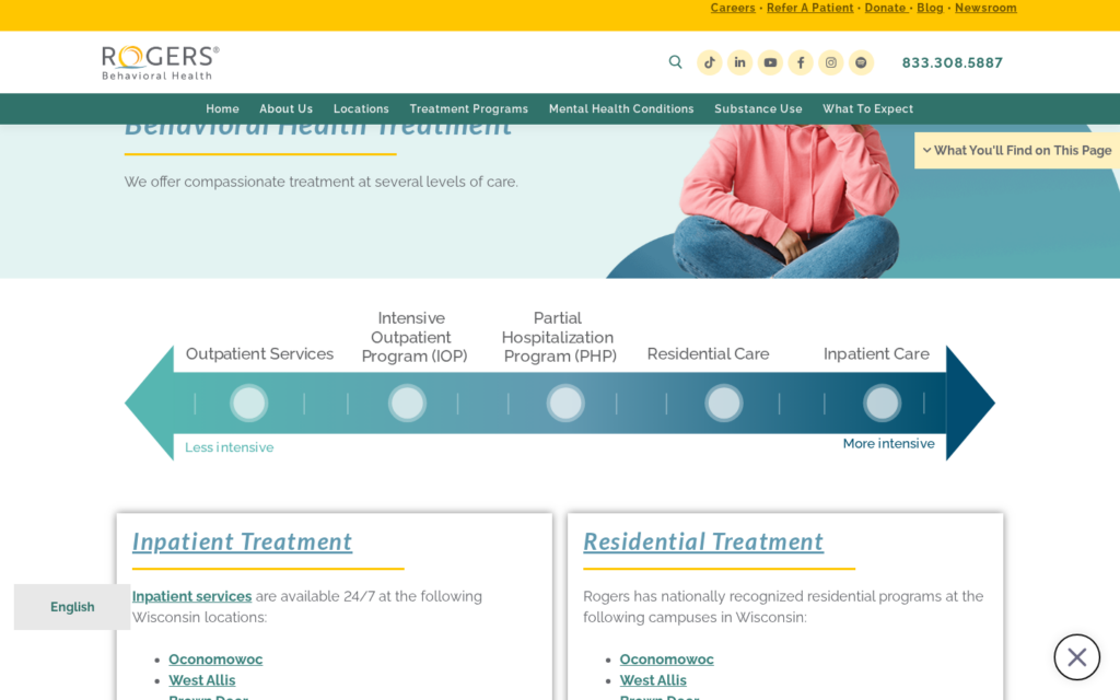
What to borrow: show levels of care as a path, with time commitments a family can plan around.
BNI Treatment Centers (California)
BNI, a teen treatment program, answers the question families ask on its homepage: “How is teen therapy different from residential and outpatient care?” It compares teen outpatient therapy, IOP, PHP, and residential care, with what each involves and who it fits, such as IOP running three to five days a week.
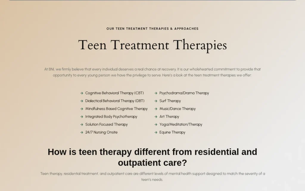
What to borrow: answer the comparison question directly, in the words families use.
Insurance: explaining coverage plainly
Caron Treatment Centers (Pennsylvania, with other locations)
Caron’s insurance page pairs a “Verify Your Coverage” form with in-network insurers listed separately for each campus. It states plainly which programs don’t accept Medicare or Medicaid, and its FAQs explain what to have ready, such as both sides of the insurance card.
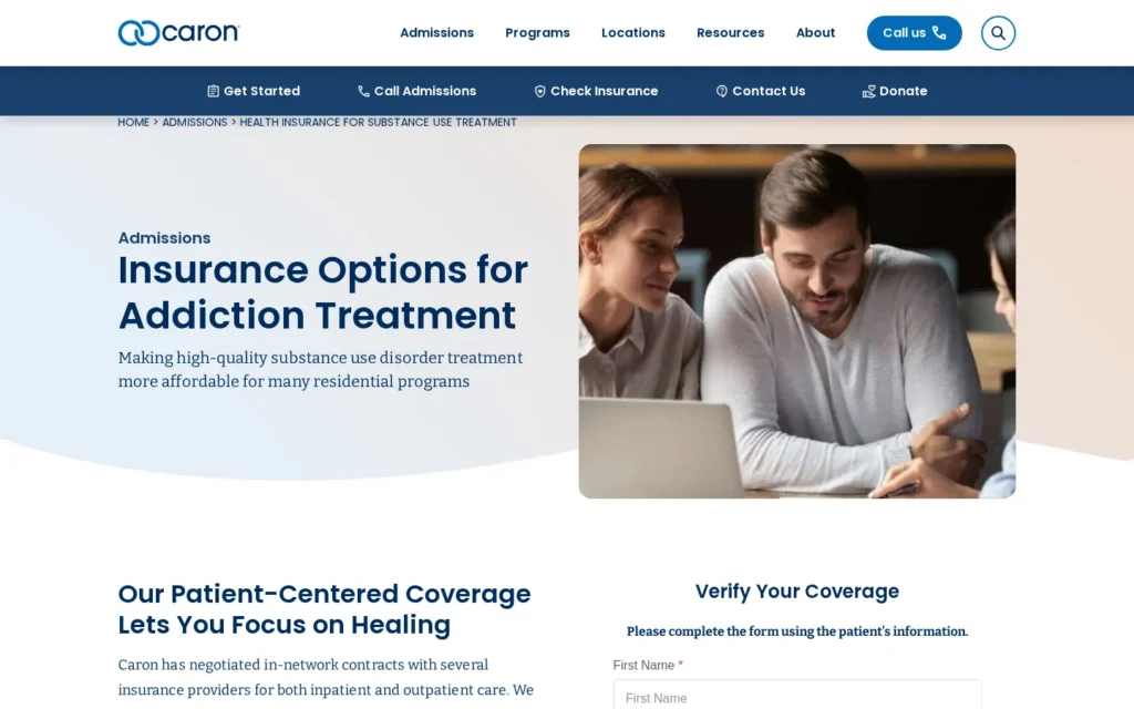
What to borrow: list coverage by location, and say what you don’t accept.
Alpine Recovery Lodge (Utah)
Alpine’s cost and insurance page publishes 30-day base rates before insurance: as of November 2026, $21,000 for residential, $14,000 for PHP, and $7,000 for IOP. It explains deductibles, coinsurance, and prior authorization, lays out its verification steps, and says plainly that verification isn’t a guarantee of coverage.
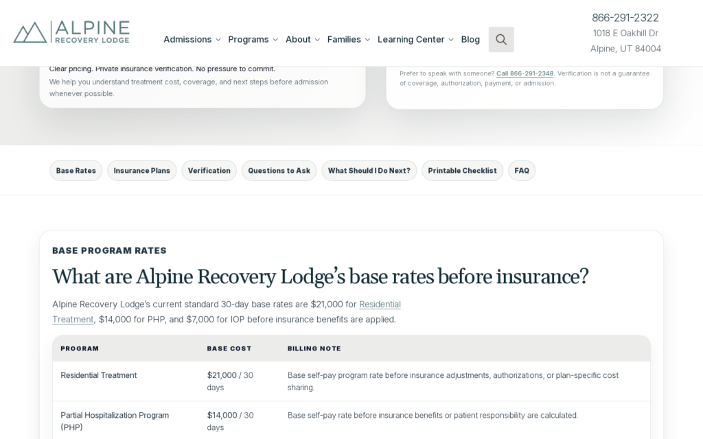
What to borrow: if you can publish base rates, do. At minimum, explain how coverage is decided and what verification does and doesn’t promise.
Our guide to insurance pages AI can cite covers how to structure these pages.
Real facility photography
Cumberland Heights (Tennessee)
Cumberland Heights opens its homepage with an aerial photo of its own campus. Its locations section uses photos of its own sites, including lodges and cabins, and links to a 360-degree virtual tour.
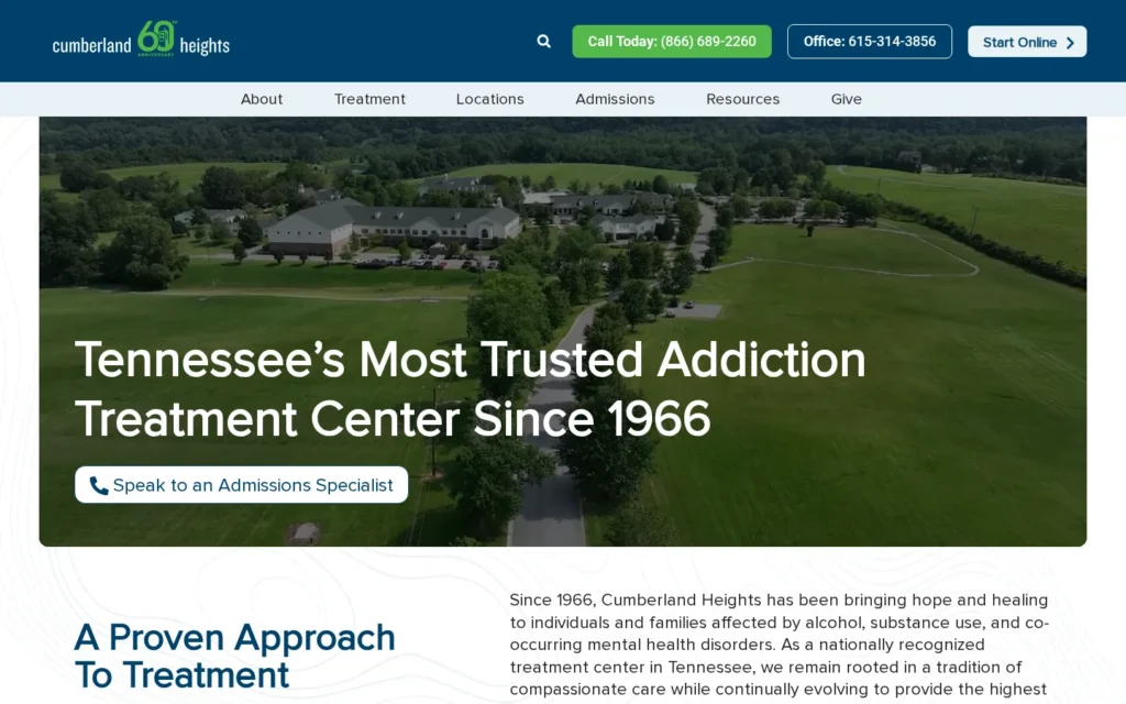
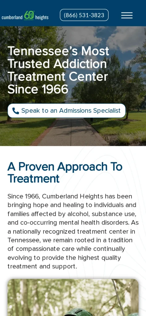
What to borrow: lead with your real place. A virtual tour answers questions before a family asks them.
Gosnold Behavioral Health (Massachusetts)
Gosnold’s homepage features its new Wareham facility with an aerial view, the street address, and a “Now Open in Wareham” announcement. The phone number for admissions sits in a bar at the very top.
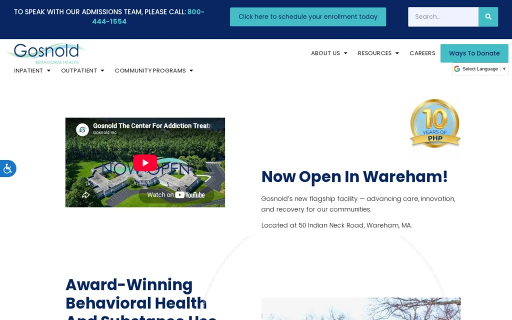
What to borrow: when you open or renovate a facility, show it and give the address.
Our guide to rehab website design as a clinical trust signal explains why photography matters so much here.
Named clinicians with credentials
Lindner Center of HOPE (Ohio)
Lindner’s leadership page has separate grids for its adult and child and adolescent care teams. Each card shows a name, credentials, and role, and links to a full bio. The executive team and board are named too.
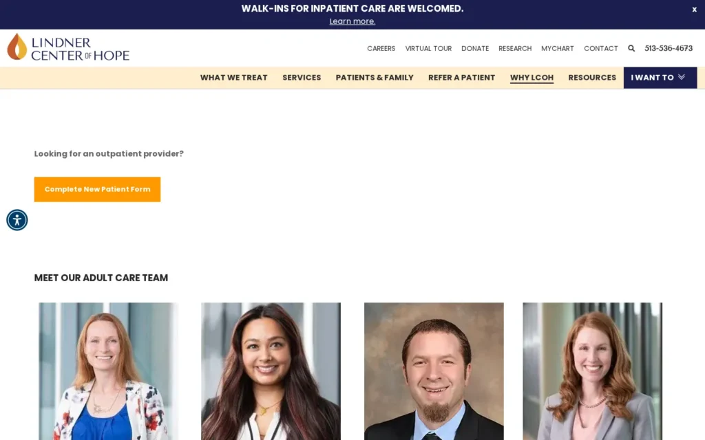
What to borrow: organize clinicians by the population they treat, so families find the right person fast.
Enterhealth (Texas)
Enterhealth’s About page shows its leadership and clinical team with headshots, full names, credentials, and titles, from its chief medical officer, Umar Latif, MD, DFAPA, to its clinical director of residential services. Each card includes a short bio.
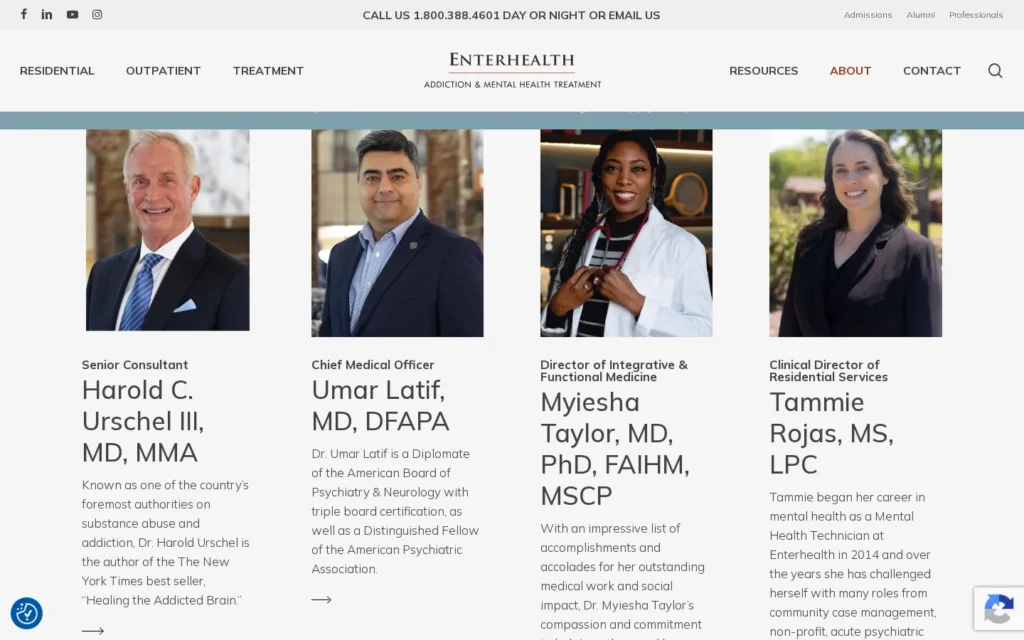
What to borrow: put credentials next to every name. “MD” and “LPC” carry weight with families.
Accreditation and licensing
Ashley Addiction Treatment (Maryland)
Ashley has a dedicated page explaining its Joint Commission accreditation, what surveyors review, and the difference between a state license and accreditation. It links to the Joint Commission’s Quality Check lookup so a family can verify it.
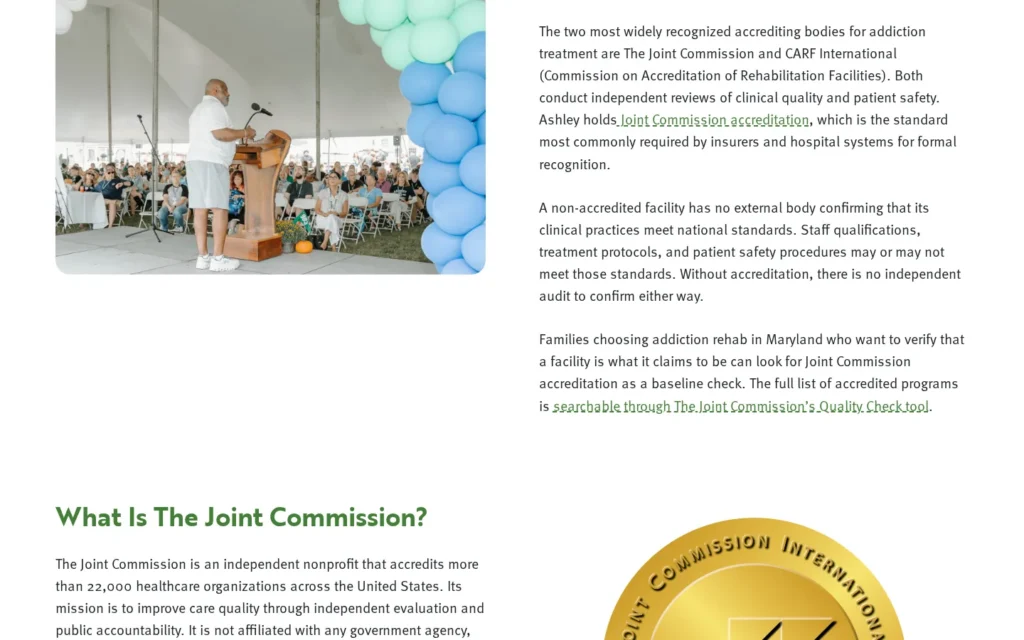
What to borrow: explain what your accreditation means and link to where it can be checked.
Discovery Point Retreat (Texas)
Discovery Point’s accreditations page names its Joint Commission accreditation, held through its parent organization, and gives the organization’s ID. A section titled “How to Verify Discovery Point Retreat’s Credentials Yourself” walks through checking the Joint Commission’s Quality Check, LegitScript certification, and the Better Business Bureau, and lists NPI numbers linked to the federal registry.
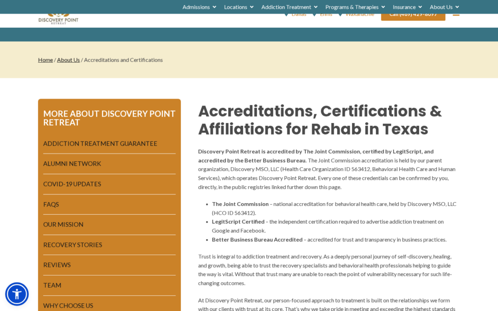
What to borrow: don’t just show seals. Tell families how to check them.
Our LegitScript glossary entry covers what certification means for advertising.
The admissions process: what to expect
The Aviary Recovery Center (Missouri)
The Aviary’s admissions page says admissions is available 24 hours a day and explains that you’ll answer a few questions and be scheduled for an assessment with a therapist.
It lists what to have ready when you call, such as ID, insurance member information, and current substance use, and covers what to bring and what to expect in detox.
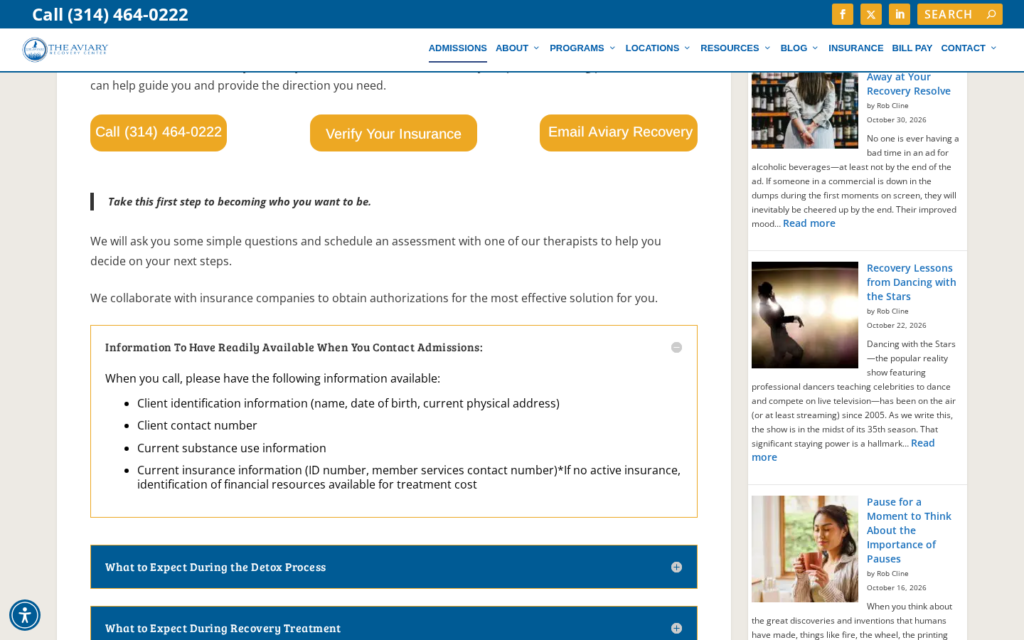
What to borrow: tell families what to have in hand before they call. It shortens the call and lowers anxiety.
Skyland Trail (Georgia)
Skyland Trail lays out admissions as five numbered steps, from an informational call to a financial estimate, an assessment interview, and the first day. It says plainly that insurance usually doesn’t cover the full cost.
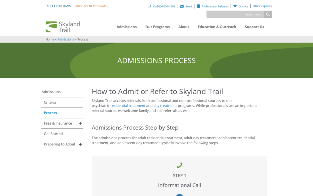
What to borrow: number your steps, and put cost conversations in the process instead of hiding them.
What these sites have in common
Across all 14, the same patterns show up:
- The next step is always visible. A phone number, a verify button, or a clear call to action sits in the first screen on mobile, which matters because Google indexes the mobile version of your site.
- They explain, then ask. Insurance and admissions pages describe what happens before asking for information.
- Proof is specific. Real places, real names, and credentials a family can check.
OPERATOR INSIGHT
Pick the three practices where your site is weakest and fix those first.
For the full build, see our guide to rebuilding or optimizing your website, our website compliance checklist, and our guide to HIPAA-compliant contact forms.
Where this fits
A strong site works best when the rest of the public record agrees with it. Check that your FindTreatment.gov listing, Google Business Profile, and directory listings match what your site says about programs, locations, and insurance.
For the development side, see our guide to website development for treatment centers. For how your website fits the rest of your marketing, see the complete guide to behavioral health marketing. If you want a second look at your site against these practices, book an intro meeting.
Frequently Asked Questions
What makes a good treatment center website?
A good treatment center website makes the next step obvious, especially on a phone, and explains insurance, levels of care, and admissions in plain language.
It shows the real facility and names the clinicians, with credentials.
Accreditation and licensing should be visible and easy to verify.
How were these treatment center websites chosen?
We picked sites that clearly show one of seven practices, from the call path to the admissions process, and looked at each live on November 10, 2026.
We included both large nonprofit systems and smaller for-profit programs that accept private insurance, drawn from operators listed on SAMHSA’s FindTreatment.gov.
We excluded current and former Webserv clients, facilities named in enforcement actions we found, and directories.
The sites aren’t ranked, and each appears under the practice it shows best.
Should a treatment center website show prices?
Many don’t, but explaining cost helps. Some sites in this gallery say plainly what insurance usually covers and when a financial counselor gets involved.
At minimum, explain how coverage is checked and who will follow up.
Families trust clear answers more than silence.
Do stock photos hurt a treatment center website?
They weaken trust when they stand in for the facility itself. Families want to see where they or a loved one would stay.
Use real photos for the facility, rooms, and staff wherever you can.
Stock images can work for general concepts, but not as proof of place.
How often should a treatment center update its website?
Check key facts like phone numbers, insurance, levels of care, and staff whenever they change, and review the whole site at least once a year.
Outdated details, such as a departed clinician or an old program, undercut trust.
Our website compliance checklist covers what to review.
Trevor Gage is the Director of Marketing at Webserv, a digital marketing agency for treatment centers.