Google’s own description of landing page experience comes down to one test: does the page deliver what the ad promised? A family that clicks an ad for “detox that takes Aetna” and lands on a general homepage has to hunt for the answer the ad promised.
That’s why a treatment center running paid campaigns needs more than one landing page, but far fewer than one per keyword. The right number is one page per kind of visitor intent, each built on a layout that answers that visitor’s question first.
This guide gives you six landing page layouts for behavioral health, with the section order, what to leave out, the compliance notes, and what to measure for each. It’s how our landing page team for treatment centers decides which template a campaign gets before any design work starts.
The elements themselves (trust signals, phone placement, forms) are covered in our complete guide to landing pages and our 10-element landing page checklist. This piece is about arrangement: which elements go on which page, and in what order.
Key Takeaways
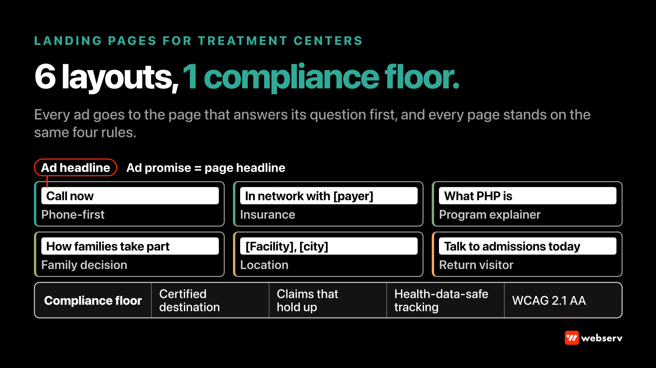
- Match the layout to the visitor’s intent, not to the keyword. Six layouts cover most treatment center campaigns: phone-first, insurance, program explainer, family decision, location, and return visitor.
- Google says landing page experience reflects how relevant and useful the page is, how easy it is to use, and whether it meets the expectations the ad set. The layouts are built around that test.
- Each layout leads with the one answer its visitor came for, then adds only what supports the next step.
- Every layout carries the same compliance floor: LegitScript-certified destination, no outcome promises, and tracking that follows HIPAA and platform health-data rules.
- Build to Core Web Vitals “good” thresholds (LCP within 2.5 seconds, INP of 200 milliseconds or less, CLS of 0.1 or less) and to WCAG 2.1 AA, which HHS requires of funding recipients on a set timeline.
- Judge each layout on qualified calls and admits, not form fills alone.
How to choose a layout
Start from the question the visitor has when they click. A search for “detox near me” is asking where and how fast. A search for “does [payer] cover rehab” is asking about cost. A family scrolling Meta is asking whether this is a place they’d trust.
Each of those needs a different first screen.
Google’s Quality Score documentation describes landing page experience in those terms: the relevance and usefulness of the information, ease of navigation, and whether the page meets the expectations of someone who clicked your ad. A layout that answers the ad’s question on the first screen is how you meet that bar.
DEFINITION
Landing page layout. The order and selection of sections on a paid landing page, chosen for one type of visitor intent. Two treatment centers can use the same elements (phone number, trust badges, program details) and still build very different pages, because the layout decides what the visitor sees first and what gets left out.
Plan on three or four of these layouts rather than all six. Our landing page design guide covers the one-page versus many-pages question.
The compliance floor for every layout
Every layout below sits on the same four requirements. Get these right once and each new page inherits them.
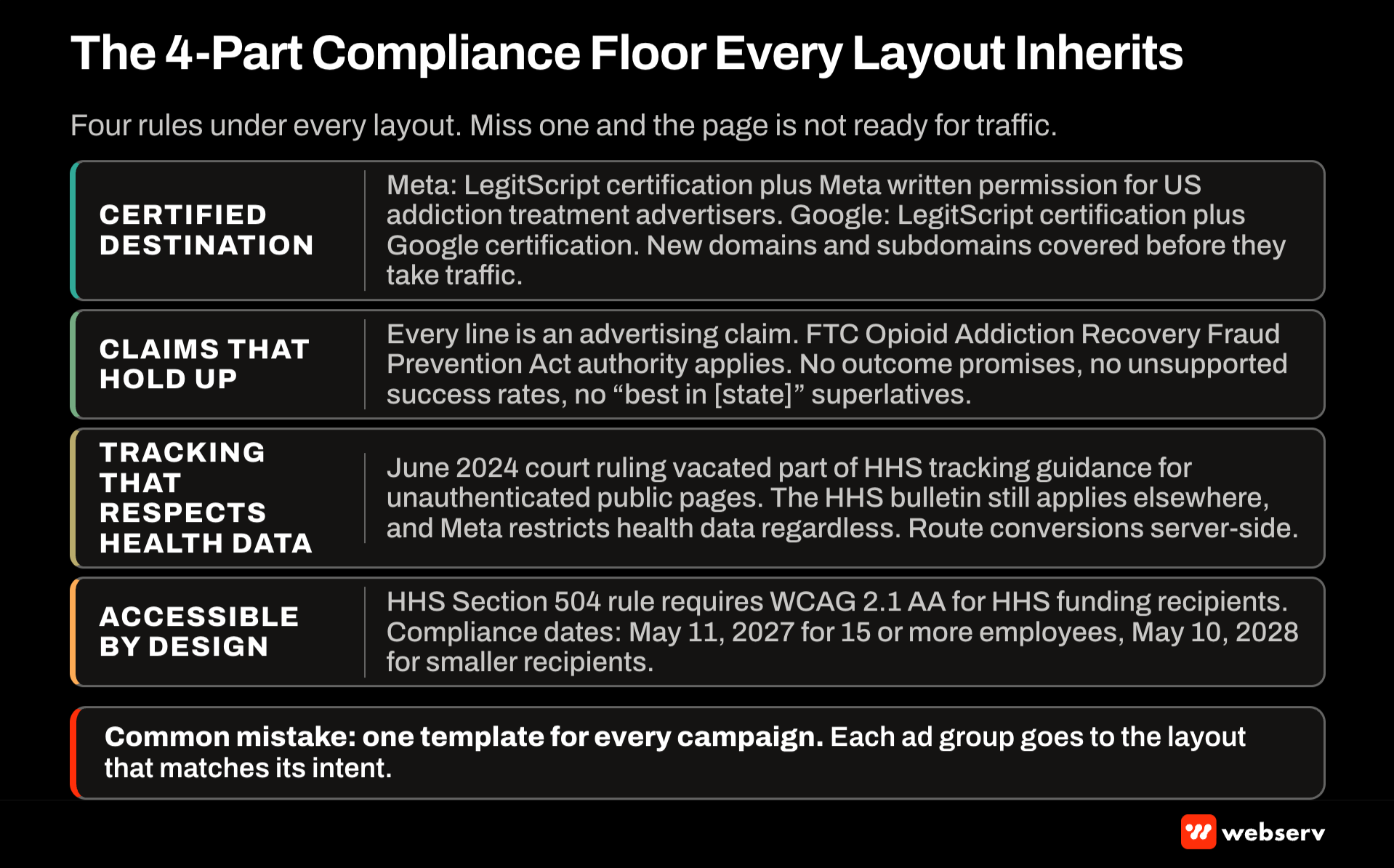
Certified destination. Meta requires addiction treatment advertisers targeting the US to hold LegitScript certification and Meta’s written permission, and Google’s healthcare and medicines policy requires US addiction services advertisers to be certified by LegitScript and by Google. A new landing page domain or subdomain should be covered by that certification before it takes traffic.
Claims that hold up. Everything on the page is an advertising claim. The FTC’s Opioid Addiction Recovery Fraud Prevention Act authority covers deceptive practices involving substance use disorder treatment services, so outcome promises, unsupported success rates, and “best in [state]” superlatives stay off every layout.
Tracking that respects health data. In June 2024 a federal court vacated part of HHS’s tracking guidance covering unauthenticated public pages, but HHS’s tracking technologies bulletin still applies elsewhere, and Meta restricts health data regardless. Route conversions through a server-side setup like the one in our HIPAA-safe conversion tracking stack.
Accessible by design. HHS’s Section 504 rule requires recipients of HHS funding to meet WCAG 2.1 AA for web content.
HHS extended the compliance dates to May 11, 2027 for recipients with 15 or more employees and May 10, 2028 for smaller ones. Facilities that take Medicaid or other federal funding should build new templates to that standard now.
COMMON MISTAKE
One template for every campaign. Sending every ad to the same page means every visitor has to scroll past answers meant for someone else. The insurance searcher reads about family programming, the family reads a phone-first page built for a crisis caller, and both leave.
Build the few layouts your campaigns need, and send each ad group to the layout that matches its intent.
Layout 1: The phone-first page
Use it for: high-intent search traffic, such as “[level of care] near me” or “[level of care] in [city].” The visitor wants to talk to someone now.
Section order:
- Header with the tracked phone number, tappable on mobile, and admissions hours.
- One-line headline naming the service and location, matching the ad.
- Short reassurance line: who answers and what happens on the call.
- Two or three trust signals (accreditation, licensure, named medical director).
- A short form as the secondary path for visitors who can’t call.
- Brief program summary with a second call button.
- Footer with address, licensure details, and privacy notice.
Leave out: long program descriptions, blog links, and main-site navigation that pulls visitors away from the call.
Compliance notes: the reassurance line describes the process (“A coordinator answers and checks your benefits with you”), not an outcome. Keep the phone number consistent with your call tracking setup.
Measure: calls longer than your qualified-call threshold, and admits from those calls. Our phone-first vs form-first guide covers when a different primary action makes sense.
Layout 2: The insurance page
Use it for: payer-intent searches and ads, such as “[payer] rehab coverage” or “does [payer] cover detox.” The visitor wants to know whether they can afford it.
Section order:
- Headline answering the question directly: “[Facility name] is in network with [payer]” (only if true).
- Benefits check call to action: phone number and a short verification form.
- What the benefits check involves, in three short steps.
- Levels of care the plan may cover at your facility, with the caveat that coverage depends on the plan.
- Other accepted payers, from current contracts only.
- Trust signals and licensure.
- Short FAQ on costs, deductibles, and what happens after the check.
Leave out: coverage promises (“fully covered,” “no cost to you”) and payer logos for contracts you don’t hold.
Compliance notes: payer names and logos must reflect current, active contracts. Promise a benefits check, never a coverage outcome. Collect only the information the check needs, and route the form through a HIPAA-compliant processor.
Measure: completed benefits checks and the share that become admits. Payer-specific depth for BCBS, Aetna, Cigna, and UnitedHealthcare comes in a later piece in this series.
Layout 3: The program explainer page
Use it for: searches and ads about a specific level of care or modality, such as “what is PHP” or “IOP for alcohol.” The visitor is researching and wants to understand the program before calling.
Section order:
- Headline naming the program and location.
- Plain-language definition: what the program is, hours per day, days per week, and whether patients go home at night.
- What a typical day or week includes, from your actual schedule.
- Who the program is designed for, described by clinical criteria your team uses at intake, framed as questions for admissions rather than statements about the visitor.
- Clinical team with names and credentials.
- Call to action with phone and form.
- FAQ on length of stay, insurance, and what happens after the program.
Leave out: outcome statistics you can’t substantiate, and generic content about addiction that doesn’t describe your program.
Compliance notes: clinical descriptions should be reviewed by a credentialed staff member. Descriptions of who the program serves should be the facility’s criteria, not assertions that the reader has a condition.
Measure: scroll depth to the call to action, calls, and admits by program. Deeper modality-specific layouts for PHP, IOP, detox, and residential are coming later in this series.
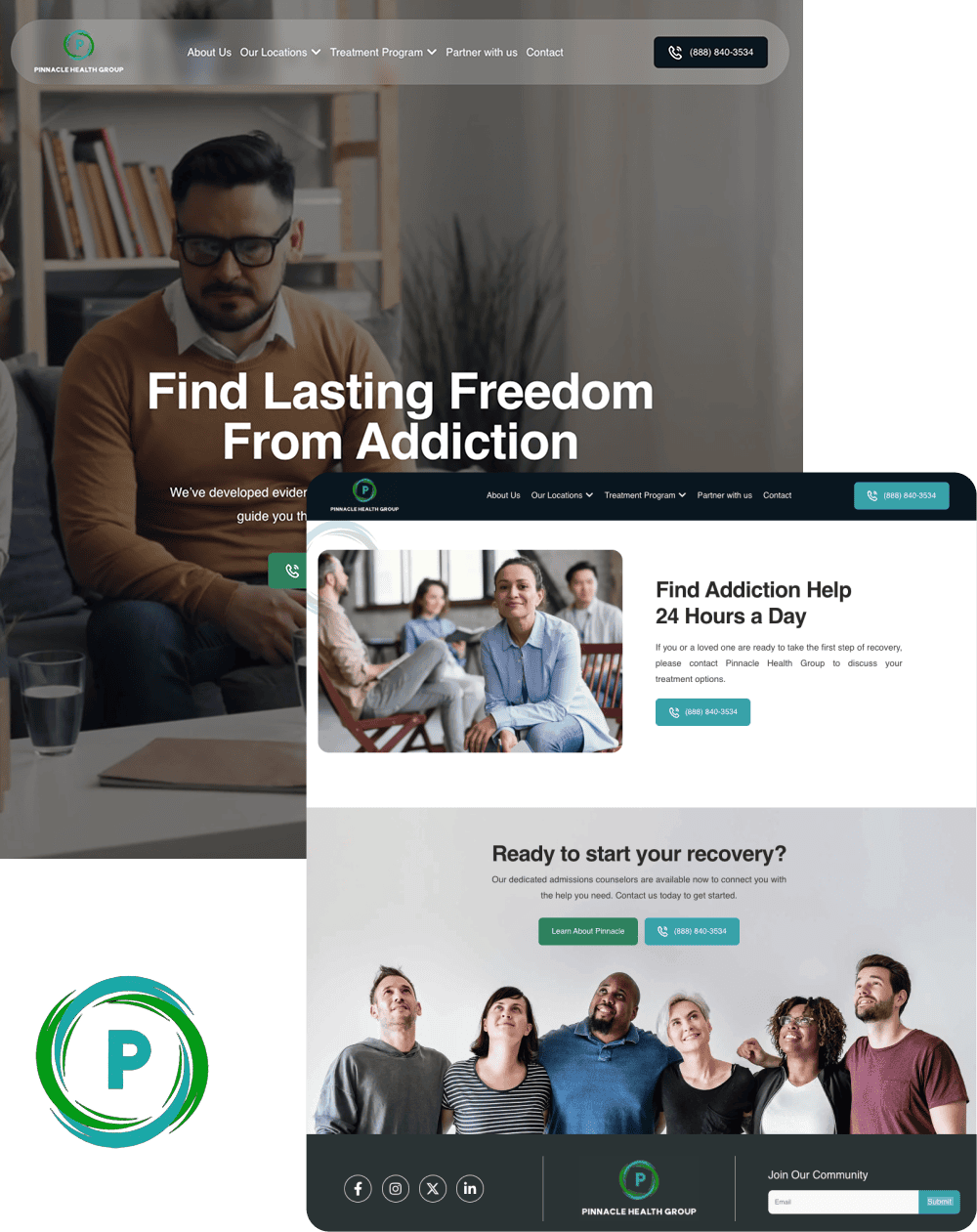
A unified platform built for multiple locations, programs, and audiences without feeling fragmented
- Reorganized multi-service site architecture
- ADA compliant responsive design system
- Future-ready CMS with modular templates
- Optimized for SEO and lead capture
Layout 4: The family decision page
Use it for: social campaigns reaching family members, such as Meta feed and Reels ads promoting your family program. The visitor is often a parent, spouse, or adult child deciding whether to make a call on someone else’s behalf.
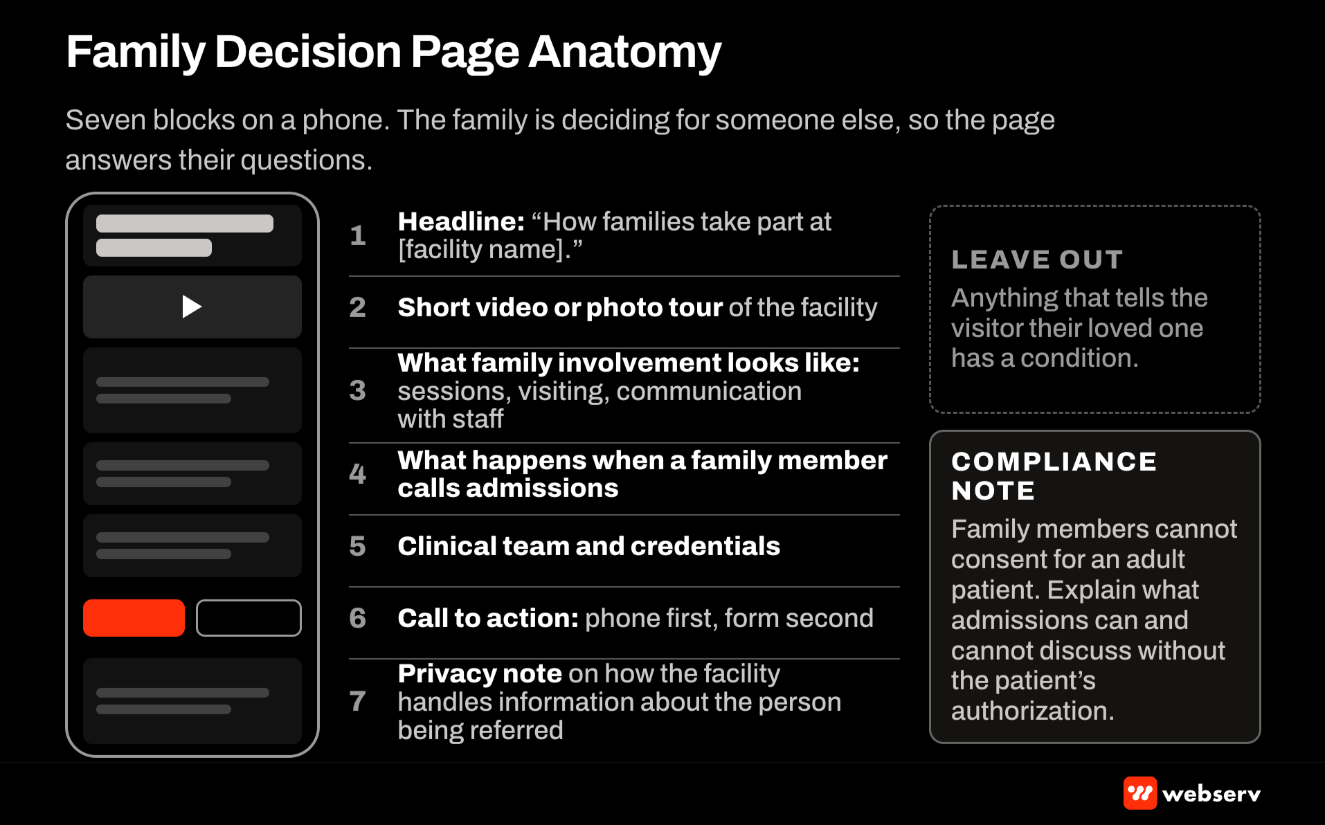
Section order:
- Headline about the facility and the family’s role, such as “How families take part at [facility name].”
- Short video or photo tour of the facility.
- What family involvement looks like: sessions, visiting, communication with staff.
- What happens when a family member calls admissions.
- Clinical team and credentials.
- Call to action: phone first, with a form for family members who prefer to reach out in writing.
- Privacy note explaining how the facility handles information about the person being referred.
Leave out: anything that tells the visitor their loved one has a condition. Meta’s personal attributes policy applies to the ad, and the page should keep the same tone so the click doesn’t feel like a switch.
Compliance notes: family members can’t consent for an adult patient, so the page should explain what admissions can and can’t discuss without the patient’s authorization.
Measure: calls and form submissions from family members, and the share that lead to an assessment. Our upcoming video ad script templates include a family program script built to feed this layout.
Layout 5: The location page
Use it for: geo-targeted campaigns for a specific facility, especially for operators with more than one location. The visitor wants to know where the facility is and whether it’s close enough.
Section order:
- Headline with the facility name and city.
- Address, map, and directions or travel notes.
- Photos of this specific facility, not a shared stock set.
- Levels of care offered at this location.
- Staff at this location with names and credentials.
- Call to action with this location’s tracked number.
- Licensure and accreditation for this location.
Leave out: content copied from other locations with only the city name swapped. Each location page should describe what’s actually at that address.
Compliance notes: state licensure is location-specific, so list the license that covers this facility. Keep the name, address, and phone consistent with the facility’s Google Business Profile.
Measure: calls by location and admits by location. Multi-facility architecture gets its own piece later in this series.
Layout 6: The return-visitor page
Use it for: visitors who have already been to the site and come back through a branded search or a retargeting ad built from site-visitor audiences. The visitor has already done research and is closer to a decision.
Section order:
- Headline that moves the conversation forward, such as “Talk to our admissions team today.”
- Phone call to action with hours and who answers.
- What happens next, in three steps from call to arrival.
- Benefits check option.
- Short proof section: accreditation, licensure, and clinical leadership.
- Answers to practical questions that come up before a decision: cost, length of stay, what to bring.
Leave out: introductory content the visitor has already seen, and any message that implies the facility knows why they visited.
Compliance notes: retargeting audiences must not be built from patient, admit, or inquiry lists, and ad copy can’t imply knowledge of the visitor’s health. Our retargeting strategy guide covers the audience rules.
Measure: calls and admits from returning visitors, compared with first-visit pages.
OPERATOR INSIGHT
The fastest way to see which layout a campaign needs is to read the ad group’s search terms or ad comments for a week. Visitors tell you their question in the words they use. If most of the terms name a payer, the insurance layout wins before you test anything.
Once the layouts are live, test one change at a time inside a layout rather than testing layouts against each other. The layouts serve different visitors, so comparing them head to head mostly measures the difference in traffic.
Map your campaigns to the layouts
Before building anything, list every active campaign and ad group and assign each one a layout. The map below is the starting point we use; adjust it to the searches and audiences your account actually runs.
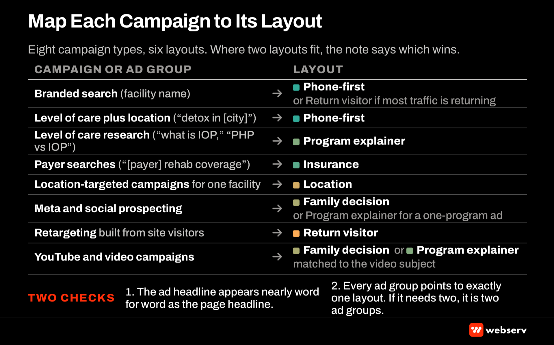
- Branded search (your facility name): phone-first, or the return-visitor layout if the campaign mostly reaches people who have visited before.
- Level of care plus location (“detox in [city]”): phone-first.
- Level of care research (“what is IOP,” “PHP vs IOP”): program explainer.
- Payer searches (“[payer] rehab coverage”): insurance.
- Location-targeted campaigns for one facility: location.
- Meta and other social prospecting: family decision, or program explainer when the ad is about a specific program.
- Retargeting built from site visitors: return visitor.
- YouTube and video campaigns: family decision or program explainer, matched to the video’s subject.
Two checks keep the map honest. First, every ad’s headline should appear, nearly word for word, as the page’s headline. Second, every ad group should point to exactly one layout. If an ad group needs two, it’s really two ad groups.
Revisit the map whenever you launch a new campaign, add a location, or add a level of care. A new program with no matching page tends to get sent to whatever page exists, which is how accounts drift back to one page for everything.
The map also tells you which layouts to build first: the ones that receive the most spend. There’s no reason to design a location page for a facility that runs no location campaigns.
Build every layout to the same technical standard
The layouts differ in order and content. The technical standard is the same for all six.
- Speed. Google’s Core Web Vitals “good” thresholds, per web.dev, are LCP within 2.5 seconds, INP of 200 milliseconds or less, and CLS of 0.1 or less, measured at the 75th percentile of page loads.
Core Web Vitals ‘good’ thresholds (web.dev)
2.5 s
Largest Contentful Paint
200 ms
Interaction to Next Paint
0.1
Cumulative Layout Shift
- Indexing. Most paid landing pages should carry a noindex tag so they don’t compete with your service pages in organic search.
- Accessibility. Build templates to WCAG 2.1 AA: readable contrast, labeled form fields, keyboard access, and alt text on facility photos.
- Forms. Collect the minimum, route submissions to a HIPAA-compliant destination, and never pass form values into URLs or analytics.
- Consistency. The phone number, address, and facility name should match everywhere: the ad, the page, the Google Business Profile, and the main site.
DO
- Lead with the answer to the ad’s question.
- Keep one primary action per page.
- Use real photos of the facility and staff.
- List only current payer contracts and credentials.
- Match the page’s headline to the ad that sends traffic to it.
DON’T
- Send every campaign to the homepage or one general page.
- Promise coverage, outcomes, or timelines.
- Copy one location’s page to another with the city swapped.
- Keep the main-site navigation on pages built for a single call.
- Pass form data through URL parameters or pixels.
How to measure which layouts work
Judge each layout on what it produces for admissions. Google’s landing page reporting shows performance by page, and your call tracking and CRM show which of those visits became qualified calls and admits.
Send conversions back to the ad platforms as value-tier events rather than raw form fills, so bidding learns which layouts produce admits. Our attribution guide covers the reporting side.
Review each layout’s results monthly by campaign. A layout that produces calls but few admits often points to a targeting or intent mismatch rather than a design problem.
Put the layouts to work
Start with the phone-first and insurance layouts. They match the highest-intent searches most treatment centers already buy, and neither needs new photography or video to launch.
Add the program explainer for your highest-volume level of care next, then the family page when your social campaigns are ready. For how landing pages fit the rest of your program, see our behavioral health marketing guide.
If you want us to map your current campaigns to these layouts, book an intro meeting and we’ll walk through it with you.
Most in-house teams hit a wall not because they lack knowledge, but because they lack bandwidth.
When you are ready to hand it off, Webserv has spent 9 years executing exactly this for treatment centers nationwide.
Frequently Asked Questions
How many landing pages does a treatment center need?
Usually three or four layouts, applied across the campaigns that need them. Phone-first and insurance pages cover most high-intent search traffic, and a program explainer and a family page cover research and social traffic.
The count grows with locations and levels of care, not with keywords. A two-location operator with residential and IOP might run each layout per location where the traffic justifies it.
The trade-off is maintenance. Every page is a set of claims someone has to keep current, so build only the pages your campaigns actually send traffic to.
Should landing pages be indexed by Google?
Most paid landing pages should be noindexed. They’re built for a specific ad and often overlap your service pages, and indexing them can put two of your pages in competition for the same organic searches.
The exception is a page you want to rank organically, such as a location page that doubles as the main page for that facility. In that case, build it as a full service page rather than a stripped-down paid layout.
Whichever you choose, keep the canonical and noindex settings deliberate, and check them after every site update.
Can we use the same landing page for Google Ads and Meta?
Sometimes, but the visitors usually want different things. Search visitors arrive with a question they typed, while social visitors arrive after seeing an ad they didn’t search for. The phone-first and insurance layouts fit search; the family decision layout fits social.
Where one page serves both, lead with the answer that fits the larger traffic source and test the headline against the ad copy for each platform.
Keep in mind that both platforms require the page to be covered by your LegitScript certification and to follow their health-data rules for tracking.
What should a treatment center landing page never include?
Outcome promises, unsupported success rates, coverage guarantees, and superlatives like “the best rehab in the state.” These create FTC and platform policy exposure, and they’re easy to remove.
Also leave out identifiable patients without written authorization, payer logos for contracts you don’t hold, and any tracking that sends form values or health-related page data to ad platforms.
The last one to avoid is copy that tells the visitor they have a condition. Describe the program and let the visitor decide it’s relevant.
How long should a treatment center landing page be?
As long as its visitor needs. A phone-first page for high-intent search can be short, because the visitor wants to call. A program explainer runs longer, because the visitor is researching.
The test is whether every section helps the visitor take the next step. If a section answers a question this visitor doesn’t have, it belongs on a different layout.
Check scroll depth against call placement. If most visitors never reach the first call to action, move it up rather than adding more content.
Keaton Nalle is the Director of Paid Admissions at Webserv, a digital marketing agency for treatment centers.