Contributors
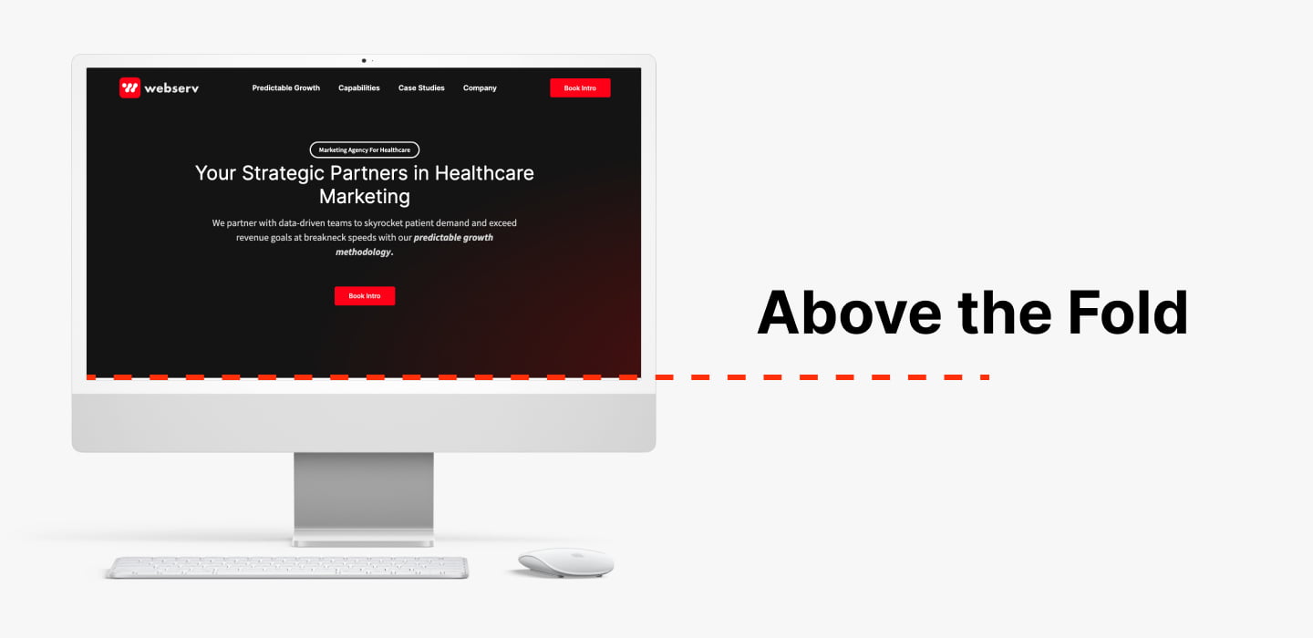
Have you ever heard of the term “above the fold”? This is an important phrase to know if you have a website or plan to create one. Above the fold refers to the visible area of a web page before a user scrolls down. It’s located at the top of the page, and it’s where users look first when they arrive on your site. Let’s take a closer look at why above-the-fold matters and how you can use it to ensure your website looks great and performs even better.

Above the fold should be used to capture visitors’ attention, highlight your key features, and showcase your main message. This is where you want to include elements like your logo, navigation menu, search bar, call-to-action buttons, images, videos, contact information, social media links—basically anything that will help engage visitors with your website.
You also have to consider how mobile users view websites. With mobile devices becoming more popular than desktop computers for browsing the web, you’ll want to make sure that all of these elements are easy for users to access from any device. That means making sure that all buttons are large enough for thumbs and fingers to easily tap them without accidentally navigating away from your website.
The general consensus among experts is that above-the-fold content does indeed have an effect on SEO. This makes sense when you consider that search engines use crawlers or robots to crawl through websites and find relevant information in order to rank them in search engine results pages (SERPs). If your most important information is hidden below the fold, then it may be difficult for these crawlers to find it.
Additionally, if users cannot easily find what they are looking for within seconds of landing on your page, they are likely to move to another website. This means that important keywords may not be given enough attention by users who visit your page, which can lead to lower rankings in SERPs. Finally, if your page takes too long to load due to an abundance of images or videos below the fold, then search engine algorithms will penalize your site for having poor loading speed as well.
Above the fold can make or break potential customers’ first impression of your website—so make sure it’s clean and inviting! Keep in mind that people view websites differently depending on whether they’re using a laptop or mobile device; design accordingly so all essential elements are easy for visitors to find no matter what device they’re using. These steps will help ensure that visitors stay engaged with your website from their first glimpse!
Above the fold is important in website design because it is the first thing that users see and interact with. Placing important information and elements, such as a call-to-action button or a form, above the fold can increase the chances of users engaging with them.
To optimize the above the fold of a website, it’s important to keep it simple and clean, with a clear hierarchy of information. The layout should guide the user’s attention to the most important elements, using whitespace, typography and visual cues. Also, it’s important to consider the different screen sizes and devices, as the fold can vary depending on the device’s size and resolution.
Common mistakes when designing above the fold include overcrowding it with too many elements, using low-quality images, poor typography and not considering different screen sizes and devices. These mistakes can make the above the fold cluttered and hard to navigate, leading to a poor user experience.
Yes, above the fold can change with responsive design, as the fold can vary depending on the device’s size and resolution. A responsive design approach should be used to ensure that the above the fold looks good and is easy to navigate on all devices and screen sizes.